
Does branding maketh the brand? If the recent menswear shows are anything to go by, the answer is a definitive yes. Gone are the days of recession-era discretion, most famously embodied by the four subtle white stitches that would instantly identify a Margiela to those in the know. Today, branding is all about the big, bold cultish lettering that can be spotted from a mile off. Sounds gaudy, doesn’t it? That’s only natural – after all, a widespread cynicism when it comes to overt branding is only to be expected considering the abuse of it as a USP within the fashion world. No longer are T-shirts with a miniature crocodile or polo player flying off the shelves like Star Wars merchandise.
Today, luxury consumers are more informed and educated than ever, thanks in large part to the masses of content, show coverage and celebrity and influencer endorsements being communicated via social media. You’d be surprised at how many 14-year-olds know who Kim Jones and Junya Watanabe are – for them, fashion shows are what music videos were to an older generation. And these millennials won’t just buy any old dusty logo – it must be cool, current, and fragrant of the zesty zeitgeist. Bonus points if it’s a collaboration, because apparently Gen Z likes to get more bang for its buck, too. So, it doesn’t come as a surprise that there’s more to this trend than the unadulterated ostentation of logo love. Rather, a slew of unexpected collaborations, subversive slogans and modern-day riffs on hallmark logos are reframing the heavily branded look with wit, irony and pneumatic sense of desirability. Let’s call it post-Internet branding for a generation of fashion-savvy label lovers.

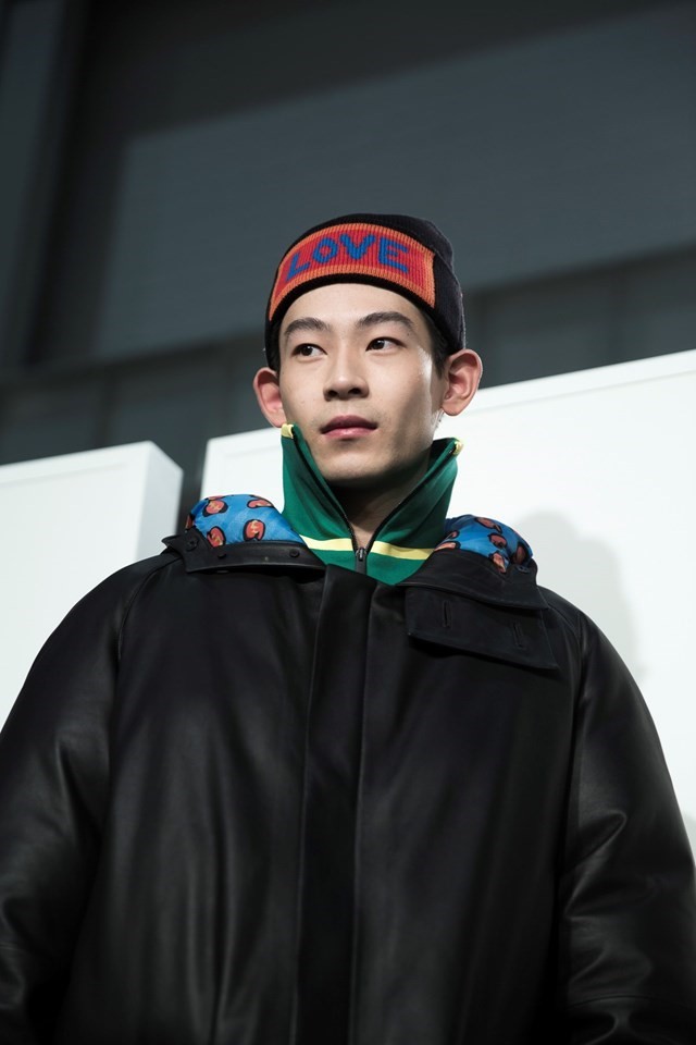

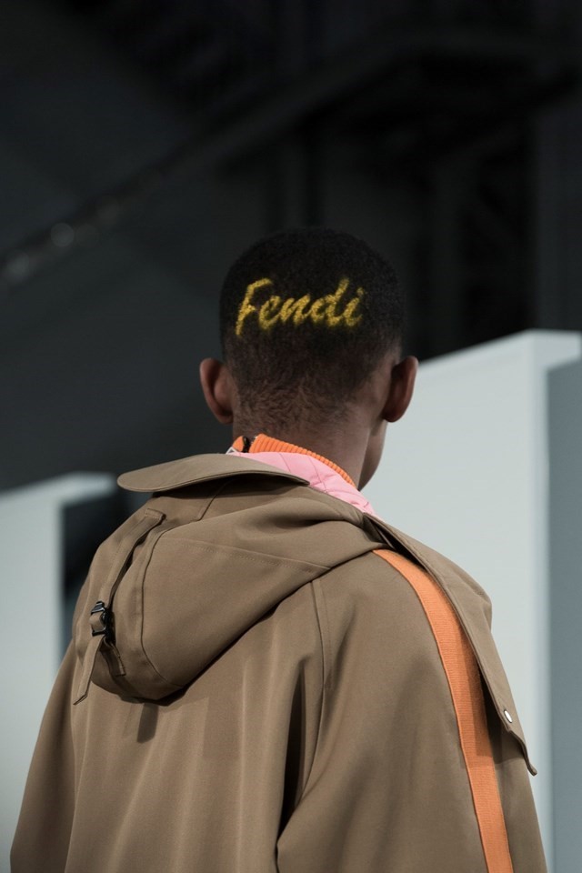
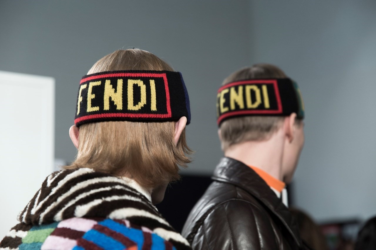
Fendi
The bright, Lichtenstein-like lettering at Fendi’s show showed the kind of comic book optimism that buoyed spirits during the week of the ominous presidential inauguration. When Karl Lagerfeld came up with that famous ‘FF’ logo half a century ago, it was intended to be an acronym for ‘Fun Fur’ – and that’s just what this was. Words such as ‘Try’, ‘Listen’ and ‘Love’ were sheared into candy-coloured mink, or appeared emblazoned across sweatbands and rucksacks. Beyond the sporty styling, however, singular pieces shined with wit – a headband with the word ‘Think’ took the prize for most original placement of a slogan that was simultaneously aesthetically and philosophically appealing.

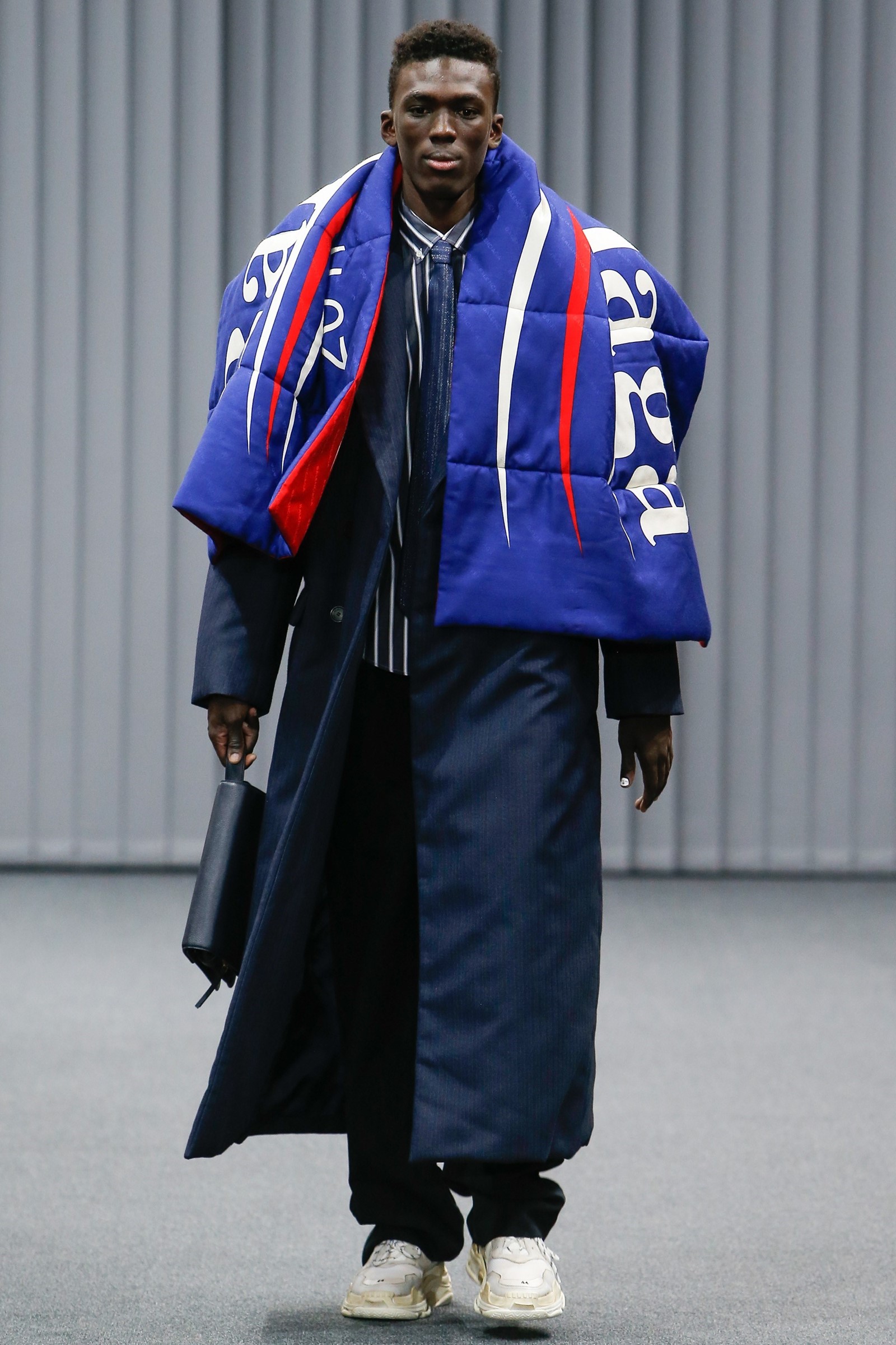

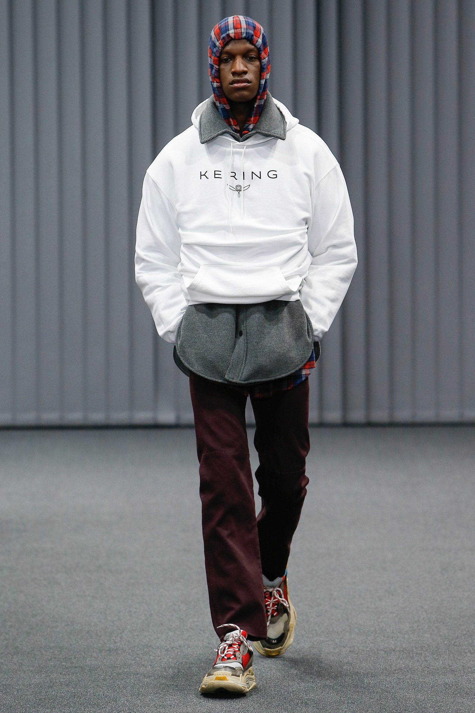
Balenciaga
Oh, the irony! Balenciaga’s ode to the corporate hetero male took on a subversive use of Bernie Sanders’ campaign logo, as well that of Kering, the French brand’s parent company. Hoodies, puffers and leather shopper bags were cleverly branded as a reminder of just how much of a cultural behemoth Balenciaga is. “It coincided with us moving to a new place – our offices at Balenciaga – so we are now neighbours with Kering,” explained Demna Gvasalia. “We actually share the same parking lot and the same courtyard, so we kind of co-exist with this corporate institution. That’s something that we wanted to soften and make it warmer and more cosy.” White hoodies that brazenly featured large Kering logos were a bold and somewhat parodic acknowledgment that the brand is owned by a conglomerate, a fact that most brands try to conceal. Leather carrier bags bearing the original Balenciaga logo added a further layer of irony as a somewhat brazen affirmation that there are plenty of people, albeit not actual corporate executives, who will certainly be buying into it. Of course, right now, irony sells – and the Balenciaga-branded stomper boots and trainers also made sure that such confidence was justified.

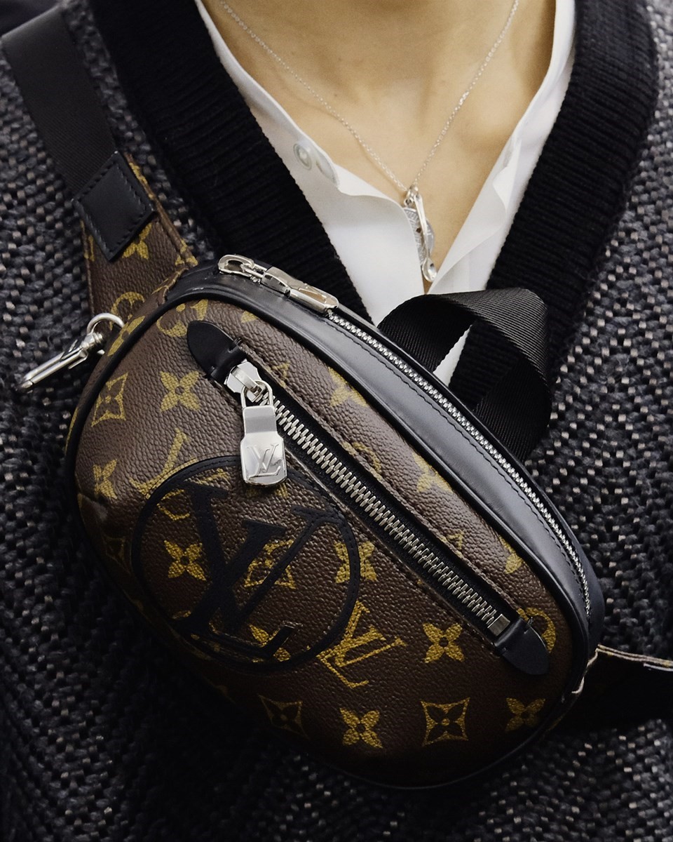

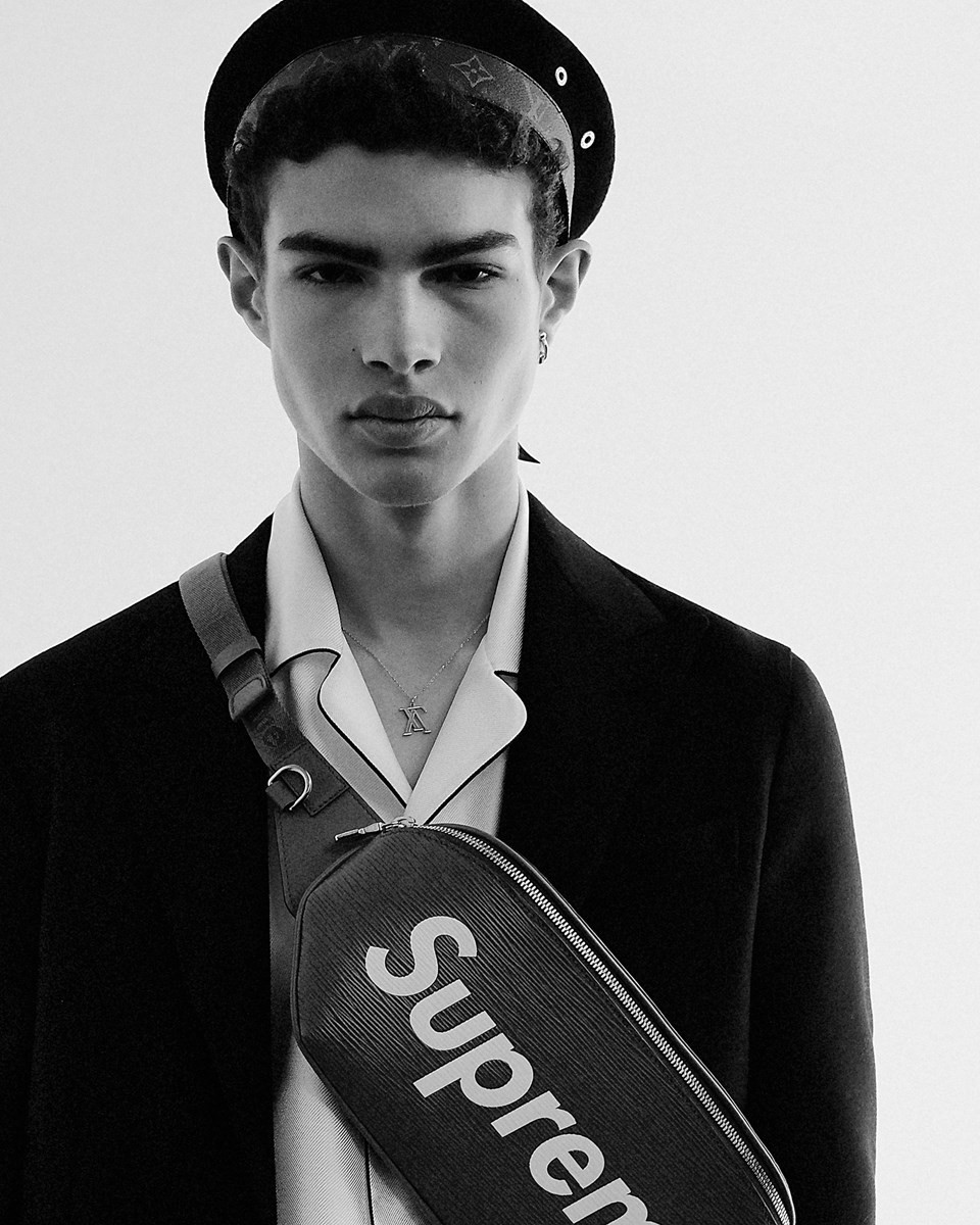
Louis Vuitton
What happens when you take two of the most recognisable, if not polar opposite, logos in the world – the Vuitton monogram and the Supreme logo – and juxtapose them through a lens of downtown New York street culture? You get a viral, if not iconic, collaboration that accelerates both brands to uncharted territory. “The most modern thing to do right now is for designers to collaborate with each other,” explained Vuitton’s Kim Jones to Olivia Singer. “Everything’s been done before – and why not? When you work together you learn from each other, you find different things and you create new, interesting projects.” The result was a genius use of branding that introduces an unparalleled sense of luxury to Generation Hypebeast. Supreme is famous for its ‘drops’ of product that sell out in minutes – including a red clay brick printed with their box logo which instantly disappeared into e-baskets. Fuse the two brands together and, as Jones says, “it looks fucking great and people can’t ignore it.”

Dries van Noten
In haute couture, much emphasis is placed on the petit mains and ateliers that justify the extreme price tag. After all, in a world of mass, globalised production, a piece of clothing must have more value than just the price, and the branding, that is placed upon it. For his 99th show, Dries Van Noten celebrated the factories that have been the backbone of menswear for centuries, and his own menswear for decades. Sweaters featured the crests of companies that made them, such as Lovat, a Scottish mill specialising in tweeds and custom cloths; Marling & Evans, a leading weaving firm in West Yorkshire; Jamieson and Smith, the proprietor of Shetland wool; and Fox Brothers & Co, which has been making fine flannel in Somerset since 1772. These are the firms that often remain invisible and are discouraged from naming clients. Van Noten decided to make them the focus of his branding as a pertinent reminder of just how well his clothes are made and who it is that makes them. It was refreshing antidote to the brand-heavy branding seen elsewhere – and one that felt sincere marriage of provenance and design.

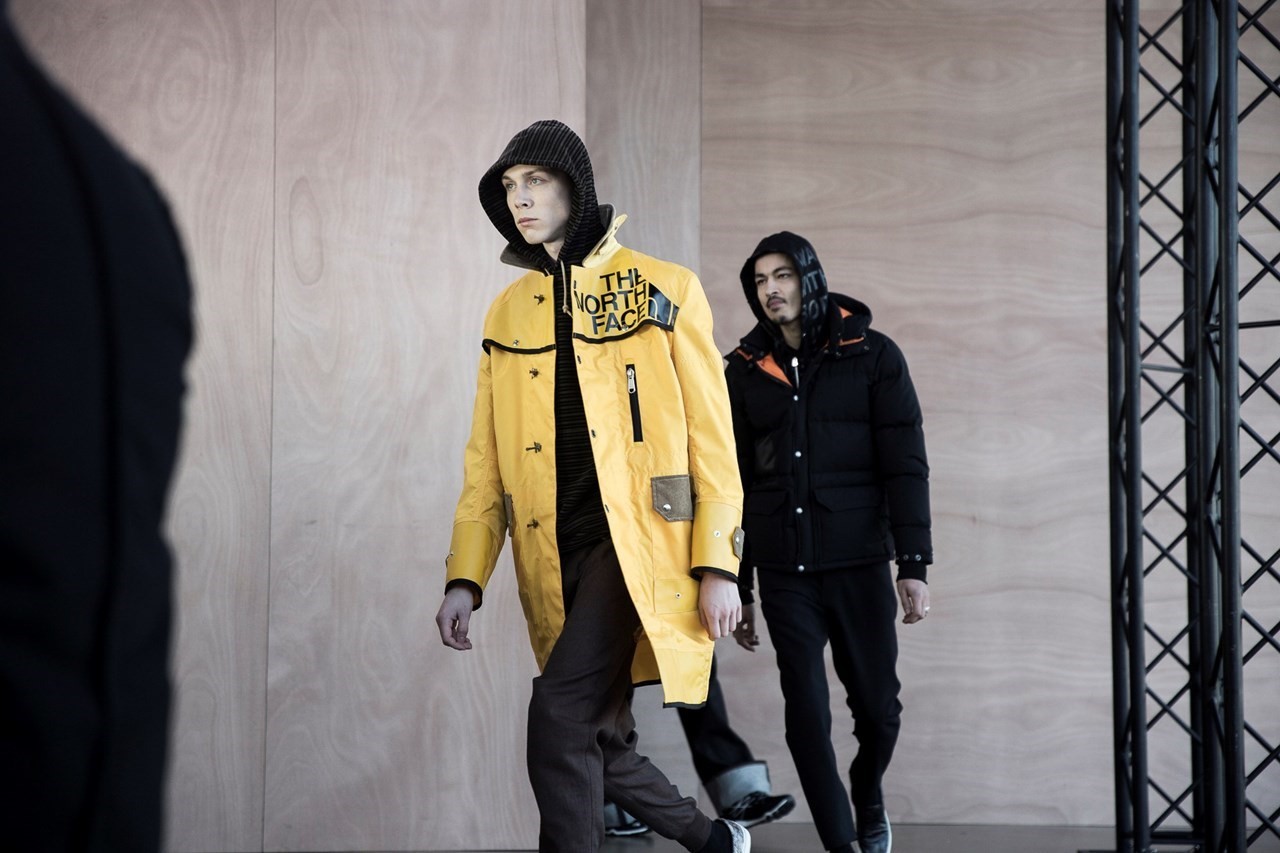
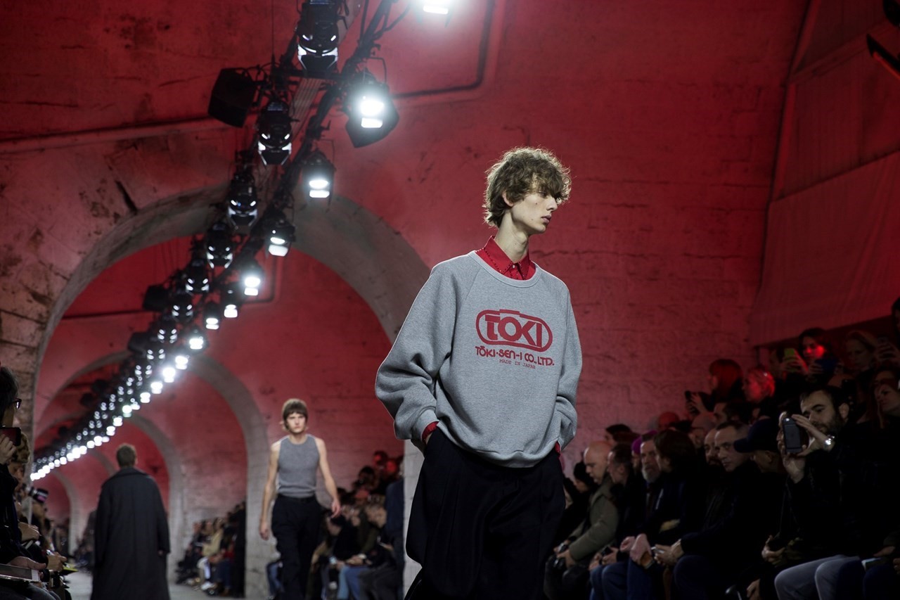
Junya Watanabe
The North Face is the ubiquitous American utility brand seen on the backs of hikers and adventurers alike, familiar to anyone that has ever come within a five-mile radius of the Lake District – or Hackney Downs, for that matter. Junya Watanabe, on the other hand, is the esoteric Japanese designer who has remained at the vanguard of fashion for the last decade and a half, thanks to his directional pattern-cutting and stirring shows. The combination of the two elaborated on Watanabe’s interest in Americana, which was only made more potent by the simultaneous collaborations with Levi’s, Carhartt, Barbour, and Kangol. It’s no secret that urban men love utilitarian garb – it makes them feel prepared for the apocalypse and look much more active than they actually are. Watanabe has probably seen countless men in these very brands, and knows that they won’t part with them for cutting-edge design.

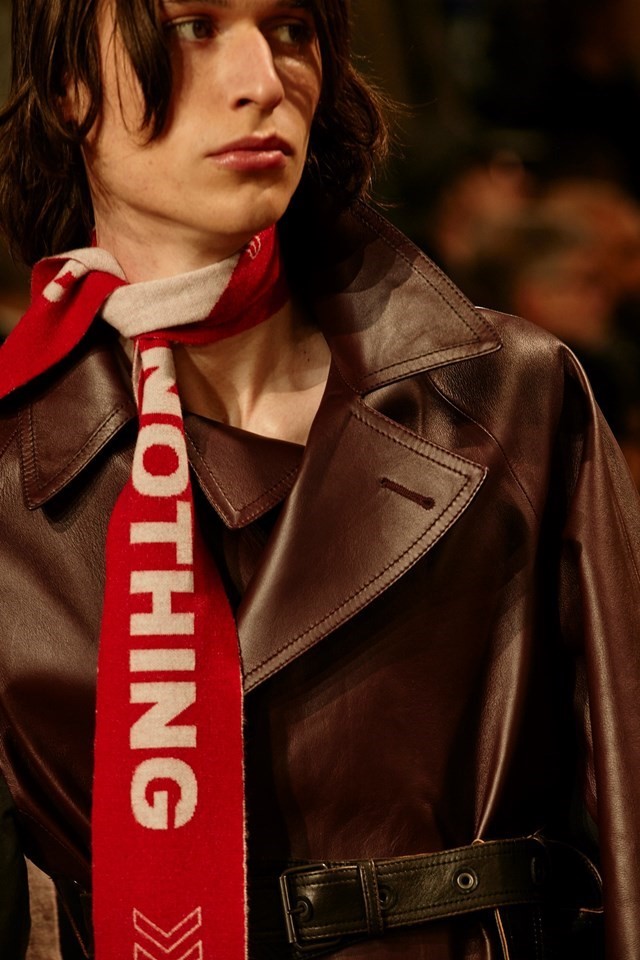

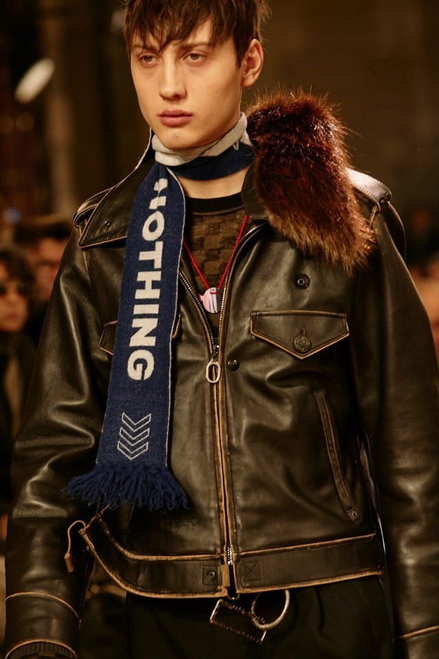
Lanvin
Perhaps the most thought-provoking branding of the season was the one that wasn’t branded at all. Well, it was branded actually – but as ‘Nothing’. Lanvin’s Lucas Ossendrijver flipped the switch on the parade of logos and slogans that dominated the catwalks to emphasise the clever cut, construction and proportion of his highly desirable clothes, which were the kind that would make unique additions to any wardrobe. After all, take away branding and what is left? In theory, it should be something that can stand on its own, recognisable for its innate innovation rather than the letters attached to it. “There is nothing: no meaning, not collaboration, no print, no art, no vintage, no decoration,” he told Luke Leitch for Vogue after the show. The words ‘Future Utopia’ features on some pieces as a kind of message of intent. “I find it a bit worrying that everything has to be normal,” he continued. “I think in fashion we have to go further than that. We have to bring something new. We have to invent things.” This was, ironically, branding with an anti-branding message.