Céline S/S17; Hand-painted paper, mid- to late 20th century, Atelier Claude Vergély, France; Céline S/S17Courtesy Phaidon, copyright 2016 Documentary Designs, Inc. d/b/a The Design Library
Examining the Patterns that Inspired the S/S17 Collections
From Molly Goddard's frou frou frocks to Alessandro Michele's undying love of chintz, we look to Phaidon's new library of patterns to decode the references from the Spring/Summer collections
Lead ImageCéline S/S17; Hand-painted paper, mid- to late 20th century, Atelier Claude Vergély, France; Céline S/S17Courtesy Phaidon, copyright 2016 Documentary Designs, Inc. d/b/a The Design Library
Talk to any designer about their collection after it debuts and you’re likely to hear some iteration of the same words each time: research, archives, inspiration. This doesn’t mean they are unoriginal, but rather indicates that smart designers know the value of looking at the wealth of visual material that has come before them. The best ideas, after all, come from looking to brilliant old ones, and standing upon the shoulders of giants.
Consider this new book from Phaidon, then, a celebration of that philosophy. Patterns: Inside the Design Library is a sourcebook collecting the wealth of patterns and prints in Peter Koepke’s New York archive of the same name, which houses over seven million fabrics sourced from 1750 through to the present day. Arranged alphabetically, the book archives prints from abstract to zig zag, the influence of which can be visibly traced all the way through fashion history and into the designs of S/S17. Case in point: here is a selection from the most recent collections, and their roots in textile history.
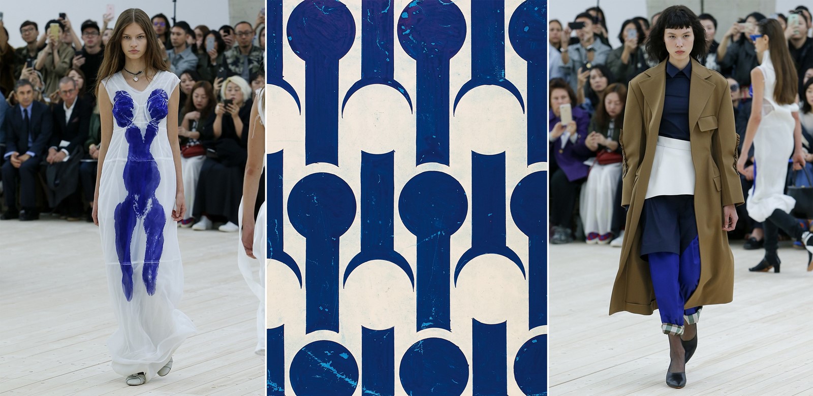
Modernism: Céline (above)
When we picture modernism, it’s the smooth lines of Eileen Gray’s chairs, or the sweeping curves of a Le Corbusier building that first spring to mind, but equally the fine art interpretations manifest in hand-painted prints on paper, or designs influenced by mechanics and geometry. The link between these patterns and Céline’s S/S17 collection is clear, from Phoebe Philo emphatically employing International Klein Blue and the body-painting of Yves Klein to decorate dresses, to the bra tops that bore distinct parallels to fractal patterns. In both cases there’s a clear tendency towards purity of form, a desire for something idealist in shape and execution that is representative of Philo’s own artistry.
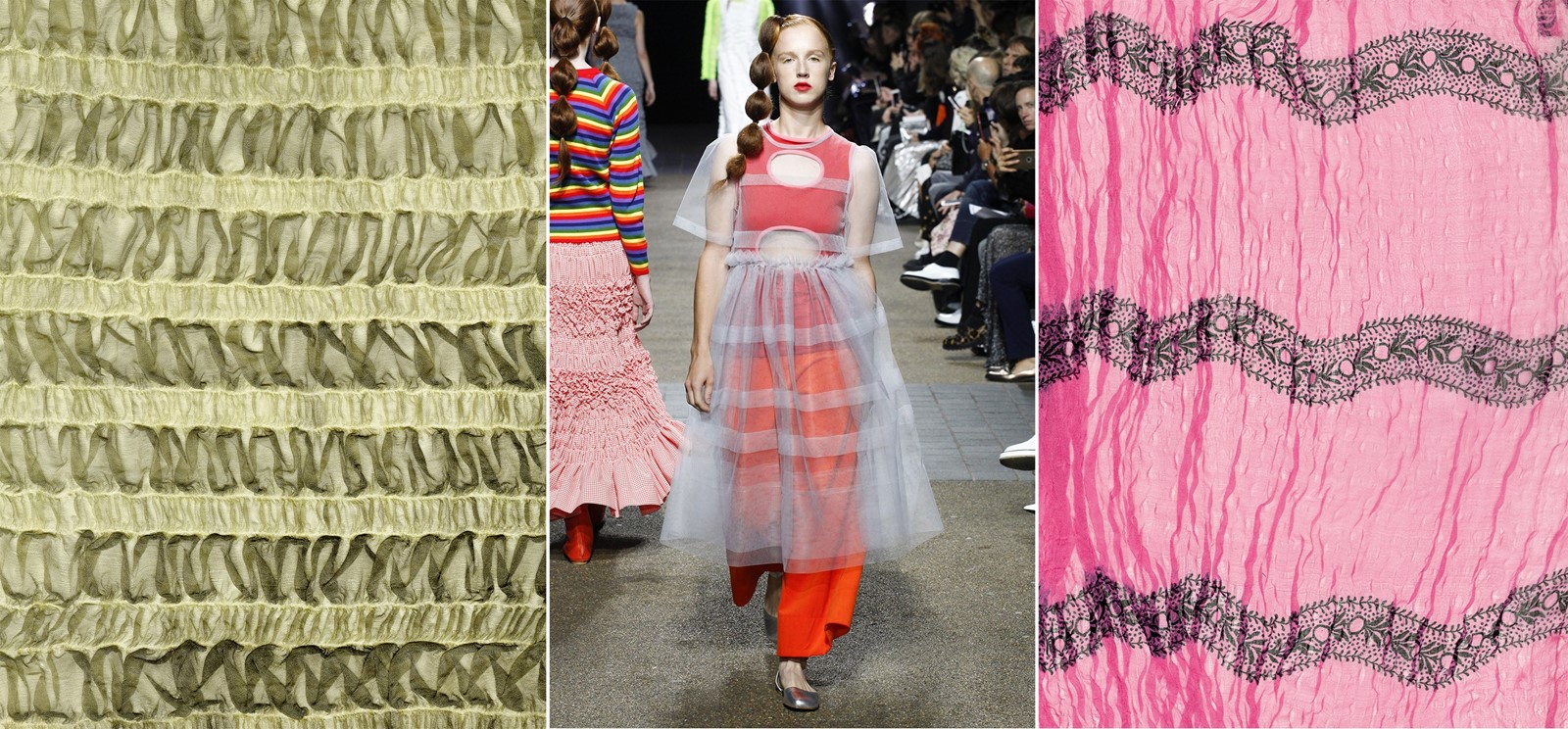
Manipulated fabric, 19th century, France; Molly Goddard S/S17; Printed and manipulated fabric, 19th century, FranceManipulated fabric, 19th century, France; Molly Goddard S/S17; Printed and manipulated fabric, 19th century, France, courtesy Phaidon, copyright 2016 Documentary Designs, Inc. d/b/a The Design Library
Frou Frou: Molly Goddard
With a name that comes from the French term for the sound of a woman’s silk dress swishing as she crosses a room, frou frou represents the manipulation of fabrics into frothy, puckered patterns on the body. Molly Goddard brought this 19th-century invention into play for S/S17 as she often does, with tiers of ruffled tulle that account for her reputation as a purveyor of a modern, girly, but never saccharine aesthetic. Yet it goes deeper, too. Goddard’s 21st-century adaptation of frou frou sees it become a contemporary party fabric: as complex and mesmerising as the woman who wears it.
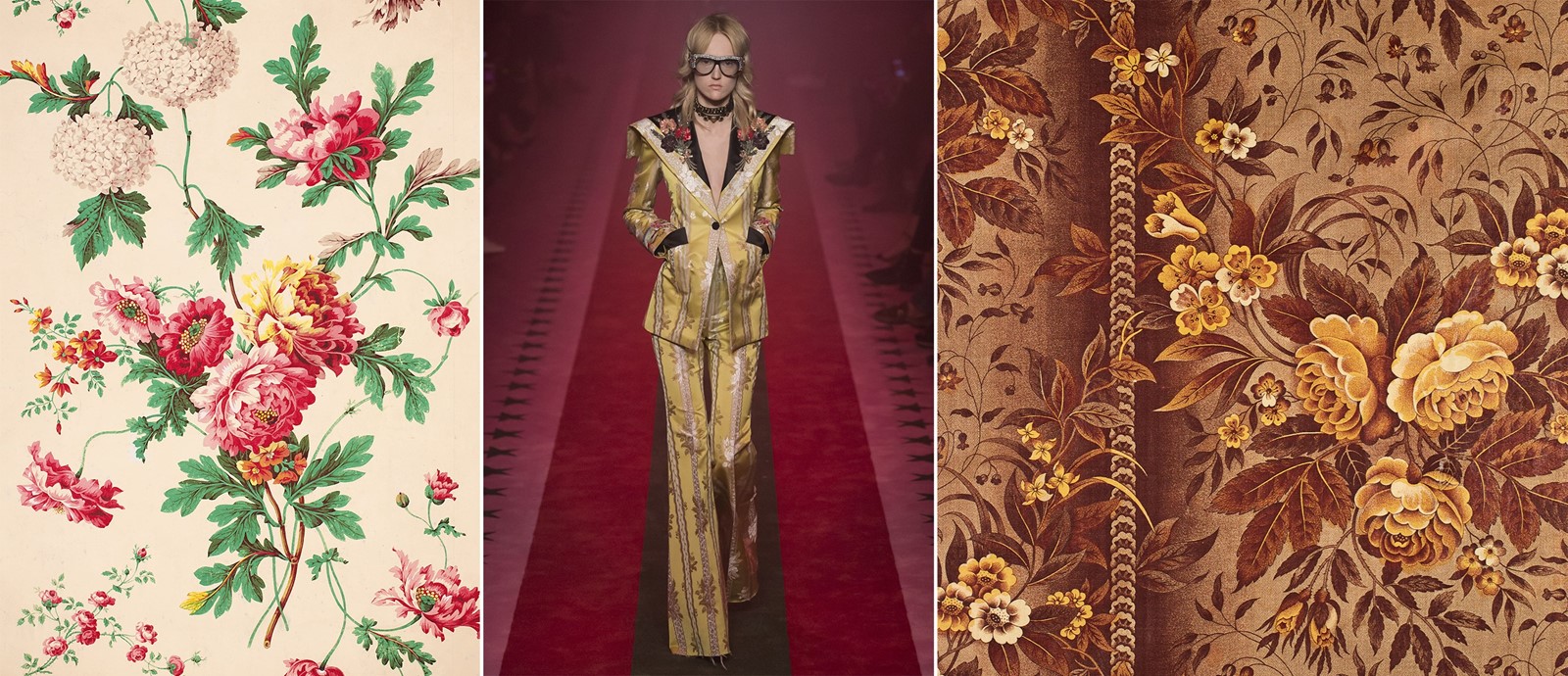
Hand-painted paper, c. 1850, France; Gucci S/S17; printed fabric, early to mid-19th century. France of EnglandHand-painted paper, c. 1850, France; Gucci S/S17; printed fabric, early to mid-19th century. France of England,courtesy Phaidon, copyright 2016 Documentary Designs, Inc. d/b/a The Design Library
Chintz: Gucci
Today’s fashion industry often finds its progression through reiterating aspects of style history, reworking it for a modern audience. Gucci is a prime example of this proclivity, and this season saw Alessandro Michele juxtapose chintz with 1970s disco and a dash of the Renaissance for good measure. Illustrated roses and floral motifs work as shorthand for the past in a collection that moves forward by looking backwards. It takes a lot of talent to render something which has been reworked as endlessly as chintz in a new light, but Michele’s greatest skill in fashion may lie in making us take a second look at what we desire and why we desire it. The result is always covetable.
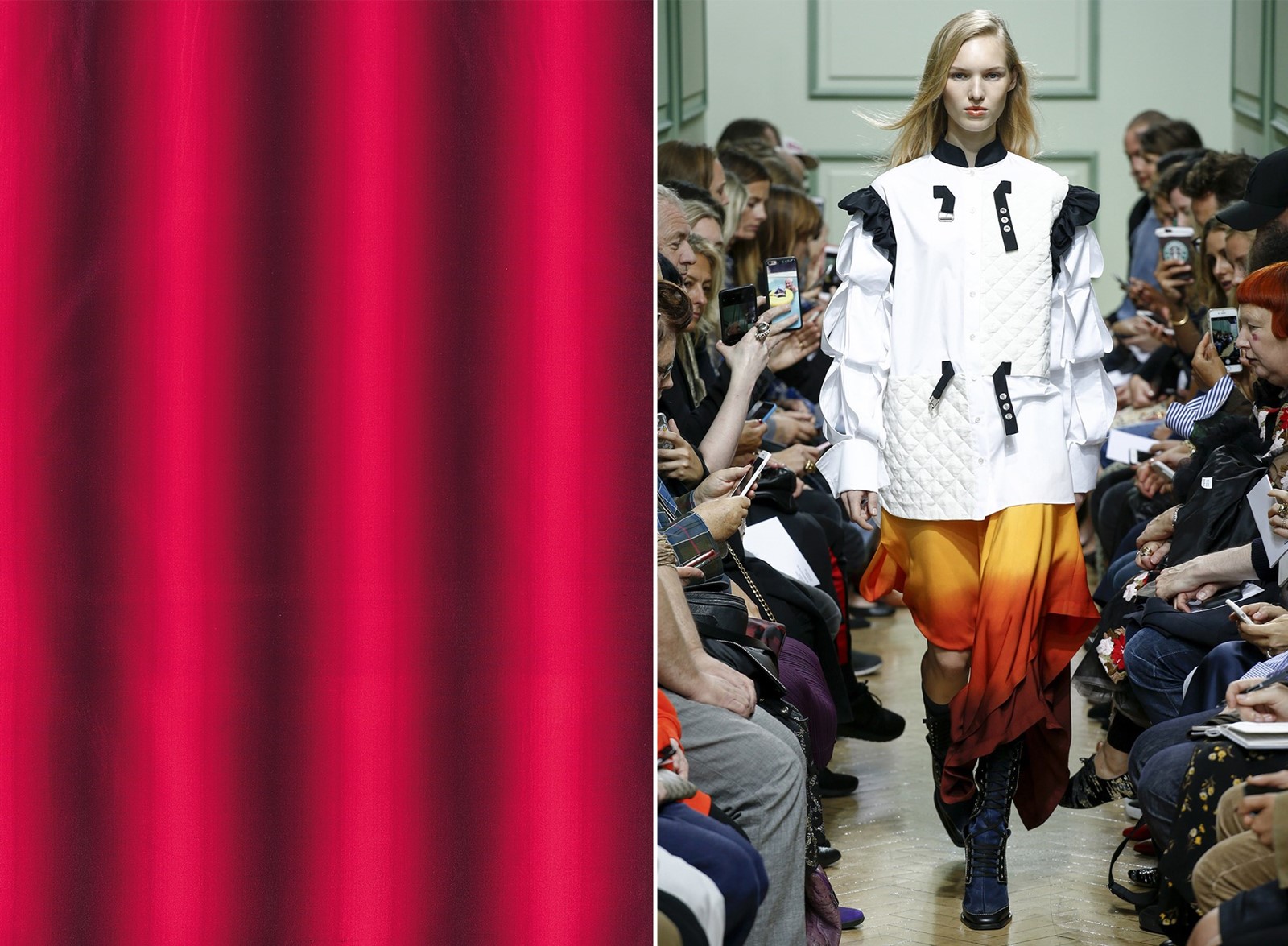
Woven fabric c. 1930, Studio Bianchini-Férier, France; J.S. Anderson S/S17Woven fabric c. 1930, Studio Bianchini-Férier, France; J.S. Anderson S/S17, courtesy Phaidon, copyright 2016 Documentary Designs, Inc. d/b/a The Design Library
Ombré: J.W. Anderson
Ombré, the simple blending of lighter shades into darker ones and vice versa, is a regular stalwart within printed textiles, but rarely has it looked as modern or relevant as it did in J.W. Anderson’s most recent collection. Used often to imply movement, fluidity and grace on a fabric, Anderson’s unexpected colour combinations – light blue into tangerine, ochre into burgundy – subvert the now-ubiquitous value placed on a look’s Instagrammability by creating garments that demand to be seen and experienced in all three dimensions.
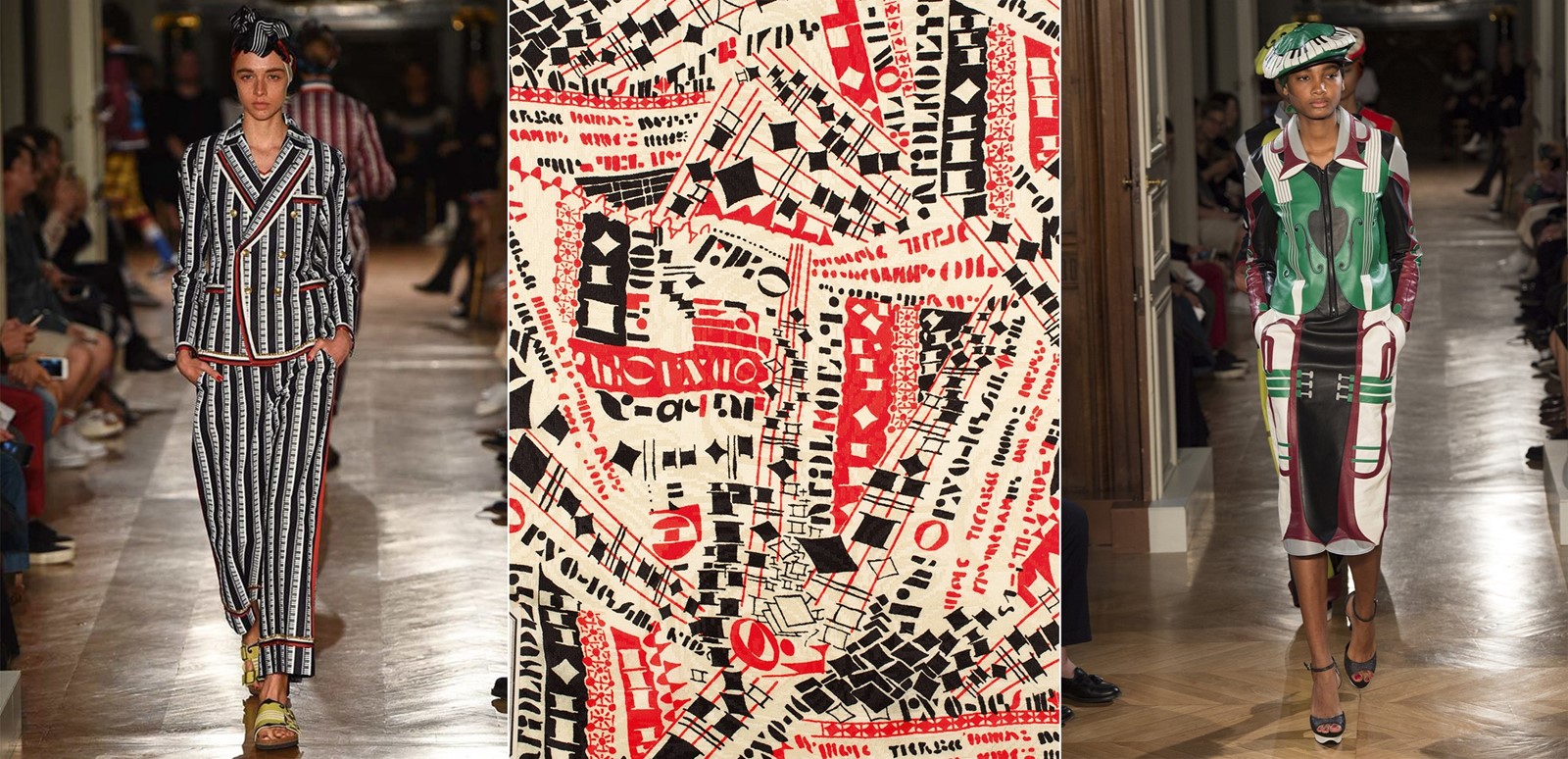
Undercover S/S17; Printed Fabric, 1936, Studio Bianchini-Férier, France; Undercover S/S17Undercover S/S17; Printed Fabric, 1936, Studio Bianchini-Férier, France; Undercover S/S17, courtesy Phaidon, copyright 2016 Documentary Designs, Inc. d/b/a The Design Library
Jazzy: Undercover
Lest we forget, jazz is in essence about adopting structure and pattern so you can twist it, use it for your own boundary-pushing ends. What a perfect point, then, for a fashion designer to alight from. Jun Takahashi worked with his own love of improvisation for Undercover’s S/S17 collection, and the result showed up in black, white and red prints inspired not only by the off-beat rhythms of jazz recordings themselves, but also by the primary colour 1930s-era prints that used the same staccato ideas of abstraction.
Patterns: Inside the Design Library is out now, published by Phaidon. The book will launch on December 15 at the Design Museum.