
Kicking off #WordWeek, we consider five iconic fashion logos
To kick off #WordWeek, our 7-day extravaganza celebrating words, language and typography, we begin with a list of five favourite fashion logos selected by editor Laura Bradley. Today, we will also be partnering with the Design Museum as guest curators of their weekly Font Sunday initiative, focusing on favourite fashion logos. Simply use twitter to share your most-loved designs using the hashtag #fontsunday.
A collection and a campaign change every season, whereas the logo will remain on carrier bags, shop fronts, websites, social media et al, until the designer decides a change is due (example, Hedi Slimane, see below). A lot can be understood by a brand's DNA by a logo from the font, arrangement and pictorial motifs.

1. Céline by Peter Miles (2008)
“I just thought I’d clean it up, make it strong and powerful – a kind of contemporary minimalism.” said Phoebe Philo when she joined the French design house in 2008. The same approach was applied to the logo. The capital letter logo was already in existence but was refined under Philo's direction. “I don’t think I’ve ever worked with anyone so precise and detailed as Phoebe,” said Peter Miles, the New York-based art director designer who developed the new brand identity. “She sees things microscopically. ‘Can you just make the logo two millimeters shorter?’ ‘Can you move it down there by three millimeters?’ I had to change things by the smallest margins... but always for good reason.”
“I just thought I’d clean it up, make it strong and powerful – a kind of contemporary minimalism.” — Phoebe Philo
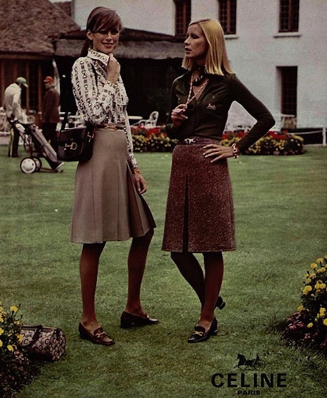
The house of Céline was originally founded in 1945 by husband and wife Richard and Céline Vipiana, which was originally a made-to-measure children's shoe business. The house's first logo was a red elephant created by Raymont Peynet. In 1967, the company opened its first store on the St.-Germain des Prés and the first collection of elegant sportswear for women was launched, as well as the equine Sulky logo, based on an American 19th-century engraving found by Richard Vipiana in the Handbook of Early Advertising Art: Mainly from American Sources. A number of other house's have also featured horses in versions of their logos including Hermès, Coach and Longchamp. In 1973, the ‘Blazon Chaine’ logo debuted, consisting of two skinny Cs separated by an intricate design in the middle. Vipiana found her inspiration in the lowly chains which encircle the Arc de Triomphe. It usilises the same back-to-back Cs approach as the Chanel logo. The elephant, the horse and the two Cs are no longer in use.

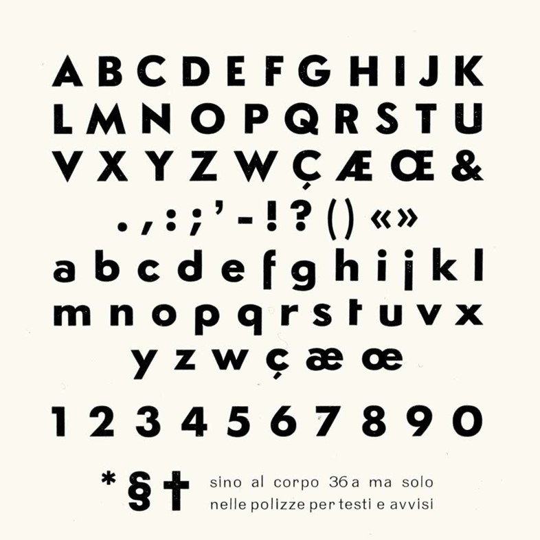
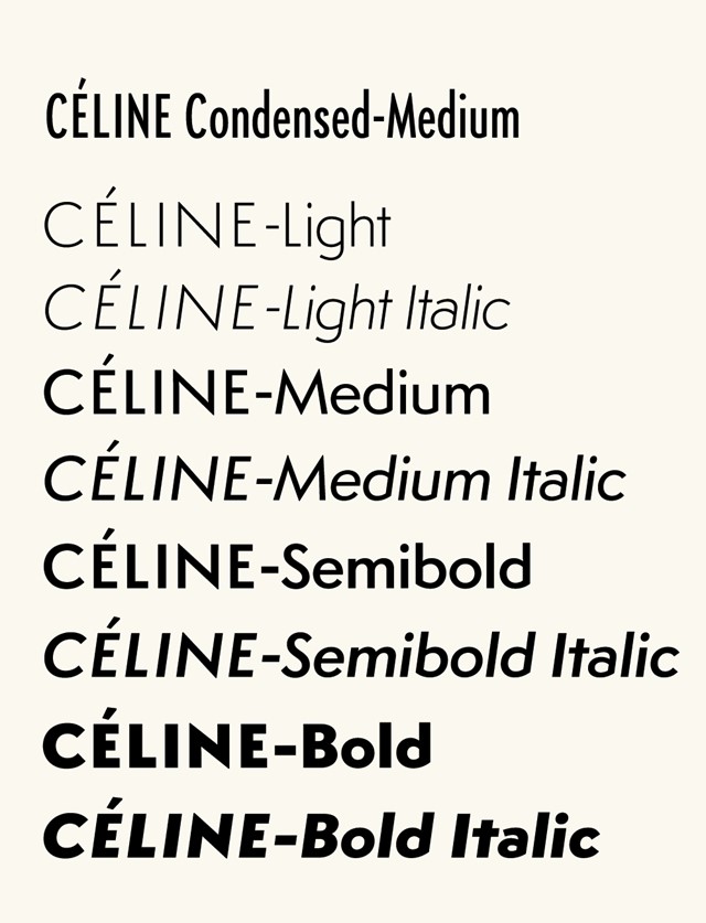
In 2005, typographic designer Hannes Famira was commissioned by Peter Miles to create a custom typeface for the corporate design of Céline. It is based on a typeface called Semplicità (1931), created for the Fonderia Nebiolo by Italian type designer Alessandro Butti, the head of the foundry’s Studio Artistico. "Following an initial conversation, Peter sent me a number of scans of the original metal type specimens pages", explains Famira. "While the resolution was great for the entire specimens page, when zoomed in to the individual character it turned out to be quite course for the intended purpose. I quickly realised how fortunate I was that there were no higher resolution scans available as this provided me with some considerable room for interpretation. After all, the translation from the original to the revival is where the fun lies. The weights of the styles of Semplicità went from quite light to very heavy causing thick-thin contrast issues for the interpolated instances. So I decided to make visual corrections in the Semibold style and re-insert it as an in-between master. The third leg delivered an interpolation with the desired, subtle transitions of weight and contrast between Light and Bold."


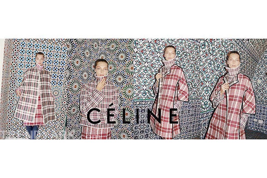
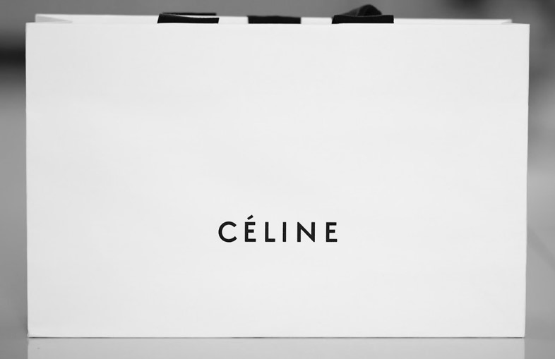
In 2009, Peter Miles continued work on the logo under the direction of Philo. "So far so simple, but then come the details", reported The New York Times in a profile on Miles. "Céline appears in what Mr Miles calls “a left in the sun black” on creamy white with splashes of dark red detailing. Rather than emboss the logo onto the packaging as other brands tend to, he has debossed – or carved – it into the surface, to create subtle shadows."
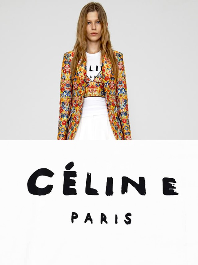
A T-shirt featuring a handdrawn version of the "CÉLINE PARIS" logo featured in Philo's Resort 2012 collection and was later worn by Rihanna. Countless counterfeit versions are now widely available.


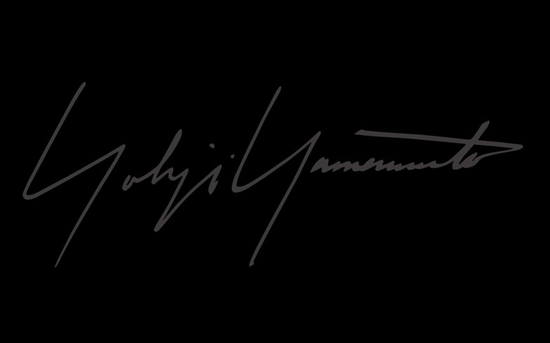
2. Yohji Yamamoto by Yohji Yamamoto (1988)
Yamamoto’s signature handwritten scrawl was designed in 1988 by Sir Yohji himself. Originally drawn in chalk, it marked the opening of Aoyama Stores, his first boutique in Tokyo. With its monochromatic colour palette, oversized capital Ys, stylistic slant and exaggerated line slicing through the T, the logo symbolises Yamamoto’s elegant, sculptural tailoring and Japanese noir aesthetic. It is also very personal: an intimate gesture from playfully conceptual designer.


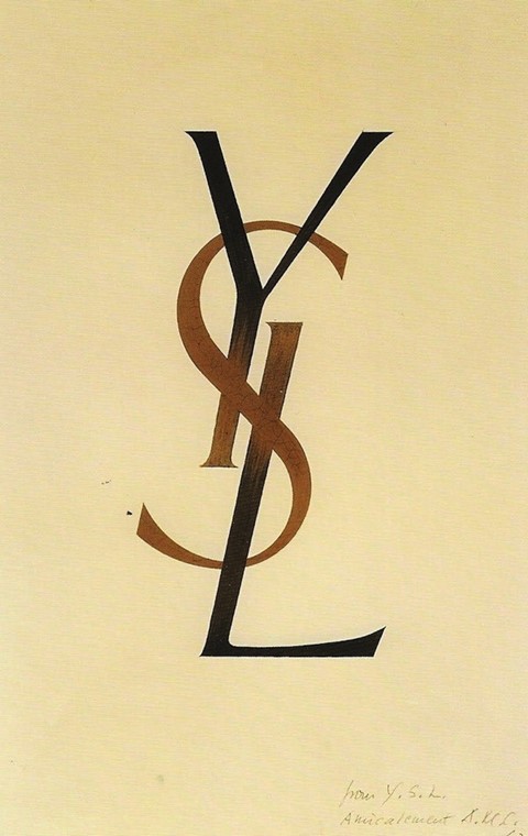
3. Yves Saint Laurent by Adolphe Mouron Cassandre (1961)
Ukrainian-French painter, commercial poster artist, and typeface designer, Adolphe Mouron Cassandre designed the iconic "YSL" logo in December 1961, whilst Yves was at the helm. Born in 1901, Cassandre was heavily influenced by cubism and surrealism and designed a number of bold typefaces including the Bifur in 1929, the sans serif, Acier Noir in 1935, and an all purpose font called Peigot in 1937 as well as striking posters and covers for Harper's Bazaar. He fought in the French army against the Germans in World War II and worked as a painter and costume and set designer for theatre until his suicide in Paris in 1968.
"Cassandra's logo, which makes use of Yves' three initials in a vertical arrangement, has been central to the French design house for over four decades"
Cassandra's logo, which makes use of Yves' three initials in a vertical arrangement, has been central to the French design house for over four decades, usually executed in striking black or gold. The logo is particularly symbolic of Stefano Pilati's reign at the house, appearing as a focus point in countless advertsing campaigns (Kate Moss peering through a window and Claudia Schiffer leant against a YSL sign in the Hollywood Hills) and in his clothing and accessory designs. Following the appointment of Hedi Slimane in March 2012, it was announced that his tenure would be marked with a name and logo change for ready-to-wear: Saint Laurent Paris (referred to as "Saint Laurent") which will be used alongside the Cassandre logo. In 1966, the house, then producing solely haute couture debuted ready-to-wear under the name "Saint Laurent Rive Gauche" with a logo featuring orange and pink squares, designed by Yves in collaboration with perfume designer Pierre Dinand; Slimane plans to leverage some of the fonts and nomenclature of that era.

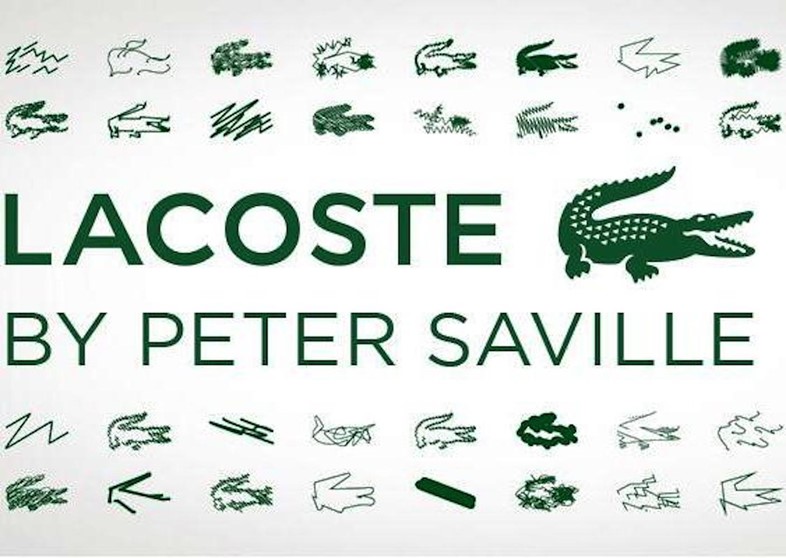
4. Lacoste by Peter Saville (2013)
Founded in 1933, Lacoste utilises a green crocodile logo. René Lacoste, the company's co-founder, was nicknamed "the Crocodile" by fans because of his tenacity on the tennis court. Although the company claims this as the first example of a brand name appearing on the outside of an article of clothing, the "Jantzen girl" logo appeared on the outside of Jantzen Knitting Mills' swimsuits as early as 1921. In 2003, a long-standing dispute was settled over Lacoste’s logo with Hong Kong-based sportswear company Crocodile Garments. At the time, Lacoste used a crocodile logo that faced right (registered in France in 1933) while Crocodile used one that faced left (registered in various Asian countries in the 1940s and 1950s). Lacoste tried to block an application from Crocodile to register its logo in China during the 1990s, the dispute ending in a settlement. As part of the agreement, Crocodile agreed to change its logo, which now sports scalier skin, bigger eyes and a tail that rises vertically.
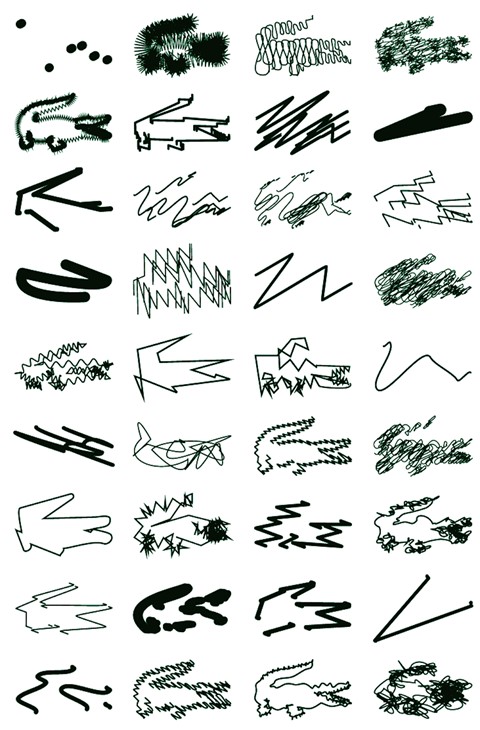
In 2013, acclaimed graphic designer Peter Saville was enlisted to create a new logo for Lacoste’s 80th anniversary and to reinterpret its famous crocodile logo for a range of special edition polo shirts. He created a string of squiggly, spiky and minimal iterations of the reptile. The logo was kept to roughly the same size and shape, though some designs are more abstract than others.


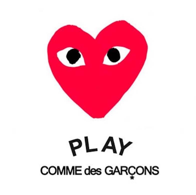
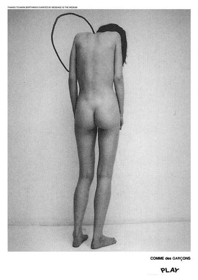
5. COMME des GARÇONS PLAY by Filip Pagowski (2002)
The PLAY line launched in 2002 described by the label as "a sign, a symbol, a feeling". The now-iconic logo was designed by artist Polish artist Filip Pagowski, who first contacted Rei Kawakubo in the 1980s with pictures of a performance/fashion show. He subsequently attended a number of men's shows and was cast for the summer 1992 show. "The heart image happened simultaneously with, but independently of the creation of the PLAY line. It’s as if [Rei Kawakubo and I] were affected subliminally by each other’s work," explained Pagowski. "I remember working on something... not connected to anything. I got this idea of a red heart with a set of eyes. I drew it instantaneously and the first draft was it. I submitted it for another CdG project, for which it never made it, but eventually it resurfaced; making bigger waves as a logo for the PLAY line."
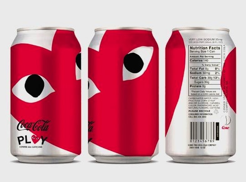
The logo utilises capital letters. The original COMME des GARÇONS logo appears in a vertical line; here, in the PLAY guise, it sits under a curved PLAY which feels more fun. The logo has appeared on various products since its launch – from the iconic T-shirts and jumpers to fragrances and Coca-Cola cans. More than any other logo, the design has the strength to make its wearer feel they are part of a brilliant club.


This week AnOther is celebrating #WordWeek, in collaboration with the Design Museum. Words & Fashion: Alexander Fury, Gareth Hague & Caroline Murray in conversation with Laura Bradley, takes place at the Design Museum on Tuesday July 28. Tickets are on sale now.
Text by Laura Bradley