
The costume designer reveals how she helped fabricate The Holdovers’ sensitive and encompassing visual language
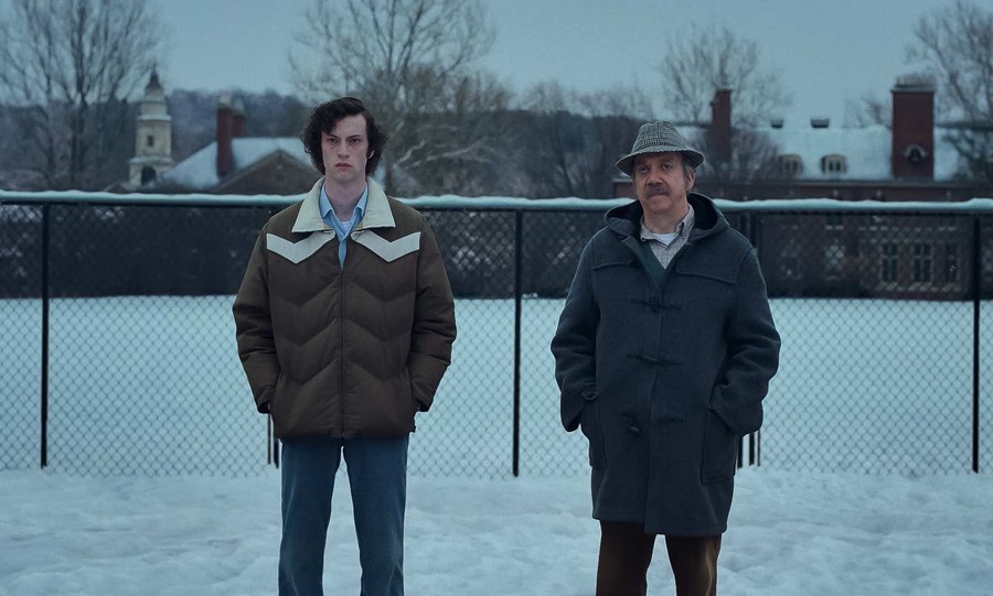
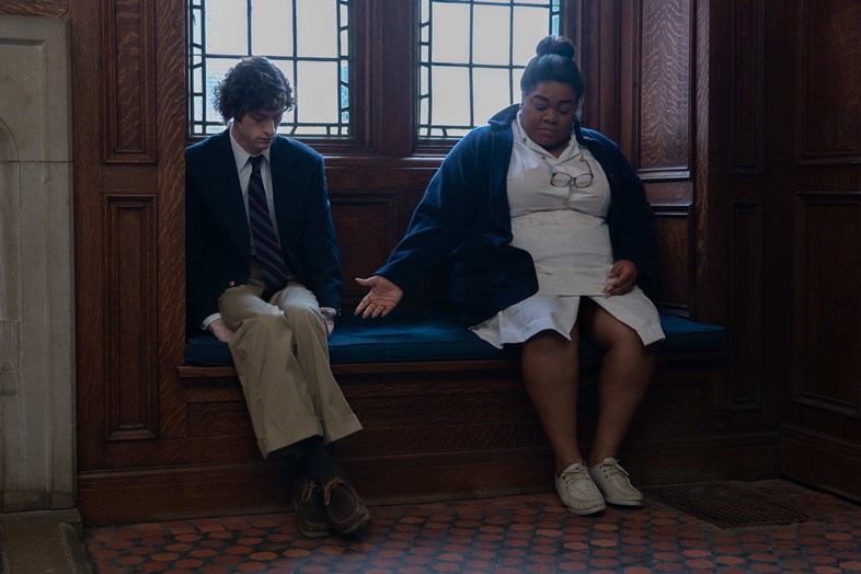
Seaming together the narrative turns of The Holdovers, a redemptive tale which unfurls against the cold-hearted backdrop of an elite New England boarding school, is costume designer Wendy Chuck’s magnificent tweed-heavy outfitting. Through her precision, each costume not only appeases the marooned (in both tone and location) early 1970s setting, but also allows the viewer to gently bear witness to the characters’ prickled stories.
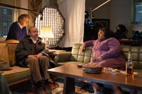
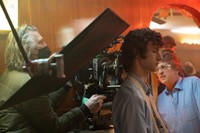
Chuck and The Holdovers’ director Alexander Payne have worked together now on eight films, an ongoing relationship that allows Chuck to swiftly understand the quirks and specificities of his vision. “We had one day, two days before we started shooting, to do all of the fittings,” the costume designer laughs, “so to get all these guys fitted and in character in one day was nothing short of a miracle.”
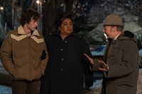

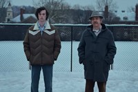
Additionally, as the film unfolds within a tight two-week frame, Chuck had to ensure that each character fully inhabited every detail of their costume. “You don’t want to keep introducing new things,” she explains, “when something is so character-driven, you kind of get an iconic look and stick with it.” Coats, in particular, came to carry great significance, protecting not only against frigid north-eastern American winters but also swaddling each character’s hurt and sadness.
Below, AnOther caught up with Wendy Chuck to discuss how she came to fabricate The Holdovers’ sensitive and encompassing visual language through her costume design.
Madeleine Rothery: What was the starting point for developing your visual language?
Wendy Chuck: We started with general references of late 60s clothes, and then narrowed it into the academic world, which is a little more specific and less fashion-forward. Then we narrowed it into more character-driven references. My assistant and I started making photo files of every character and we’d just dump things into there. When I would meet with Alexander [Payne], I’d show him, and we’d start eliminating or formulating. For Paul, he came in with the reference of “Mr McAllister in [the film] Election” but 30 years on. Different environment, but that same kind of sad sack-ness about him.
We went to Western Costume in Los Angeles, where I’m based, and just started pulling a bunch of vintage rentals from the stacks there. I put together a Paul Hunnam look, which is all very dishevelled. [Alexander] also gave me the look of corduroy but really worn in, with elbow pads and kind of busted-out knees. And it’s all to look really old, like he’s had it forever.
MR: Did anything change when you then met Paul Giamatti?
WC: We didn’t have a lot of time to be able to change things. Paul [Giamatti] is such a collaborator so I’d spoken to him before. And David Hemingson, the writer, had attended the schools so he had reference to a company in New York called J Press where he knew that all his teachers had sourced their clothes. And they are still in existence – they still have the three-piece corduroy suits. So, we were able to go there and get in his head. That’s where Paul’s Christmas party suit comes from … J Press is still very much a walk-in and walk-out, like with a professorial look kind of shop.

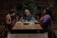
MR: There’s a coherency among each character’s costume yet there are tonal differences which really materialises the underlying narrative tension – each has their own tragedies, but they are ultimately cut from the same cloth. How did you develop each colour palette?
WC: I don’t know I did it so consciously. Everything happened so fast, and the fittings of the boys were all in one day … But I knew that I was going to put Mary [Lamb] in blue and red colours. Just this morning, I found some old emails that Alexander had sent me in reference to colour and the Virgin Mary. The red and blue are the colours of the Virgin Mary; together they make purple. Paul’s [palette] was kind of dull and grey like a mouse. And Angus had more greens and blues. But they weren’t bright, and they weren’t outside of the palette of the late 60s. But I think there was enough definition for them to be individual and cut from the same cloth as you said.
MR: Were there any challenges in dressing modern body types in vintage silhouettes?
WC: That period was a crossover – we still had the stovepipe [pants] of the 60s, some slight bootcut, and then some wider flares. But they were so high-waisted and modern bodies can’t really wear them. I really do think bodies were shaped differently then. What I’ve learnt – and I’ve said this a few times now – is that fast food wasn’t around at that time. So, especially in the US where it’s so abundant now, and we have an obesity problem, bodies are different. And also, shoe sizes – feet weren’t as big or as wide then … So, you know, there’s the challenge for a designer who wants to use vintage but has to fit a modern body!
The Holdovers is out in UK cinemas now.