
To mark the home entertainment release of Woody Allen’s Cafe Society, the film's three time Oscar-winning cinematographer shares the secrets of his art
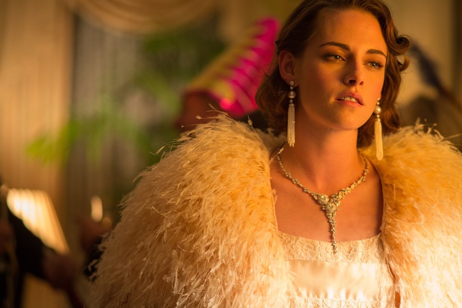
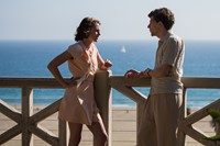
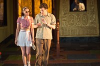
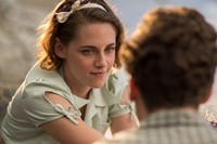
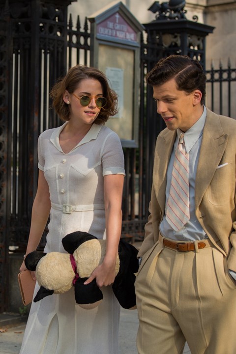
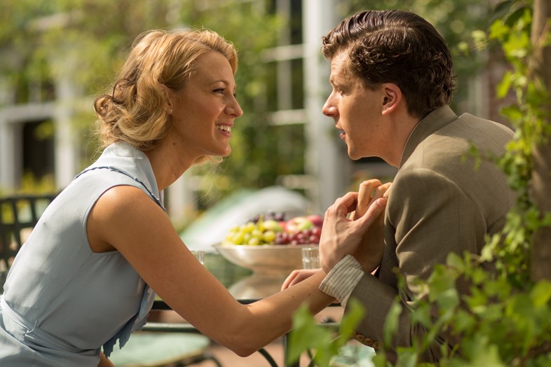
Vittorio Storaro is one of the world’s greatest living cinematographers; the man whose camerawork gave birth to the extraordinary visual worlds of such masterpieces as Apocalypse Now, Reds and The Last Emperor – all of which saw him win Academy Awards. Over the course of his esteemed career he has worked with everyone from Dario Argento to Warren Beatty, and most recently Woody Allen, for the director’s latest feature Café Society – a collaboration that marked the first digital filming experience for both movie veterans. The film tells the story of Bobby Dorfman (Jesse Eisenberg), a young Jewish New Yorker of humble origins and great expectations. Enticed by the bright lights of Hollywood, where his uncle Phil is making a fortune in the movie business, Bobby leaves the cosy squalour of his family home in the Bronx and heads west in search of a new life. His uncle provides Bobby with both a job, and unwittingly, the love of his life, in the form of Vonnie, Phil’s beautiful secretary, played by Kristen Stewart. But all is not as it seems, and soon Bobby’s good fortune falters, forcing him to return to New York and begin all over again – all the while pining for Vonnie with a Brief Encounter-like passion.
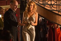
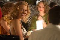
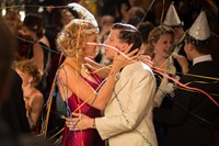
Café Society is Storaro’s 60th feature but sees the cinematographer on fighting form, taking viewers on a visual rollercoaster ride as we career from the drab world of 1930s New York to the dazzling sphere of Golden Era Hollywood. When we speak on the phone, Storaro is in New York himself, working on Allen’s latest (as of yet untitled) project, and his enthusiasm and ongoing passion for his work is both unwavering and infectious. “I’ll confess something very private,” he says in a hushed voice, “the day before yesterday we did a screen test for the new film, with the actors in make-up and costume, and it was so emotional. This is my 61st film and it felt like it was my first!” Pre-production is integral to his practice, he explains, and as a result he has been in the city for seven weeks ahead of shooting to prepare, study, research and conduct technical tests. “I love it,” he enthuses. “But no matter how much I’ve prepared, I’m never sure whether my arrival will be as I’ve imagined it, because during the journey, you discover so many new elements. It is wonderful; I am 76 and I feel like a student all the time.” Here, to mark Café Society’s home entertainment release, we sit down with the Roman visionary to discover some of the secrets of his art, the visual concept behind Apocalypse Now and the myriad meanings of colour.

On his visual inspirations for Café Society...
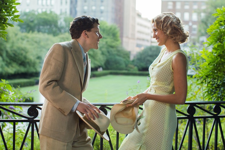
“I recognised straight away that the story was wonderful, because one part of the picture is set in the Bronx in New York in 1935, and the other part is set in Hollywood in mostly the same period, and I thought that I could do something interesting to visualise the two different moods in those cities. For New York, I started with the photographers making a big impact at the time – Margaret Bourke-White, Edward Steichen, Alfred Stieglitz – and then at the paintings of Georgia O’Keeffe and Ben Shahn, to give me a feeling for this era in visual art. This conjured up a vision of the Bronx that was very low in tonality, with a lot of penombre and a specific style and rhythm for the camera. I was trying to consider a family living in the poorest atmosphere in one city and then to put that in relationship to the main character’s move to another world completely.

“So in Hollywood, there’s a new vision that moves away from the wintery, lunar look to a solar one in the summer time. German Expressionism was really important at that time. It affected theatre, music and photography – suddenly there was incredible conflict between light and shadow to create drama. It also influenced cinema a lot, particularly in the United States where a lot of German directors had arrived and were using their own style. So for the Hollywood scenes I looked at the paintings of Otto Dix, who had this incredible influence in terms of perspective and colour. I think that the relationship between these two different elements, these two different artistic periods, two different geographic positions, two different moments in the life of the character makes the story much more appealing for an audience in an emotional sense.
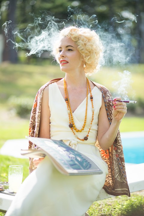
“Then when Bobby goes back to New York, one level that Woody Allen was really interested in introducing was this café society, where people had just started to go to restaurants, to nightclubs and so on, so the vision of New York is completely different from that at the beginning of the picture. So then I was looking at the paintings of Tamara de Lempicka – all these beautiful men in great tuxedos and women with glamorous dresses on. Finally when Jesse’s character goes back to Los Angeles to meet Vonnie, the lighting of Edward Hopper came to me. The sense of sun, the sense of daylight – the very strong visualisation of light. Without doubt, we as cinematographers are the result of all the visual art that has been made before us. Not only in painting, but also in photography and cinema of course, and we are carrying with us all this history and knowledge in order to try and reinterpret it in relation to specific stories.”

On how his nationality affects his work...
“Being Italian is in your bones. Our religion is Catholic, so my mother and my father took me to a church to be baptised and of course I don't have a memory but in front of me there was probably a painting – perhaps by Pinturicchio, I don’t know! – as well as specific architecture, sculptures and maybe music. Then when I went to elementary school, and they gave us our little book, maybe on the front page was an image by Giotto and on the back page one by Raffaello. Then while I was walking in Rome, I saw the ancient ruins of Roman history next to a church in Baroque style and another in the Romanesque and another the Renaissance style. When you start your life like that it stays with you, without any doubt; it's something you can't avoid.”


On the importance of symbolism…
“When you go to the Vatican on a Sunday and the Pope appears from his window, you notice that Lorenzo Bernini’s architecture is designed with this very specific symbology, because their are two circular colonnades and all the people stand in the middle so when the Pope looks down and sees them, it is like they are being embraced by two arms – symbolic of the church and of the Pope. All the time artists use symbols to create an emotion. The language of cinema is images and those images are mainly made up of light and colour and the way you mix them can influence your body, not only your eyes but your entire body. It's been scientifically proven that in the presence of strong light, our metabolism, our blood pressure increases so in penombre, at the end of the day, our blood pressure goes down. So when images create a harmony or conflict of light or of different colours it makes an impact to us. Whether we looking at something in reality, or looking at a painting or watching a film, those factors have an influence on us and are able to trigger different emotions.
I’ve spent more than 30 years studying the philosophy behind the visualisation of images all around the world and I wrote trilogy of books called Writing With Light in order to understand what I was doing, because at film and photography school I was trained in black and white so my principal focus was light. But after Apocalypse Now – I stopped working for a year, closed myself into my house and I tried to understand what was inside the light; to discover the symbology, the dermatology, the physiology of colour and how to use it conceptually to convey the appropriate emotions of a story.”

On the theory and meaning of light and colours...
“In any profession, we are trying to understand who we are, we are trying to answer our own questions and understand through our vocation, the meaning of our life. My main aim is to find a balance between the different visual elements – the different colours, different lights and so on – and to understand how to use those concepts to better understand who I am and the world around me. We change throughout life – at different stages we have different temperaments, we feel different emotions – and light can be a metaphor for life with colours symbolising different moments.
Red is the first colour in the spectrum according Isaac Newton and it is the colour of birth, the colour of life. Orange – when we are between three and ten years old – is the moment when we need the warm feeling of family around us. Yellow is the colour of consciousness. When you are around 12 years old you understand the kind of society into which you are born, the kind of person you are – so I use yellow when the emperor is crowned in the movie, for example. Green is the colour of knowledge – around 20 years old let’s say. Blue is the colour of freedom, the colour of the most important moment between 30 and 50 years old; it’s the colour of our following own intentions. Later there is violet, which is the colour I am living now I think – I am 76. It’s the moment when you transfer your knowledge to a new generation. I was teaching for ten years at the Academy of Image, about all my research and I was very happy to be doing that. Then finally there’s white – the colour of maturity; the colour of the white light; the unity of the different stages as you reach the end.”
Café Society is available on DVD and Blu-ray from December 26.