
We analyse the cultural significance of the contentious colour through fashion, architecture, art and film
From the colour-coded baby blankets of the maternity wing to a girl’s first dabblings with lipstick and nail polish, pink is a colour that carries emotional baggage. Its cultural permeance through Barbie dolls and ballet lessons has left it with powerfully loaded perceptions: preconceived ideas of gender, sex, sensitivity and personality infuse its shades, from the palest baby pink to the zap of Elsa Schiaparelli’s shocking magenta. But remember that it’s mutable, too. One 1918 trade journal states that at the time, pink was preferred for baby boys rather than girls. It explains: “Pink, being a more decided and stronger color, is more suitable for the boy, while blue, which is more delicate and dainty, is prettier for the girl.” Seemingly, it was only later that society’s views on this colour became a little more hardwired.
So instead of being fixed, pink is rife for exploitation and subversion, and in recent years it has often been used by female artists and designers as a way of dismantling the very assumptions that accompany it. Consider this pink as the interloper: the Pepto-Bismol shade – deeper than cherry blossom and more chemical than petrol station carnations – that can’t be defined as only sweet and saccharine. In fact, having looked closer at its use and purpose over the years, it seems something far more subversive is going on...
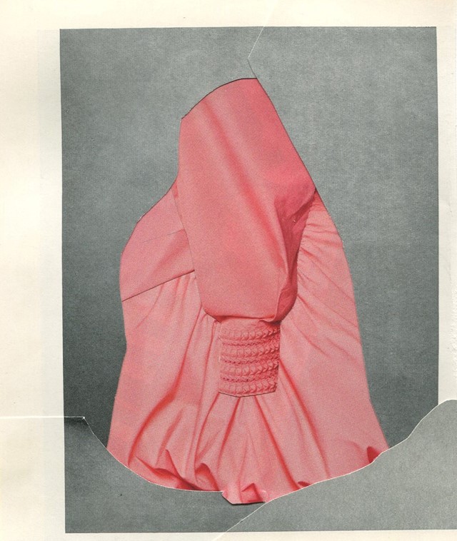
In Fashion
In clothing, pink holds an undeniable charm. Evidence of its versatility is best seen in how endless permutations of it can fill runways, and how its apparent 'return' is heralded by the press every year or two. In reality, pink never fully goes away, but lately a particular mood has given it a new significance in fashion. Alessandro Michele’s Gucci subverts expectations of gender and newness, creating a vision of 1970s urban bohemia that calls upon a spectrum of pinks. From salmon through to fuchsia, Michele's pink has a sinister, knowing edge to it, eluding status as merely a cheerful neutral to be mixed with blue denim and heather grey. Today’s woman wears pink, knowing well that it communicates so much more than just girlish charm and ballet lessons. See Mansur Gavriel’s supple, putty-coloured handbags and suede mules, Dries Van Noten’s tactile, printed separates or Fendi’s punchy leather playsuit: pink has the power to create an underlying tension.

In Art
Photographer Richard Mosse’s 2013 series The Enclave uses Kodak Aerochrome film to flood scenes of conflict in the Congo with vivid pink. In doing so, he transcends the categories of photojournalism and art to create something sublime. The resulting images mesmerise, disturbing in their depiction of violence and the landscape. The unexpected nature of Mosse’s pink then underscores this animosity in the images themselves.
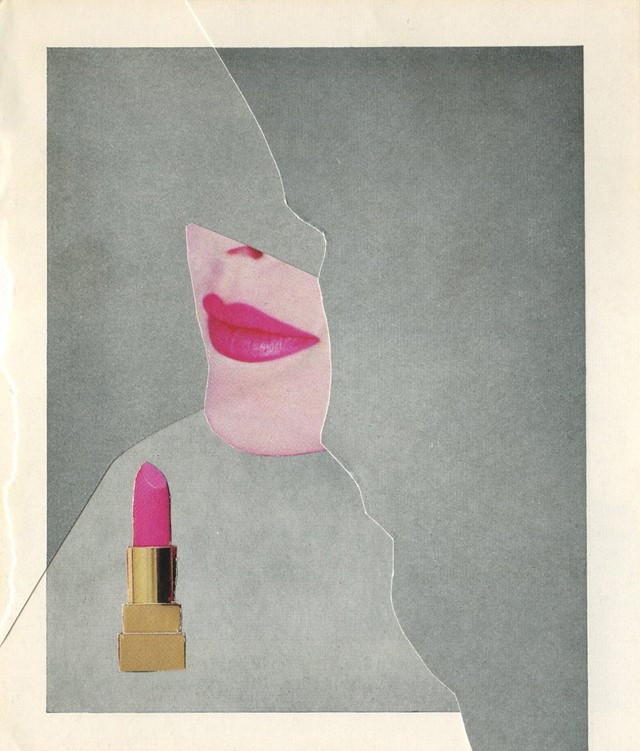
On the cover art for The Velvet Underground & Nico, Andy Warhol enjoyed the colour’s titillating properties, employing it as a flesh-like shade revealed once the banana’s yellow skin is peeled back. With its connotations of caucasian naked flesh, notions of sex are rarely far from the mind. But it’s too simple to relegate bright bubblegum pink only to the categories of sex, femininity or softness, as net artists like Arvida Bystrom and Mayan Toledano have highlighted in their photographic exploration of the colour on Tumblr and Instagram. Today in social media, pop-bright pink takes on a life of its own, and has never looked as bold as it does on Instagram, where it serves as the backdrop for desert plants on the popular crowdsourced account @plantsonpink.


In Architecture
Pink can also cause a stir in an urban environment, particularly as it is much more common with flowers and sunrises than on concrete streets and in buildings. Julian Schnabel’s Palazzo Chupi, a mock-Italian palazzo he built atop a Greenwich Village factory in 2008, is painted a vivid, rosy coral. Housing a series of luxury condominiums, the building sticks out like a sore thumb (itself another pink appendage), but once you see it from the street, blushing pink against glass towers and brick townhouses, it’s obvious that the artist’s indulgent architectural dream could never have been another colour.

On Film
David Lynch’s Twin Peaks uses the colour to illuminate the corridors and bathrooms of the local high school. In an empty bathroom lit eerily with the colour, Audrey Horne and Donna Hayward smoke cigarettes and reapply their lipstick in the wake of Laura Palmer’s brutal murder. While we can’t see the source of the light, its presence is palpable, and contributes to the sense of dissociation that prevails throughout the whole series.
Elsewhere in cinema, pink’s usage might not necessarily carry such great weight. It’s long been a stylistic calling card of Wes Anderson, whose Grand Budapest Hotel is painted a light, bright pink, tiered like a wedding cake in amongst the mountains. It’s a similar sugary shade as that of the Futura font in the title cards of The Royal Tenenbaums, and of Margot Tenenbaum’s bathroom princess phone. Each time it conveys whimsy and personality along with something slightly indulgent or decadent – like the cherry blossoms trees in full bloom, a poignant whiff of something beautiful that hits on a spring day.