
We talk to the designer behind AnOther Magazine's brand new look
AnOther Magazine has a brand new look for S/S15 – a new logo, art direction and design aesthetic, all courtesy of our new creative director, Laura Genninger and her team at Studio 191. To celebrate the refreshed magazine, we spoke to Genninger about her inspirations for the issue, her favourite fonts, and those perfect objects that she wishes she'd designed.
On starting out in design and art direction...
I was designing since I can remember. I was always making books, art and fashion zines at a very early age. As a young student my school reports were in magazine format. I probably officially started an art direction career at Pipeline, the university newspaper while studying art history. From there I went on to receive a BFA in Graphic design from RISD with a scholarship and grant to work in The Netherlands. I was invited back to New York to redesign Art & Auction and Interview magazine with Tibor Kalman at M&Co, then Details and Mademoiselle at Condé Nast for a short time in the early 90s.

On what informed the new AnOther...
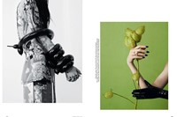
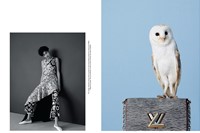
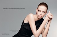
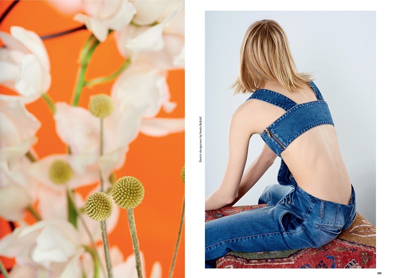
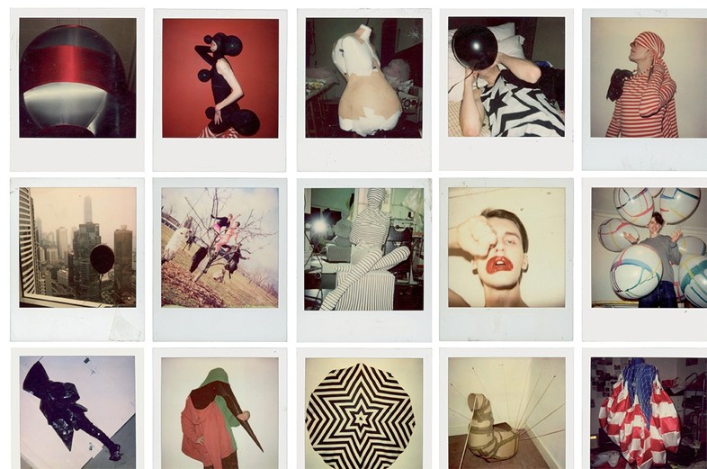
Fashion and portrait photography – We built a grid that responds to photography formats and classic photo proportions.
A meaningful relationship – We wanted to excite a new relationship between AnOther’s print partner Another Man.
The present, past and future of information – I am interested in how we read and see photography over so many platforms and mediums today – the new ways we take in information and look at images, the reposition of fashion images, how this influences editorial design and vice versa, while keeping the typography and image relationship elevated. I hope to be responsive yet respectful to a writer's message, and to a photographer and stylist’s vision.
Women – I am informed and inspired by all the women I work with at AnOther. I feel this issue is transitory and look forward to working with Jefferson Hack and the team to continue the evolution.

On the magazines that were her inspirations starting out...
I loved magazines and there were many. I grew up looking at Harpers Bazaar and Vogue (the Diana Vreeland years), Life (late 60s-70s), Abitare, Seventeen, my sister’s issues of Andy Warhol’s Interview and After Dark (70s), Emigre (80s), I was greatly inspired by the independent fashion magazines from the UK (80s, 90s). The content, style and photography coming from London was very different from anything in New York at the time. I looked at magazines from other parts of the world, in languages that I could not read, info organised differently and fonts that did not exist in America. These also had great influence on me.

On her favourite font...
A favourite font is one with a strong character, authentic personality and well defined visual attributes ie: height, weight and body type. I like a font that expresses itself well and works with others but ultimately it will depend on the content or concept of a project that determines the font I work with.
Personally, the few san serif fonts born in 1920s-30s on the dawn of modernism, the one that changed everything could be my #1 but I love the warmth of a classic serif font and the mystical power of a gothic. I had a love affair with Helvetica in the 90s but sadly moved on. I am intrigued by digital fonts, especially the conceptual ones designed well before the Apple computer. An original courier, cut and sized as if it came straight off the typewriter, will always be an inspiring font that I return to.

On the relationship between fashion and words...
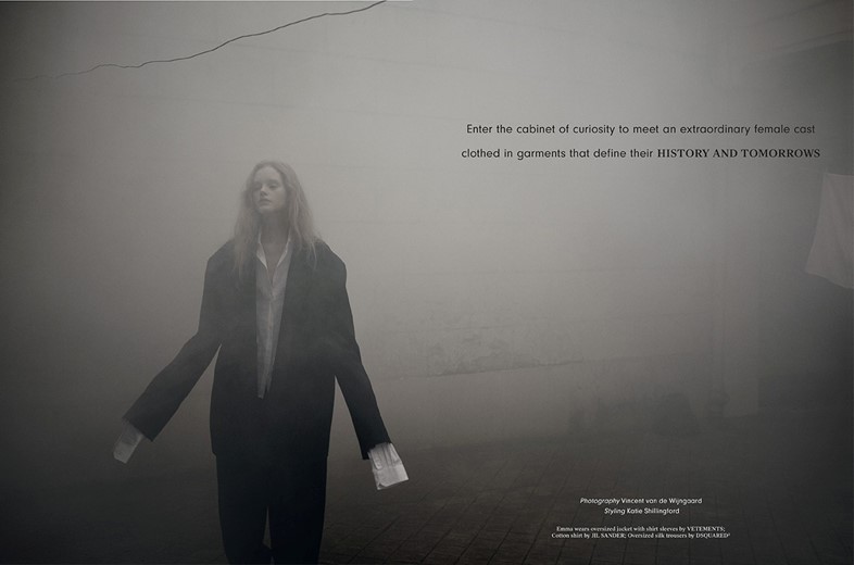
The creative or art direction of fashion photography greatly impacts the overall editorial message, equally text and image can change each other’s meaning. Words direct the emotion or meaning of an image they are near to or placed on. Where a word or phrase is placed on an image can also greatly affect the whole meaning or emotion of an image. More often than not, words and images must collaborate with each other – although the spirit of editorial design was always to create attention or contrast. A brand logo will own an image, own the emotion and power of an image. A photograph without words allows the viewer to create their own relationship with the image, the emotion and meaning is personal.

On the piece of design she would like to have created...
The pencil, the iPhone or the t-shirt and blue jean.
The S/S15 issue of AnOther Magazine is out now.