
Terracotta colours were once revered for their retro reputation, so why are contemporary designers once again turning to a palette of muted oranges and reds?
There are a scant handful of materials that successfully renew their relevance decade on decade, while maintaining the authenticity and sincerity that rendered them key to building our ancient worlds. Inimitably organic, terracotta — which literally translates from Italian as “baked earth” — not only refers to the material commonly used in product and architectural design, but also a range of earthy hues stretching from the burnt oranges that defined bazaar-inspired, Horst-photographed homes of 1970s glamour queens, to the rose-tinged shades of clay embraced by contemporary interior designers and stylists as a neutral base packing just enough heat to set their palettes ablaze.

Terracotta’s rise to fame as a medium for timeless creative production began more than 5,000 years ago. It has been used so widely and across so many disciplines that its symbolism and cultural reflections are somewhat muddied (if you’ll excuse the pun). Said to date back to 2700-2100 BC, an ornate terracotta figurine discovered in Mohenjo-Daro, Pakistan, is said to represent “a female divinity” and is unanimously identified as “the Mother Goddess”, providing the earth-born material with a somewhat feminist narrative. Meanwhile, in an era of life dictated by the charm of our built environments, architectural terracotta is synonymous with New York’s many Beaux-Arts masterpieces and the equally romanticised Georgian heritage that continues to influence even London’s most modern developments.

Speaking to interior designer Sophie Ashby, it’s clear that the profound impact of the material features in all corners of her world. “Terracotta is the colour of earth for me,” she says. “I grew up between Devon and South Africa and ‘Devon clay’ (as well the colour of the hot earth in the Bushveld) has strong red, burnt orange tones like terracotta. It’s a very neutral colour to me, and within the spectrum of earth tones it therefore forms the perfect basis on which to layer other colours. At [recent project] One Crown Place, the terracotta fins on the façade can be seen from the interior, so it was important that the interior envelope worked in harmony with that; the Georgian palette we referenced because of the site’s rich history actually partners beautifully with the terracotta, and when you introduce warm, figured timbers it gets even better.”
Prominent Vogue and House & Garden photographer Horst was particularly enamoured with terracotta; search his name and it’s impossible to miss the generous smattering of burnt rouge that consistently pierces his fashion and interiors spreads. Although this mid-century love of Van Gogh-sunflower shades is reflected in contemporary interior design — just take a look at the rugs featured in Horst’s 1986 garden shot of Yves Saint Laurent alongside the one in Daniel Hopwood’s recently completed Marylebone home — the use of terracotta in interiors has extended to a less firey, more understated and rose-tinted range of shades. Though a clear throwback to the retro opulence of the 1960s and 70s, it is also possible that those of us who spent the past five years admiring unbothered cool and understated sophistication in Scandinavian neutrals are now yearning for a warmth that is as just as versatile but more reassuringly indulgent. Designers are striving to create spaces that encourage people to linger a little longer within them – something that is increasingly difficult when our lives focus on being everywhere and nowhere all at once.

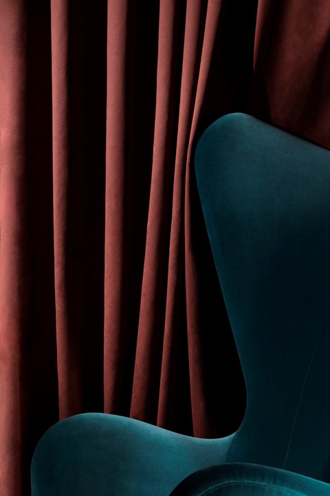
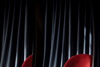
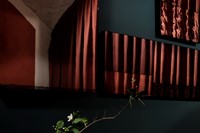
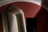
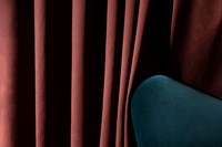
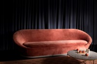
Also brought into focus by the current retro-revival are the opulent aesthetics that first emerged from chic creative hubs in Italy and France in the 1930s and 40s. These tactile, textural interiors are making a comeback and bringing the romance of 20th-century urban living with them. Interior stylist Katie Phillips spent much of Milan’s design season channelling the city’s innate richness and warmth into a collaboration with furniture brand Sé. “This photo series was shot in Milan following a collaboration with Sé whereby we designed Sé Ensemble, an apartment created for Milan design week within the Rossana Orlandi Galleria. When I first visited Milan, I took a lot of inspiration from the colours of the city, everything seemed much richer and textural, there was a weight to everything that I hadn't experienced before and it was so refreshing to become absorbed in an aesthetic that moved away from Scandinavian minimalism. I wanted to dip into this colour palette and create a space that felt as if it had the same depth of history as the architecture of the city. The beauty with terracotta is that there are so many tonal hues, reddy browns, pinks and oranges, it can feel chalky in some lights and velvety in others which lends itself perfectly to interior spaces.”
In spite of its startling home identity and occasionally clichéd reputation, terracotta offers designers a rarely attainable blend of versatility, history and neutrality with enough strength to carry its own narrative. In the short term, its singed orange and red hues will succeed ‘millennial pink’ and refrained shades of ‘duck egg blue’ as we strive for domestic comfort in a world that offers little protection or security, but what sets it apart from other colours of the moment is the inherent intensity of the material as a source of context, allowing terracotta to transcend cultural expiration for decades and even centuries to come.