From Raf Simons at Jil Sander to Wes Anderson’s corduroy suits, Ana Kinsella examines the evolution and eminence of autumn’s most prevalent hue
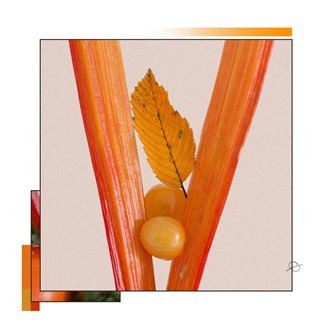
While in the built environment orange offers associations with speed, emergencies, warnings and energy, in the natural world the colour reminds us more of the changing seasons, and of our own relationship with the world around us. Looking around you at this time of year, you’d wonder if orange knew its own strength. Its shades and hues, running from russet to apricot, transform the landscape with an extra dimensionality we don’t often see in the flat, placid greens and blues of spring and summer, or in winter’s all-encompassing greys. Orange is also the shade that represents the last of nature’s harvest – a row of windowsill squashes that can last well into winter’s dark days. It is the colour that glimmers first on the night horizon, heralding dawn. Like this, or like biting into a tangerine on the fifth day of the office cold, orange can stand in for hope, even in the depths of the darkest season.
It’s a reasonably young colour, since until the 16th century it was often referred to in English as red or saffron. So perhaps there remains something modern about this colour, even today. Something bright and optimistic, and delicious too. Just as in shades of brown, shades of orange are often edible: tomato, mango, pumpkin, peach, or even the Crayola-owned Atomic Tangerine.

Fashion
In fashion, orange tends to act as the exception, rather than the rule. During his time at Jil Sander, Raf Simons developed a new palette of minimalism for women where joyful orange would often be the only bright colour in a sea of black and white and grey. Memorably the Autumn/Winter 2009 collection brought forward flashes of sculptural orange, deep and vivid, in amongst a powerful, and mostly monochrome, collection.
On the body, orange’s strength is intensified by the fact that many women consider it a difficult colour to wear. Today’s colour supremos, such as Sander Lak of Sies Marjan and Rachel Mansur and Floriana Gavriel of Mansur Gavriel treat orange like a powerful tool in their arsenal, something luxurious to celebrate the body and the woman who wears it. Orange, a colour sometimes previously read as loud or tacky, now becomes subtly decadent.
Away from the runway, orange can inspire the most evocative names for lipsticks and nail polishes: Essie’s Clambake, Hourglass’ Riviera, or even Chanel’s Pimpante (Italian for “full of beans”, apparently) remind us of the hold that language has over us when it comes to those precise moments of colour, place and memory.

Art
Let’s go for a moment to New York in the early 1950s. Frank O’Hara wrote about visiting the studio of his friend, the painter Michael Goldberg, and about how their processes differed, in the poem Why I am not a Painter. In the poem, Goldberg inserts the word ‘Sardines’ into his painting, then excises it; the finished painting is called Sardines. O’Hara, meanwhile, writes:
One day I am thinking of
a color: orange. I write a line
about orange. Pretty soon it is a
whole page of words, not lines.
Then another page. There should be
so much more, not of orange, of
words, of how terrible orange is
and life.
In the poem O’Hara keeps writing until a suite of poems titled Oranges emerges, with no mention of the colour itself. Instead his friend, the painter Grace Hartigan made 12 paintings illustrating O’Hara’s Oranges and incorporating its text, in which the colour allows her to explore questions of her own identity: as in O’Hara’s poem, here orange in the abstract becomes an open window into the self and how our actions relate to our identity.
Much of 20th-century painting’s development relied on synthetic paint colours invented during the previous century. After the colour theory work of English chemist George Field, who developed vivid synthetic pigments, painters including the Pre-Raphaelites were able to embrace orange in their work for the first time. Consider Frederic Leighton’s voyeuristic portrait Flaming June, in which a young woman in an apricot gown is asleep under an oleander plant. The painting, one of Leighton’s last, became an emblem of Victorian art, reproduced around the world today.
Cinema
Orange, sepia-like tones often fill the films of Wes Anderson, acting like liquid nostalgia to frame his self-contained worlds in an idealism that can only face the past. The director himself has also been seen on set in an orangey-brown corduroy suit, much like a well-worn sofa in a family home. But in dystopian thrillers, orange can become much more sinister, a sign that things are truly not right. The endless deserts of Mad Max: Fury Road are soaked in the colour, as an immediate sign of the heat and drought that allow nothing living to grow in this world. The futuristic cityscape of Blade Runner 2049 too is clouded in hazy orange dust that hangs amongst the skyscrapers, not dissimilar to London on a particularly sunny, polluted day. For all our own careful optimism, in the future, it seems, even the colour of light is weaponised.