
A magazine cover should both inspire and artistically express the mood of the volume. Eye-catching and striking, the parameters of this individual page creates the starting point for what is to follow. Inspired and influenced by these “nostalgic and
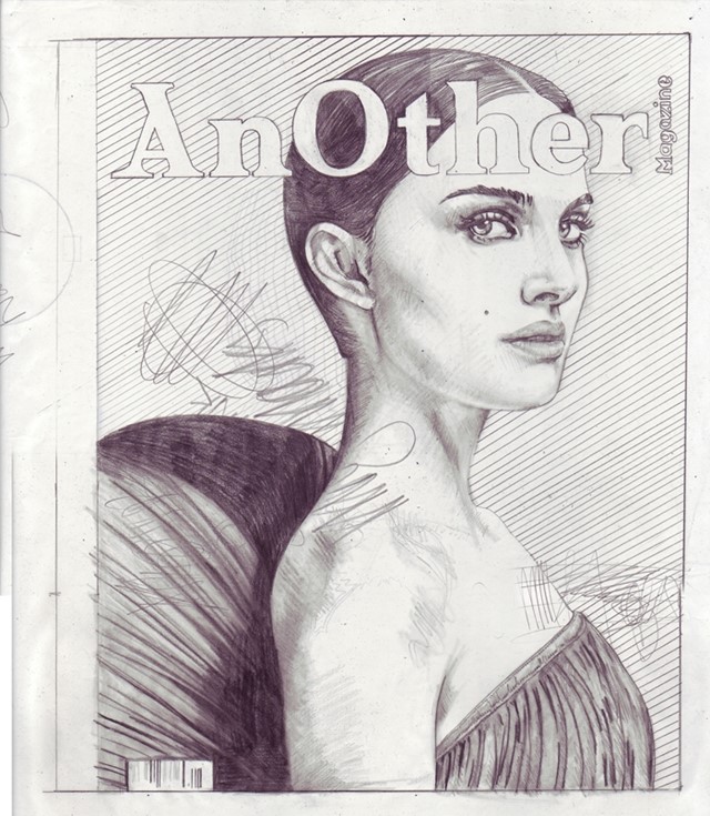
A magazine cover should both inspire and artistically express the mood of the volume. Eye-catching and striking, the parameters of this individual page creates the starting point for what is to follow. Inspired and influenced by these “nostalgic and historical documents” London-based illustrator JP Thurlow has painstakingly recreated 100 drawings reinterpreting classic and obscure magazine covers with the most beautiful precision. Here we speak to Thurlow about his upcoming 100 Covers exhibition at the KK Outlet in which the AnOther A/W09 Natalie Portman cover is featured alongside Dazed & Confused, Vogue and Elle covers, and others. Who said you shouldn’t judge a book by its cover?
How did this project come about?
I’d made a cover version of a record cover at college years ago… I loved the idea but it came back to me for this series. The circumstances of the start of the project were kind of fucked up. I was made redundant. I got very depressed. I went away on an artistic retreat to Japan, I lived in a Buddhist temple for a while. I started drawing, drawing the contents of my room. There was a copy of Elle I had for the flight. I drew it. I drew it again and again. I knew I had something, the college idea came back to me, and I haven’t stopped working on the idea since then.
Have you always had a passion for magazines?
I suppose so yes, but without realizing it at first. As an art director magazines are a useful tool of the trade, making tear sheets, moodboards and so on. I built up a sizeable collection as a by-product of my job… but it’s bigger than that. Magazines have the potential to capture an exact moment in time, for example I have old issues of The Face that mark out a clear memory of where I was and what the world was like. It’s a mix of nostalgia and historical document. That’s very fertile ground for the imagination. I must also say that I’m playing with magazines because they represent a perfected kind of mass consumerism. They are beautiful but so disposable. I’m taking a mass produced object and making it a one off art piece. That transformation appeals to me.
Your reproductions look almost identical to the original magazine covers – do you always draw with such precision?
I try to, yes. My technique has improved drastically over the course of the project. I like very much the contrast between the photorealism and the subsequent defacing. I always start out trying to reproduce the cover image as well as I can but each time there comes a moment when I get frustrated, maybe I’ve made a mistake or I stand back and think the drawing looks too pretty… then I have to attack it.
Can you explain your choice of drawing tool?
I wanted to keep the drawings as simple as possible as an antidote to my day job. It turns out pencil and paper is complicated enough!
There are so many magazine covers that exist – are there any specific qualities that determine your choice and have you read all of the copies you have drawn?
There are probably only five or six of the covers that I don’t own. The Rolling Stone cover with John and Yoko by Annie Leibovitz is a good example of one I wish I owned but don't. The selection process is best described as magazine lust. I’m usually drawn to something that stands out on the newsstand; an unusual image, colours, typography, format... something that sparks a thought or memory in me… something I have a connection to. I know enough about graphic design to get a bit geeky about the selection too, after a while you get to recognize the different styles of the art directors and designers, the tones of voice used by editors. In one-way Covers has always been an homage to those people.
Please describe the AnOther cover you have drawn for the exhibition and why you chose this one?
Well I’ve drawn AnOther twice, both title designs. The first was Uma Thurman by Craig McDean S/S08, the second Natalie Portman by Hedi Slimane A/W09.
AnOther is highly seductive, it’s like fashion crack. The women I chose to draw appeal to me as they are actresses rather than models, in both cases their eyes have something alluring and mysterious that pulled me in.
Everything about the styling of the photographs and the design of the covers appeals to me. Uma was challenging because of the pose, her chin in particular (sounds kind of lame to focus on that but there you are). I like very much Hedi Slimane’s photography, the minimal almost stripped beauty of it. And of course AnOther A/W09 is a celebratory issue, I wanted to revel in that theme.
What do you hope viewers get from your drawings?
I was very nervous the first time I showed 20 of the Covers because I saw people stopping to read all the tiny details hidden in the drawings. It was like bearing your soul to strangers. But I had to just go with it. It’s kind of the point. My covers are not straight reproductions they are autobiography piggybacking fucked up glamour… beyond this I don’t know. Anything that redefines or challenges your perception of something everyday or vernacular has got to be good.
If you could draw a new cover for AnOther magazine who and what would it be of?
Probably AnOther Man… but you’ll have to wait and see.
Text by Lucia Davies
JP Thurlow, 100 Covers runs 5 – 30 November at KK Outlet alongside a launch of the 100 Covers book which features the full series of illustrated covers, including a ‘post by post’ artist’s diary and interviews with JP Thurlow.