
What better antidote to all the deep, dark sexiness of autumn 2011 than a pale and pastel palette cleanser for the summer months?...
What better antidote to all the deep, dark sexiness of autumn/winter 2011 than a pale and pastel palette cleanser for the summer months? Out of Marc Jacobs’ wintry bondage brothel at Louis Vuitton came light and delicate zoomed-in broderie pieces in brighter and more girlish hues than any fashion follower cares to remember. A-line skirts, headbands and a merry-go-round: this was a far cry from the urban street toughness that we had learned to cultivate.
Our last real colour experiment was with the sort of brash and bold fluoro mattes that Raf Simons worked into his acclaimed sports couture collection for summer 2011. This time, while the shades may be slightly watered down, the message has absolutely not been. Femininity, womanliness, sugar and spice are key; these are not colours for shrinking violets. Or rather, they are – and that’s the point.
"Out of Marc Jacobs’ wintry bondage brothel at Louis Vuitton came light and delicate zoomed-in broderie pieces in brighter and more girlish hues"
At Dior, Bill Gaytten held the reigns ahead of Simons’ anticipated arrival with a spring collection that nodded to the roots of the label: an uptight but gossamer-light ladylike collection rendered in nudes and fondant colours, which made up the chic and bourgeois outfits and separates that so personify this Parisian institution.
Riccardo Tisci at Givenchy meanwhile used pale pinks and ecru to soften structured and deconstructed tailored, striving for a fluidity and grace in pieces that are by and of themselves rather sharper than they are feminine. And at Christopher Kane too, pastels were a means of exploring the fairytale aspects of fashion, the princess dream that we create from clothes as we sit under the grey glow of murky skies and the flicker of our televisions.
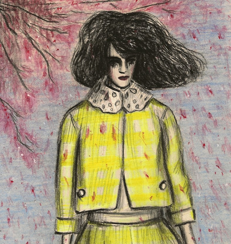
But Marni’s Consuelo Castiglioni used these colours – duck-egg blue, bubblegum pink, lemon yellow – to a rather different end. By melding them with a silhouette that was boxy and linear in the extreme and offering pieces that were reinterpreted classics for women of any age, she created the Bauhausfrau, a pleasing portmanteau and Teutonic compound not only of words but ideas. These were modern pastels: soft in theory but strong in aspect; fantastical yet pragmatic.
It was proof enough the hyper-femininity is not a trend to shy away from, that it can in fact work in everyday life. But that’s not to say we won’t fade straight back to grey as soon as spring’s pastel petals have all blown away.
Text by Harriet Walker
Harriet Walker is a fashion writer at The Independent. Her book Less is More: Minimalism in Fashion is out now, published by Merrell. Zoë Taylor is an illustrator based in London. Her work has appeared in The Guardian, Syntax Editions and Le Gun among others.