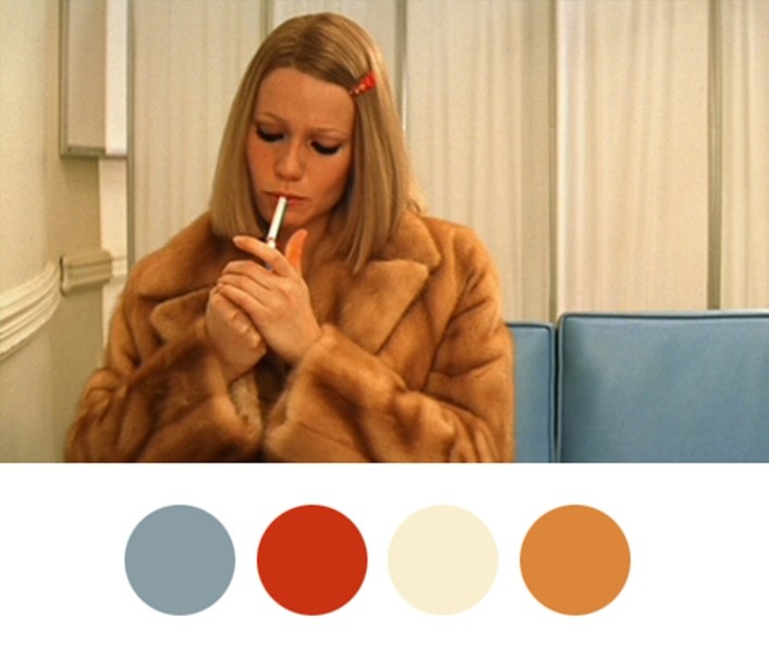
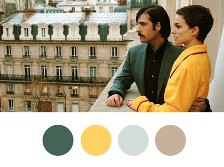
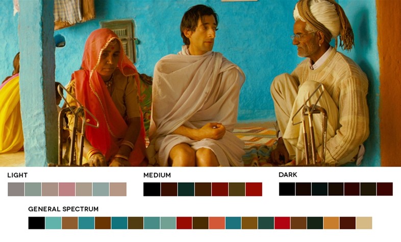
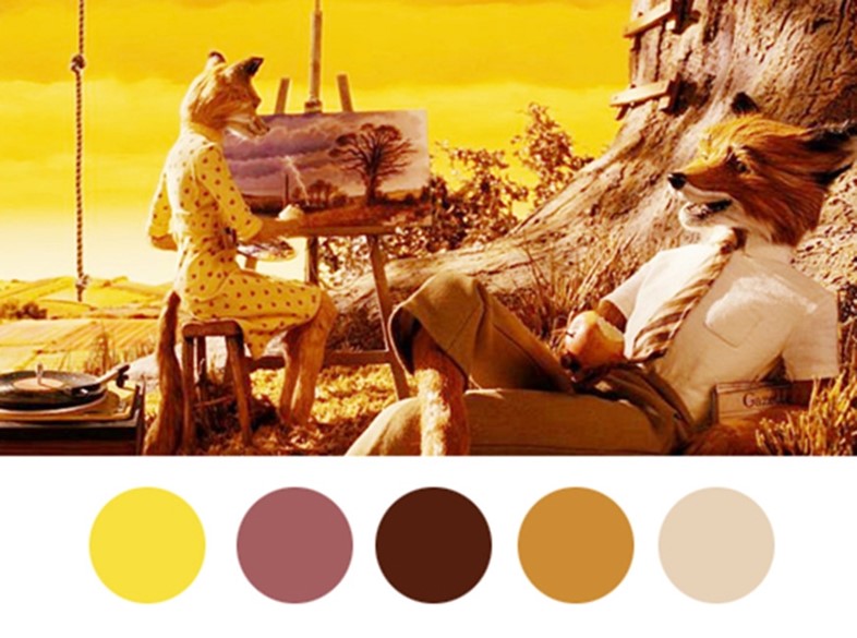
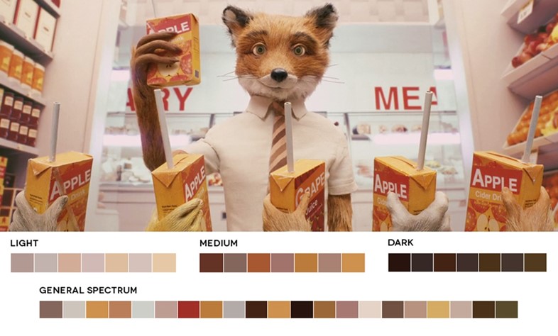
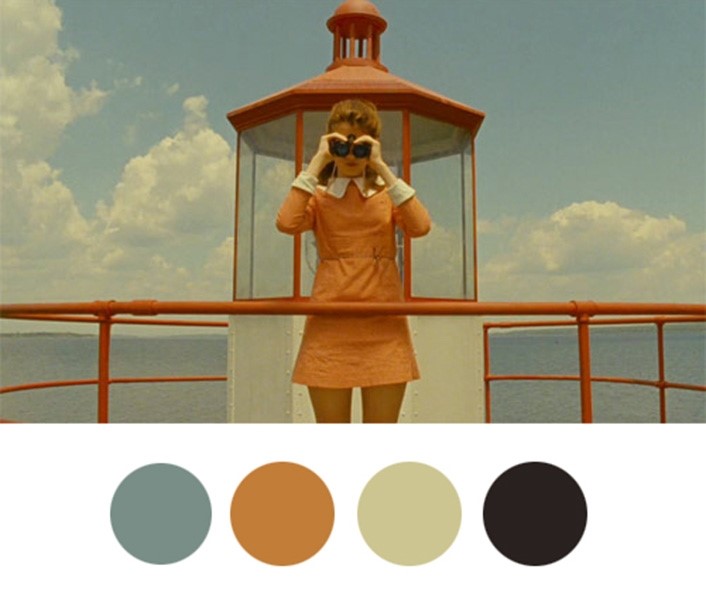
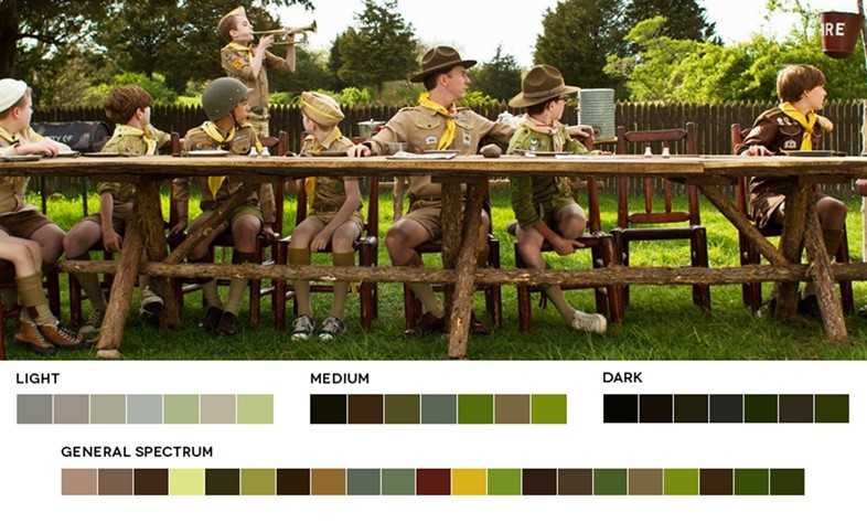
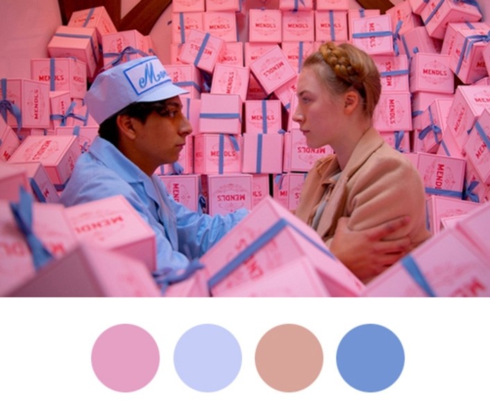
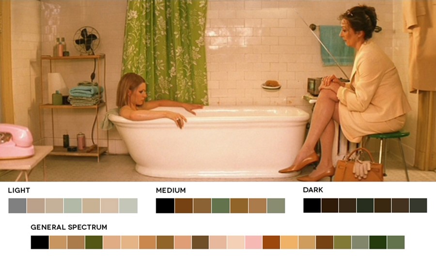
The fictional worlds evoked in film by director Wes Anderson have such a precise colouration – the very particular pastel-hues that paint the skies, drench the buildings and dress the characters, render Anderson’s microcosms almost dream-like. The hazy-hued lens through which we peer into the director’s unique world has a retro quality that casts his films in a nostalgia for a time that could have been. The muted pink of The Grand Budapest Hotel that makes the hotel itself the biggest character in the movie; the very particular French mustard that comes to define Gwyneth Paltrow’s Margot Tenenbaum in The Royal Tenenbaums; the vintage boy-scout green in Moonrise Kingdom – all of these hues are captured in the Wes Anderson Colour Palettes Tumblr, which breaks down the shades that colour Wes’s world scene by scene with precise accuracy, and also the Movies in Color site, which considers individual frames of many films, including Anderson’s, distililng them down to their myriad different shades.
“The hazy-hued lens through which we peer into the director’s unique world has a retro quality that cast his films in a nostalgia for a time that could have been”
Artist and Wes Anderson enthusiast Hamish Robertson says, “Anderson’s colour palettes are integral to his cinematic ‘world-building’. His eye for art direction and fantastic attention to detail creates the appropriate space and tone for his characters to exist in – and for the viewer to lose themselves in. They ultimately become their own visual language, the way character themes are elaborated in cinematic scores, allowing an immersive visual experience whether the sound is on or not.”
Follow AnOther Loves Wes on pinterest.