Pastels are big right now, to be seen in everything from your ice cream sundae to your dress or furniture. We noticed a lot at London Design Festival, and as fans of this washed out palette, we decided to round up our favourite examples of candy-like colours.
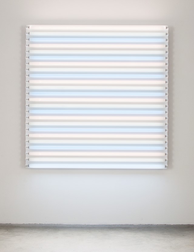
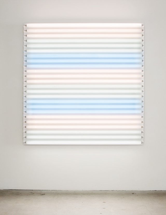
Heather Carson chose light as her medium and in her installations, inspired by Josef Albers, there is a beautiful selection of bleached out colours and pastel stripes.
light/LINES: Untitled #1, 2011Courtesy of Heather Carson and Ace Gallery
light/LINES: Untitled #2, 2011Courtesy of Heather Carson and Ace Gallery
light/ALBERS: Metal Halide/Cool Green/Cool White, 2010Courtesy of Heather Carson and Ace Gallery
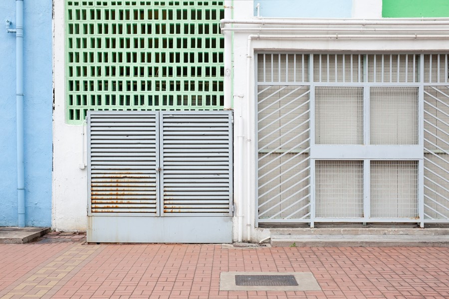
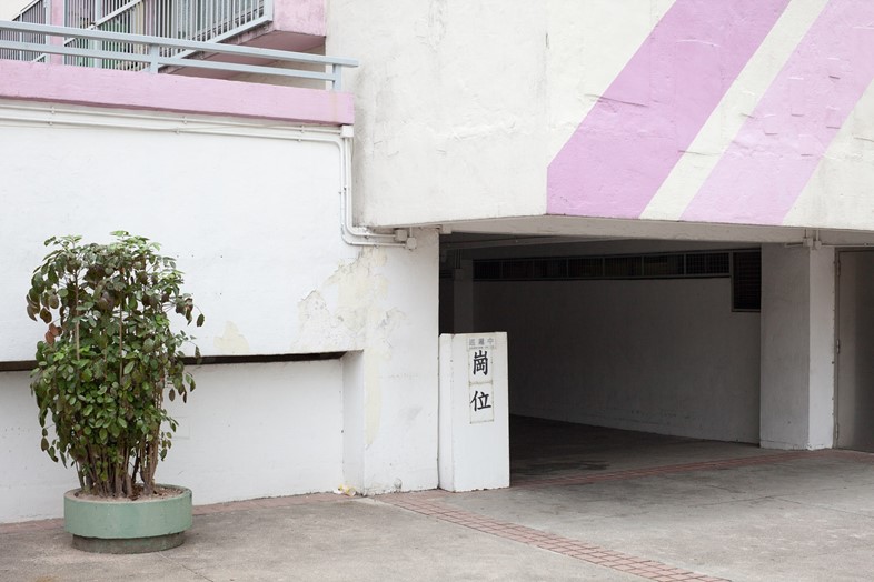
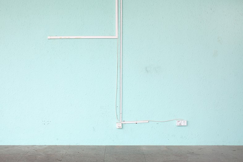
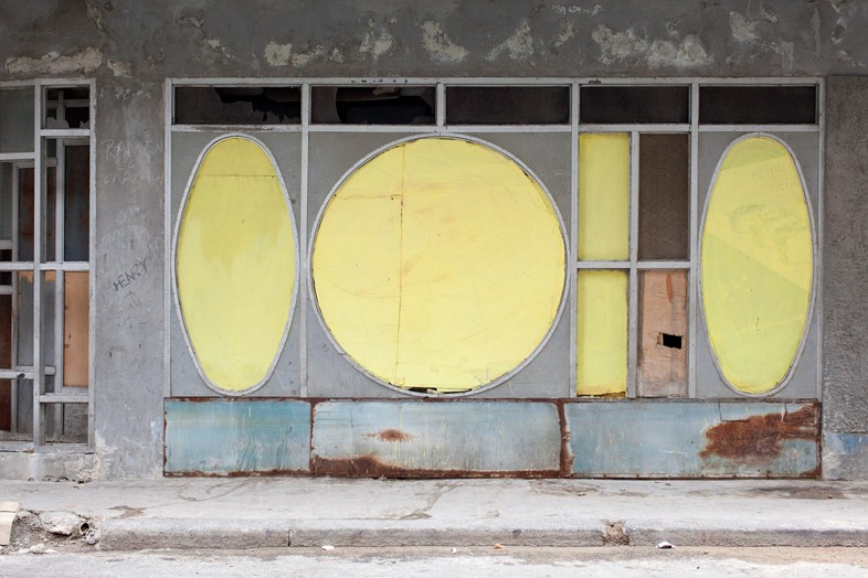
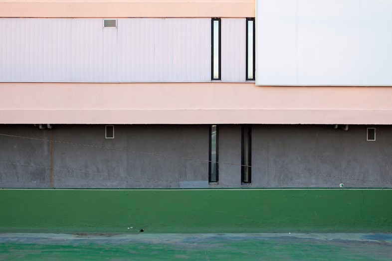
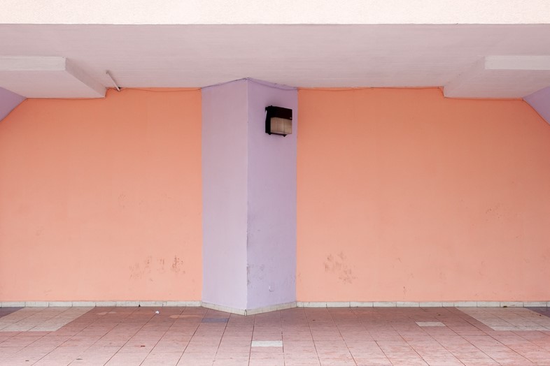
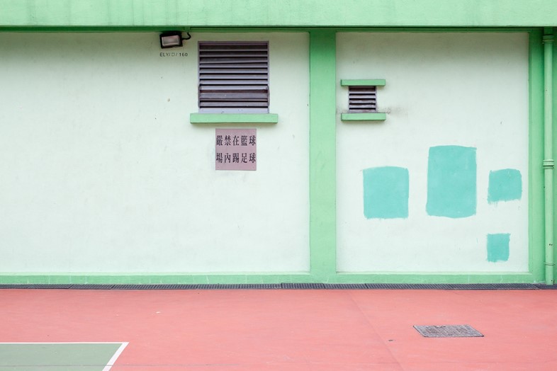
One of our all-time favourite photographers, Bert Danckaert has an eye for fantastic palettes in every day buildings. There are 100 to explore on his website.
Simple Present #580 (Hong Kong), 2011Photography by Bert Danckaert
Simple Present #591 (Guangzhou), 2011Photography by Bert Danckaert
Simple Present #336 (Havana), 2010Photography by Bert Danckaert
Simple Present #370 (Havana), 2010Photography by Bert Danckaert
Simple Present #409 (Havana), 2010Photography by Bert Danckaert
Simple Present #549 (Hong Kong), 2011Photography by Bert Danckaert
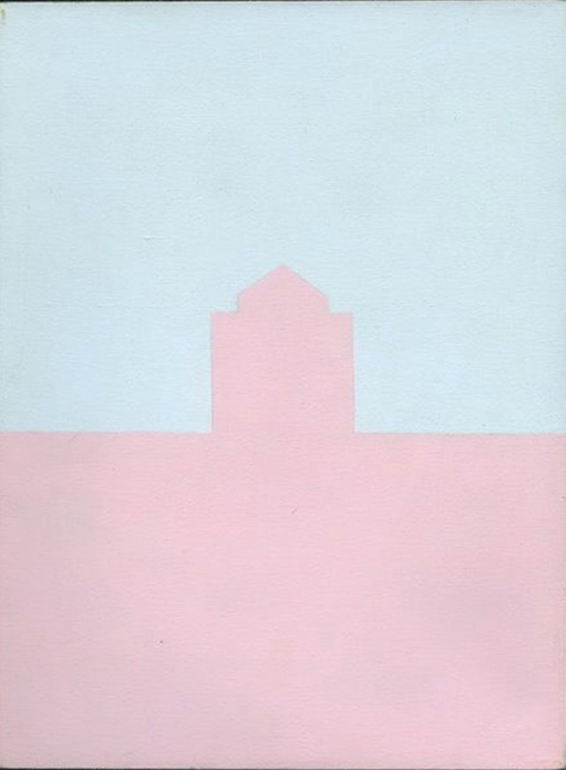
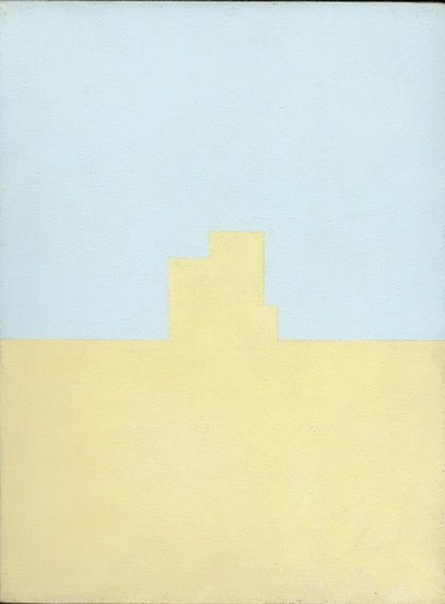
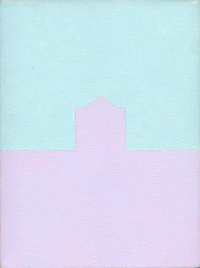
Olivia Boudet’s pastel canvases depict the simplest silhouettes of rooftops, chimneys, towers and houses turning these views into something far dreamier than they are in reality.
Olivia Boudet, number 100, 1997Courtesy of the artist and Fred Torres Gallery
Olivia Boudet, Number 96, 1997Courtesy of the artist and Fred Torres Gallery
Olivia Boudet, Number 53, 1997Courtesy of the artist and Fred Torres Gallery
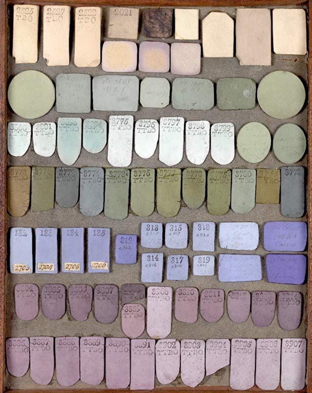
As a piece of eye candy it doesn’t get much better than a colour chart, this one is a selection of ceramic testers for Wedgwood – they were on trend back in the late 1800s.
Wedgewood jasper colour trialsCourtesy of the Wedgewood Museum
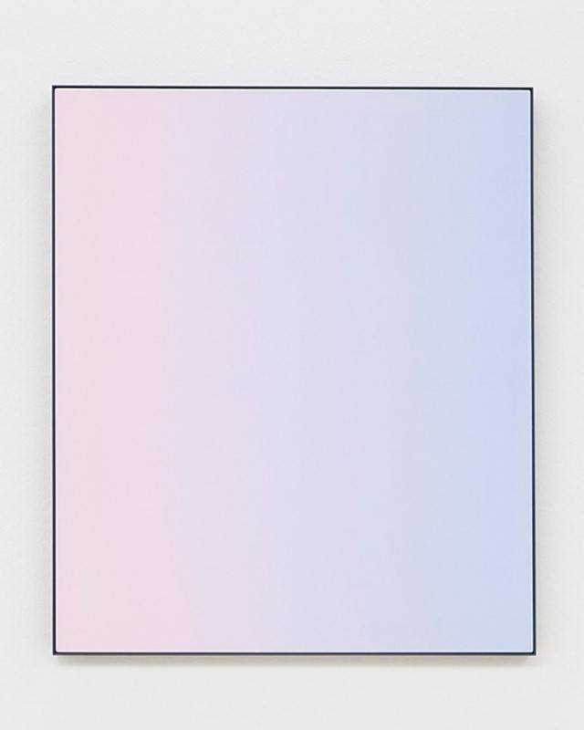
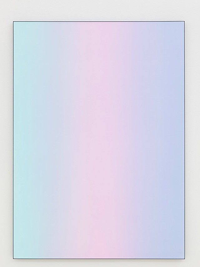
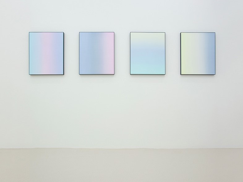
Pastels AND gradients. It’s as though Matti Braun wanted Pinterest to implode when he created his elegant dyed silk panels.
Matti Braun, Untitled, 2014Courtesy of the artist and Esther Schipper Gallery
Matti Braun, Untitled, 2014Courtesy of the artist and Esther Schipper Gallery
Matti Braun, Bo Lak, 2014Courtesy of the artist and Esther Schipper Gallery
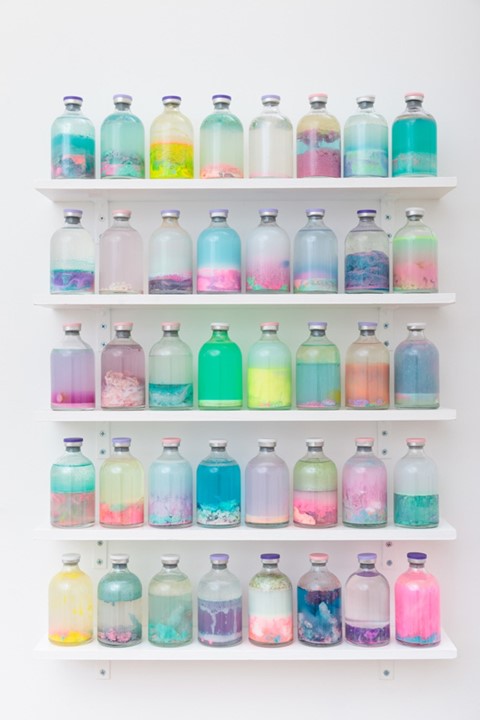
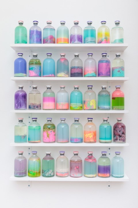
Louise Zhang’s ‘Slosh Samples’ are a mixture of glue, pain, resin, clay, water, varnish and pigment. A heady concoction of toxins which has produced this array of pastel delights. Like a medicine for the oncoming S.A.D..
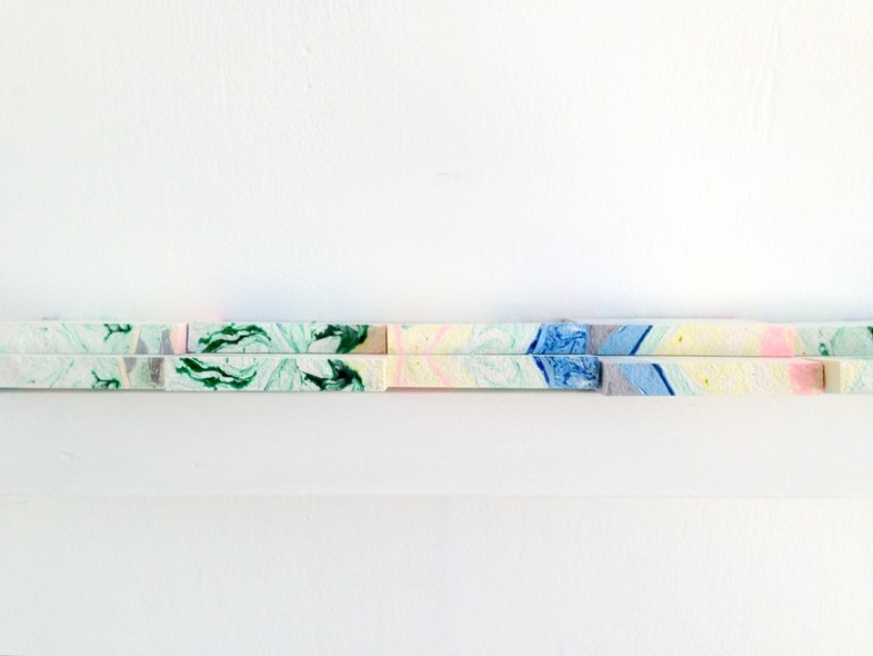
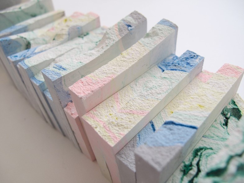
If only these tiles by Bonny Mably were edible. They resemble the most fun nougat ever, with their pastel swirls and marbled goodness.
The Art of Looking SidewaysArtwork by Bonnie Mably
The Art of Looking SidewaysArtwork by Bonnie Mably
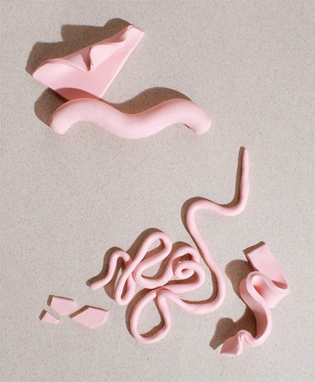
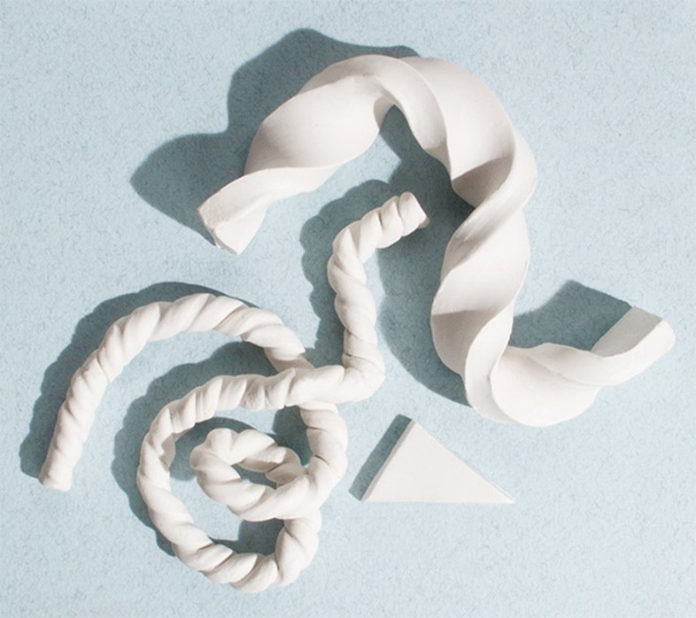
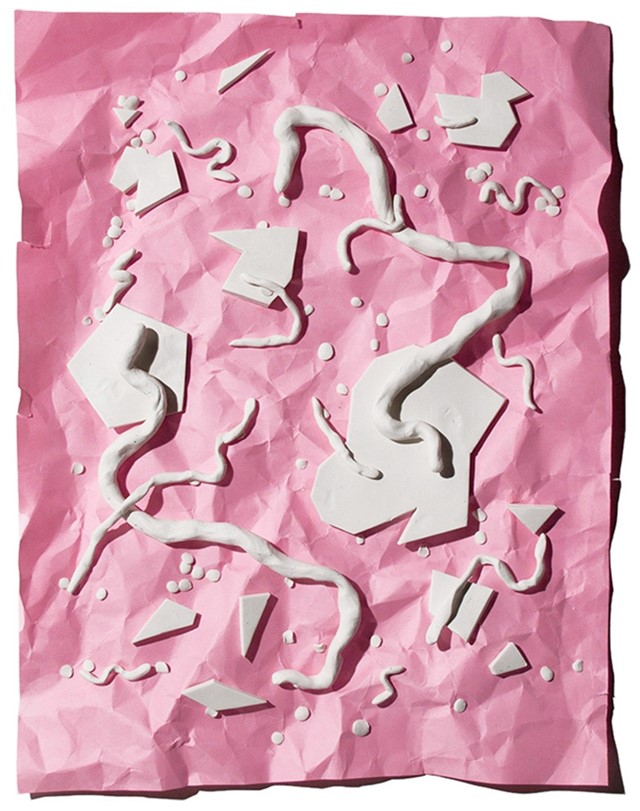
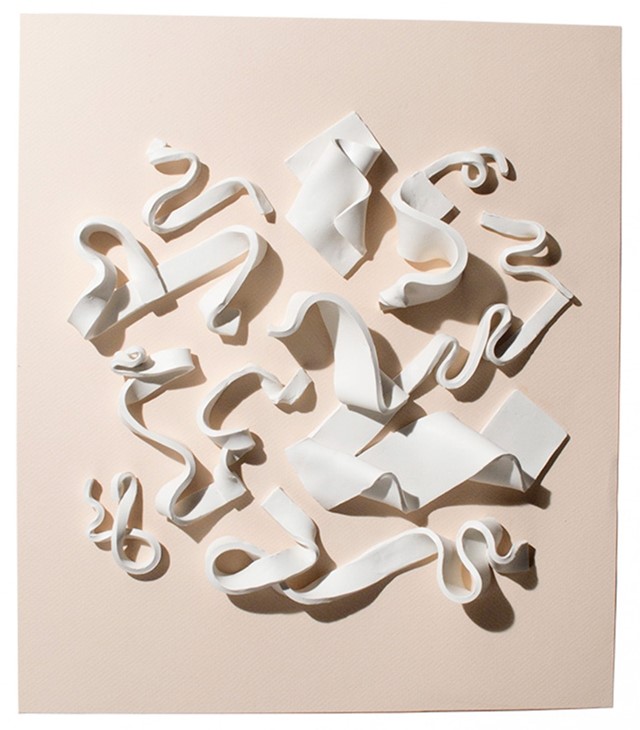
Mel Nguyen's clay compositions are so pleasing, like an explosion in a flump factory.
Clay CompositionsArtwork by Mel Nguyen
Clay CompositionsArtwork by Mel Nguyen
Clay CompositionsArtwork by Mel Nguyen
Clay CompositionsArtwork by Mel Nguyen
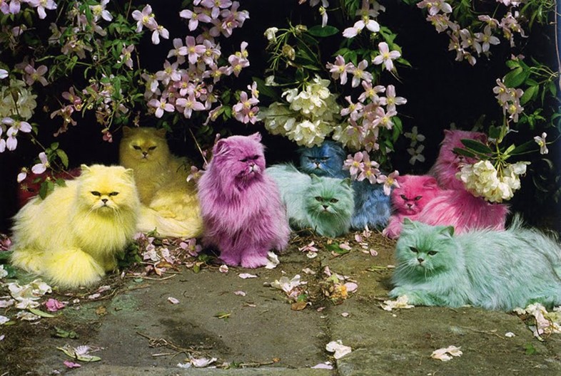
The recent craze for dyeing your pet a pastel colour must surely be attributed to this iconic photo by Tim Walker. Black, white, or tabby just doesn’t cut the mustard anymore.


, 2011)
, 2011)
, 2010)
, 2010)
, 2010)
, 2011)


, 2011)