Flicking through the pages of a fashion magazine can often feel like wading through pages of glossy advertisements. What is the real and what is fantasy, a less familiar reader may ask? The answer is simply irrelevant. Fashion advertising is an art form in itself – an unbridled communicator of a brand’s vision and the mood of a collection. Fashion is nothing if not lustful, and this is a chance for brands to stun us into hysterical desire and make us ache for something that we’ll never need, but need to want; one only need look to Tom Ford’s 1990s Gucci campaigns to understand that.
Of course, advertising imagery can vary from subtly nuanced nods to hyper-branded mania, but it is also a chance to understand the deeper themes and ideas behind a ready-to-wear collection, beyond the terribly captured Instagrams at catwalk shows and the barrage of behind-the-scenes photography. This season, we’ve extracted the colour palettes for each major campaign as a means to deciphering the season’s most prominent tones. From Gucci’s synthy bubble-gum hues to the dusky romance of Valentino, these are the colour codes to know.
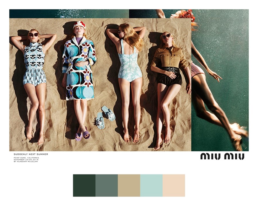
1. Miu Miu
Miu Miu takes us for some fun in the sun on an Italian seaside at its postwar peak. Kitsch turquoise and lilac 70s floral prints sunbathe atop lusciously golden sand. Meanwhile, an auburn-haired swimmer with scarlet flowers in her hair floats through teal water — summer is almost here, says Mrs Prada.
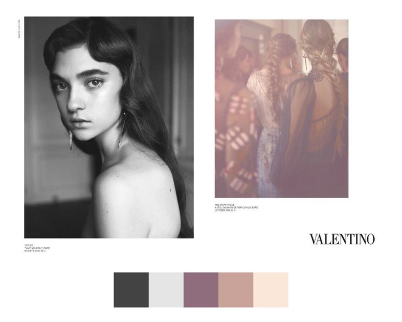
Valentino S/S17Photography by David Sims
2. Valentino
Valentino’s spring show was a veritable feast of sizzling fuchsia, but the mood the Italian brand sought to convey in its campaign is a softly tinted view of balletic pale periwinkle blue.
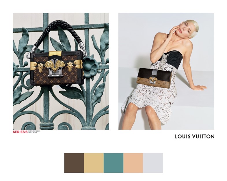
Louis Vuitton S/S17Photography by Bruce Weber
3. Louis Vuitton
The seafoam patina of oxidised copper is all too familiar to Parisians, which is what makes the French city the perfect backdrop to Louis Vuitton’s deliciously chocolatey monogrammed leather. That, combined with the sheen of gold and silver hardware and contrasted against Michelle Williams’s platinum blonde chignon, results in a thoroughly modern take on French craftsmanship.
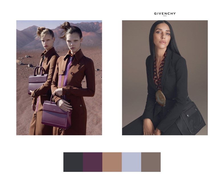
Givenchy S/S17Photography by Mert & Marcus, Styling by Carine Roitfeld
4. Givenchy
The cavernous, russet rock formations of Maria Island in Tasmania lend an earthy sensibility to Givenchy’s campaign. Imagine the swirling terracotta patterns of the rocks at a lilac-tinged sunset, and the result is a warm, soothing and romantic colour palette.
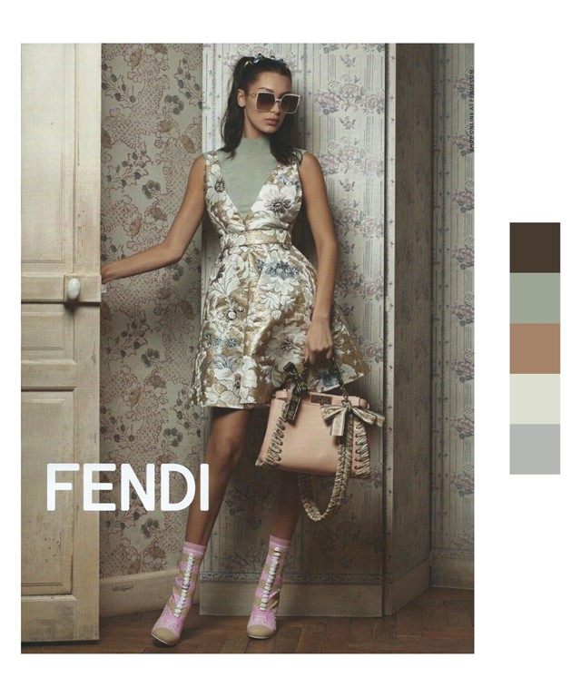
Fendi S/S17Photography by Karl Lagerfeld, Styling by Charlotte Stockdale
5. Fendi
Karl Lagerfeld described Fendi’s spring collection as a “down-to-earth fairy-tale”, which explains the baroque metallic, faded wallpaper florals and candy-striped pink. It’s all rather muted, however, making it more of a people’s princess palette.
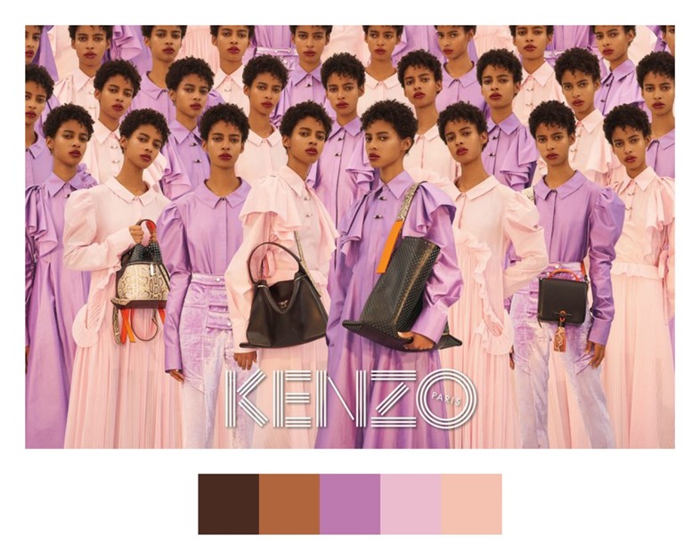
Kenzo S/S17Photography by Johnny Dufort, Styling by Agata Belcen
6. Kenzo
Kenzo’s sweet feast of lavender and pale pink may seem a little Disney at first, but it’s punctuated with black leather, zesty orange and silver python accessories. That, and Amelia Rami’s short, dark curls and caramel complexion.
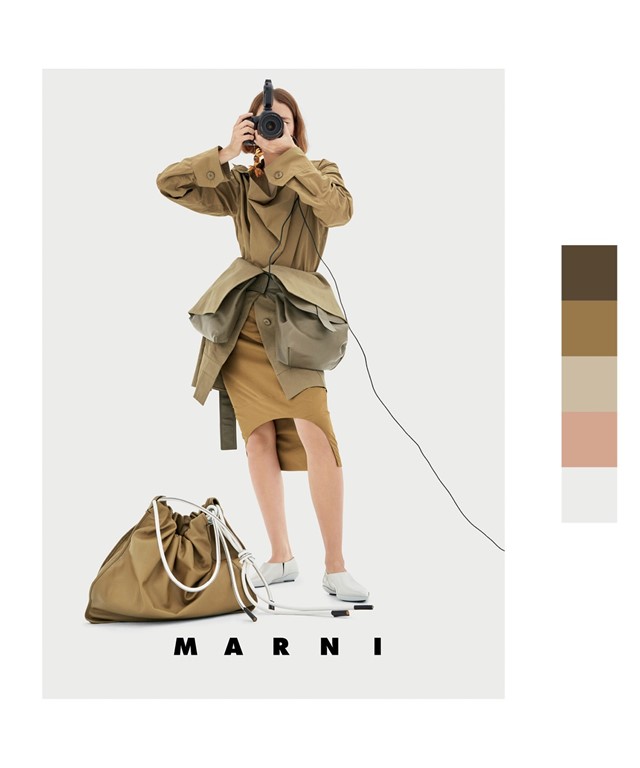
Marni S/S17Photography by Barbara Probst, Styling by Lucinda Chambers
7. Marni
Safari khakis in crisp cotton make us dream of the Sahara Desert. For life in the city, however, Marni punctuates it with white-hot accents that act as the tonic to turn an earthy palette into something more refreshing.
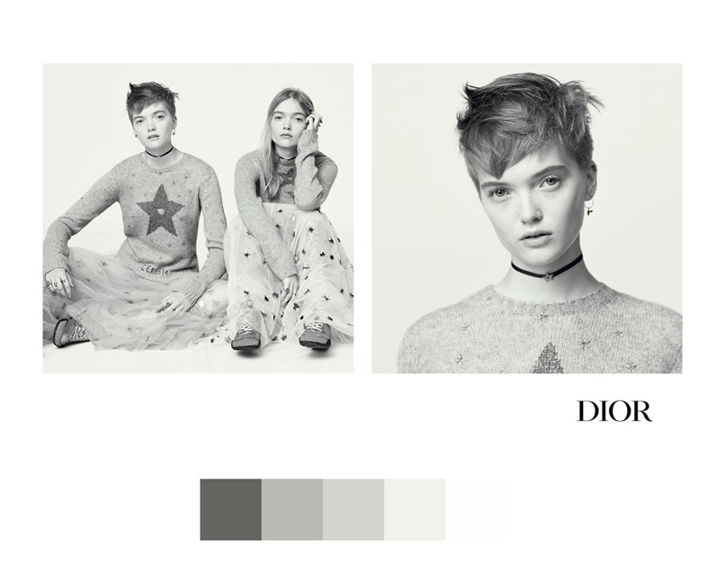
Dior S/S17Photography by Brigitte Lacombe
8. Dior
Maria Grazia Chiuri imbued the fabled house of Dior with a romantic grunge sensibility this season – think chokers, cosy knits over ballet skirts and leather lace-up trainers. The campaign echoes the 90s vibe with a creamy and classic monochrome.
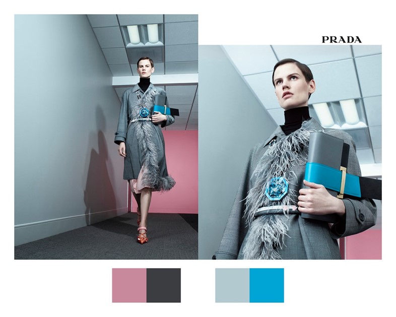
Prada S/S17Photography by Willy Vanderperre
9. Prada
Prada’s spring campaign may be a series of short stories, but this one is certainly a contemporary noir, starring Saskia de Brauw as a modern Hitchcock heroine. Here, electric blue marabou feathers, a little black dress and zingy pink leather steal the show – and sit contrastingly to the hauntingly mundane wood-panelled corridor.
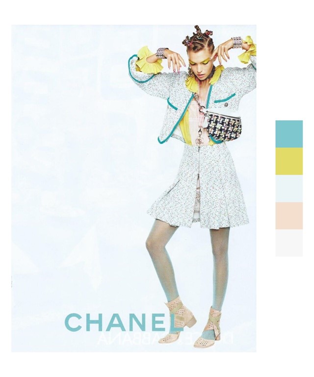
Chanel S/S/17Photography by Olivier Saillant
10. Chanel
Chanel’s light-filled campaign is characterised by shot of limoncello yellow in the form of a ruffled blouse and zesty eyeshadow. The rest of the palette is kept airy and soft, with the exception of a sharp turquoise and pale pink – very Miami, we think.