Possagno, Treviso, Photography by John Pawson; Versace S/S18
Looking at the S/S18 Collections Through the Colour Spectrum
A new book of architect John Pawson’s inspiration reads like the arc of a rainbow, writes Ana Kinsella – and its vibrant hues map neatly onto Spring/Summer 2018
Lead ImagePossagno, Treviso, Photography by John Pawson; Versace S/S18
Taken in isolation, colour can seem like such a simple thing: a vibrant, incidental background noise that links the visual world to the world of emotion. But colour can’t be taken in isolation. Each shade, each moment, is interconnected with an infinite number more, and every decision we make around colour – whether it’s selecting a new paint for the front door or simply getting dressed in the morning – ends up revealing more about us and our world than we might imagine.
Spectrum, a new book from renowned minimalist architect John Pawson and published by Phaidon, celebrates the “deeds of light” of the colour spectrum through a curated collection of almost-abstract photographs. The book journeys through a spectral cycle, encouraging the reader to note the minute differences in shades and hues, and to look at the stories the brain creates as a result.
Something similar happens when a fashion designer presents a new collection, one where colour is pushed to the forefront. We are forced to reconsider something as simple as a burst of blue or shock of yellow, to evaluate why it might be so and how it makes us feel. Colour, after all, is something fundamentally sensual, and thus should never be taken for granted. For Spring/Summer 2018, we examined the colour propositions set forward by some of the designers of the season.
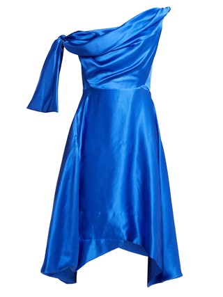
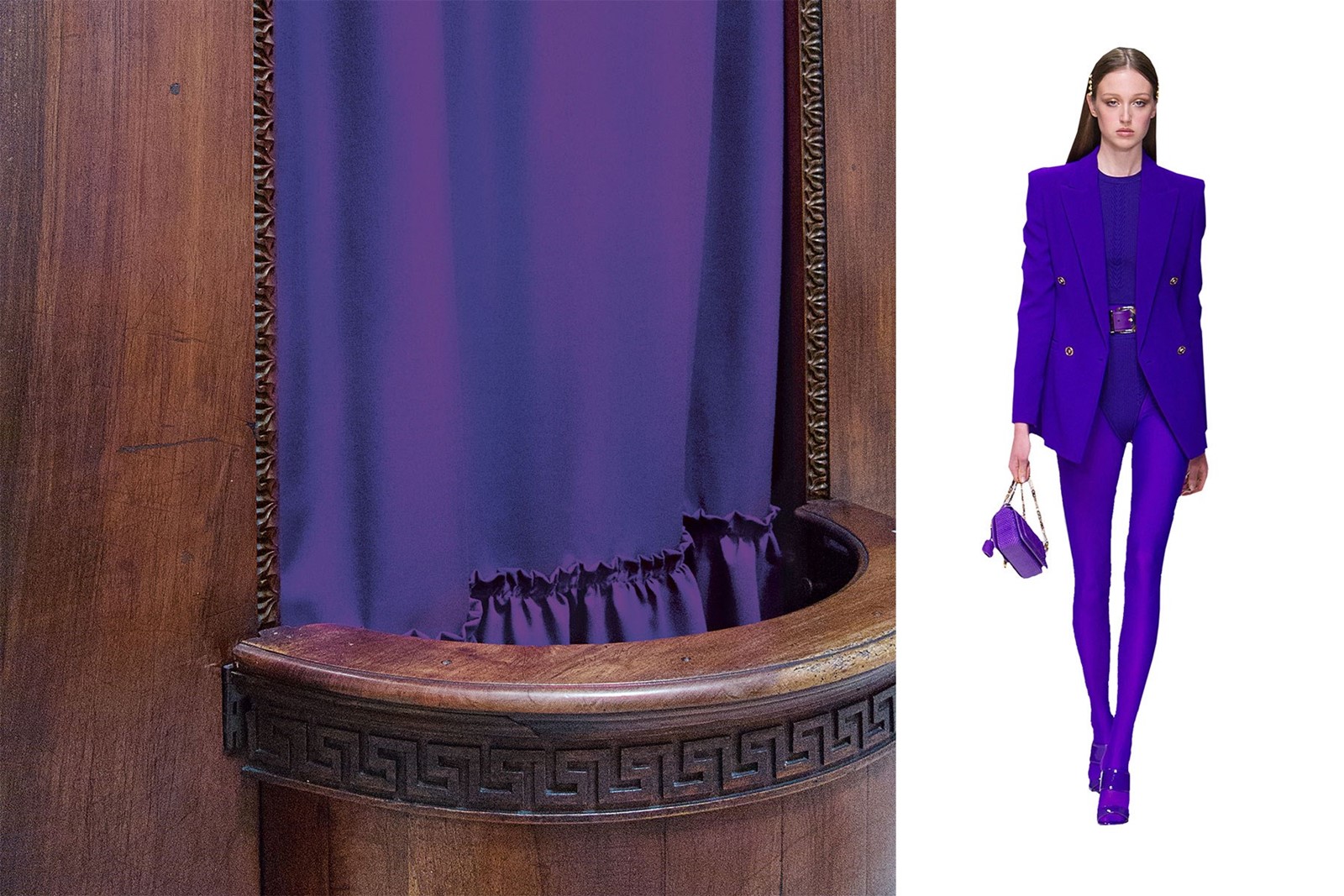
What colour commands attention like violet? For Spring/Summer 2018, Versace turned directly to Gianni Versace’s own archives, rehashing the great and good from the years 1991-95. A key thread amongst these looks was the headline-grabbing power of vulgarity, perhaps best epitomised by this strong head-to-toe violet look. Popping shades of purple are never purely risqué, though; their impact comes from the insinuation of royalty, luxury and decadence that deep purple carries. Think of an ermine cloak, or a heavy velvet curtain at the theatre. What could be written off as merely vulgar becomes instead voluptuous and ultimately indulgent.
Notting Hill, Photography by John Pawson; Simone Rocha S/S18
2. Simone Rocha
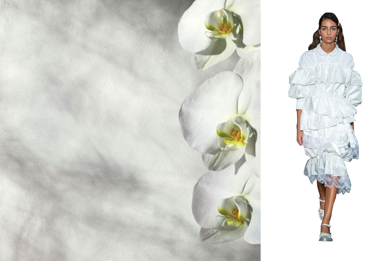
Architects and designers both traditionally love white. The colour of space and emptiness, white creates a void that is theirs to fill as they choose. But throughout her career Simone Rocha has made more of the colour and what it stands for, in white dresses and skirts that riff on the elaborate lace of wedding dresses and Holy Communion gowns. In her collections, white is ceremonial and emblematic, and a part of a woman’s life. Ruffled or tiered with lace or pearls, Rocha’s whites are innocent and sweet, but never saccharine. As with those aforementioned architects and designers, Rocha’s whites provide you with a canvas and leave the rest up to you.
Al Shahaniya, Photography by John Pawson; Christopher Kane S/S18
3. Christopher Kane
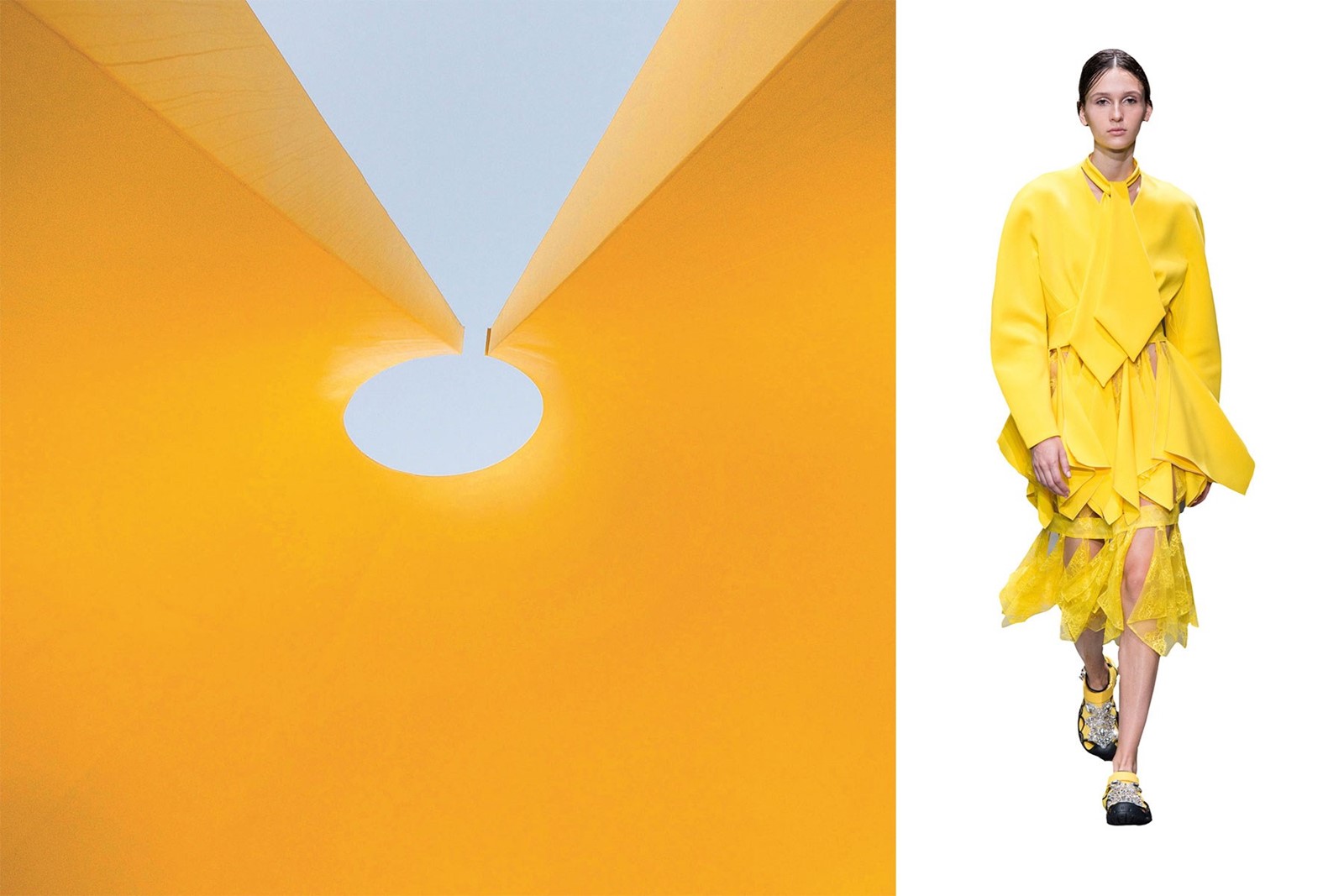
Never afraid to delve deep into our collective subconscious, Christopher Kane looked this season to the relation between cleanliness and perversion. Finding kink in the idea of domestic bliss, Kane turned the familiar yellow of a dust cloth into a cutaway look that provided flashes of flesh underneath. Here, yellow isn’t the colour of comfort, of nursery walls and Easter eggs – instead, like a bruised knee or spoiled milk, it’s a sign of something just a little bit off.
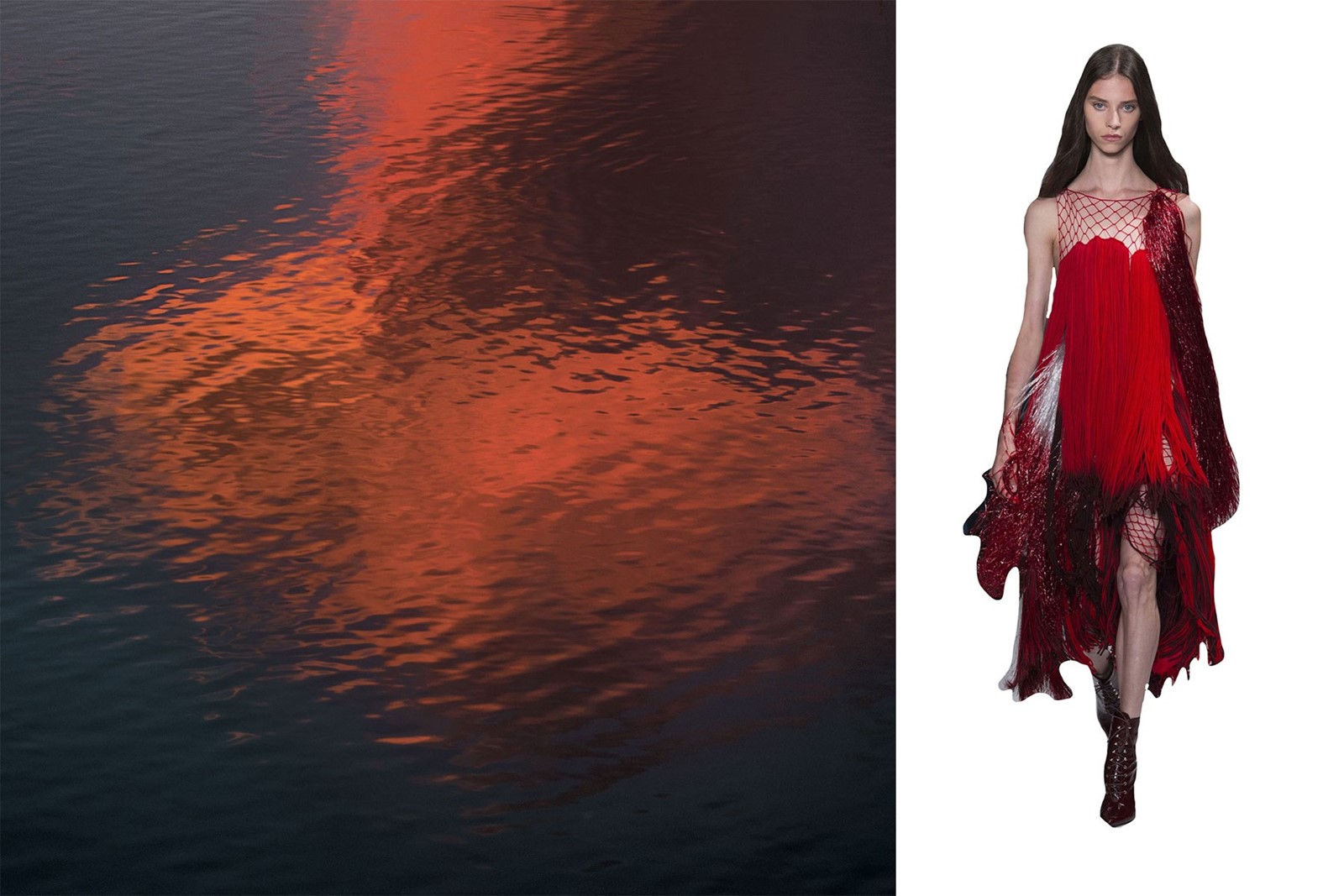
Gustavia, St Barthélemy, Photography by John Pawson; Calvin Klein S/S18
4. Calvin Klein
For Raf Simons, horror is essential to the American dream. At Calvin Klein, his vision for Spring/Summer 2018 came dripping in blood red, reminiscent of Sissy Spacek’s star turn in Carrie. There’s something primal and nightmarish about the splash of vibrant red when spotted in nature, and that was echoed on the catwalk by swishing, tassled gowns and sickly rubber and silk. Red is powerful, yes, but for Simons there’s danger to that power too.
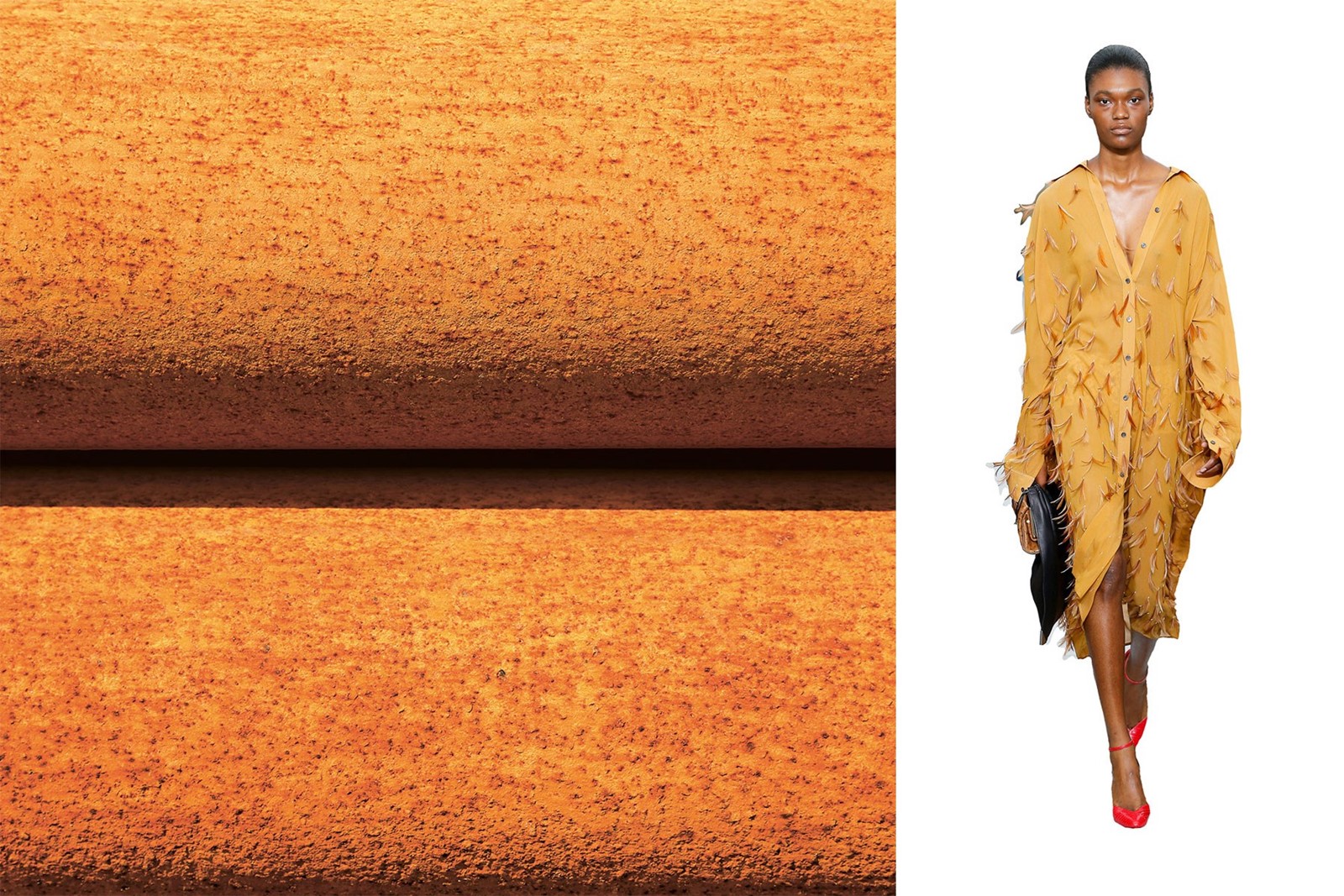
Jaffa, Israel, Photography by John Pawson; Céline S/S18
5. Céline
Under Phoebe Philo, much of what Céline aims for has to do with the luxurious everyday: the subdued refinement underpinned by fine craftsmanship that stylish, professional women can work into their daily lives. It’s no surprise, then, that we often see earth tones and natural neutrals in her collections. For Spring, it was an embellished ochre shirt dress that turned heads. A colour perhaps more linked to brickwork and varnished wood than luxury fashion, but for Philo, an ideal point from which to trace a path back to women’s lives.
Goleta, California, Photography by John Pawson; Chanel S/S18
6. Chanel
Only Karl Lagerfeld could rearrange the actual landscape to suit his work. For Chanel’s Spring/Summer 2018 collection, he recreated the waterfalls of the Gorges du Verdon in the south of France in the centre of Paris, celebrating those beautiful blue places where earth meets water. The sea itself has been a source of fascination for artists and designers (more broadly, for humans throughout history), and perhaps it was its liminal quality that Lagerfeld wanted to pin down. The rolling surf, the endless waves, the calm of the distant horizon: what could be better for a mind as busy as Lagerfeld’s?
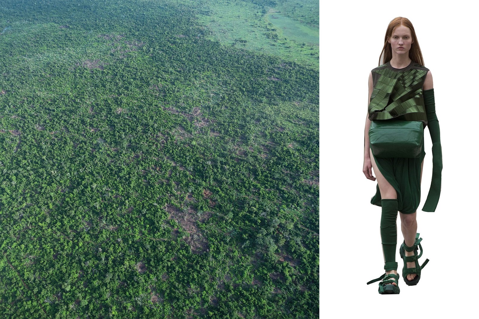
Over Chakengi, Tanzania, Photography by John Pawson; Rick Owens S/S18
7. Rick Owens
It would be easy, lazy shorthand to say that in fashion, green stands for a return to nature. For Rick Owens, the truth is always more complicated. In a Spring/Summer 2018 collection titled Dirt, he found hope in the stuff of the world around us, ravaged resources and all. Green is nothing if not the colour of growth and fertility, and far from the architectural brutalism Owens often shows us, here green becomes a little glimmer of optimism in an increasingly difficult era of climate change and uncertainty.
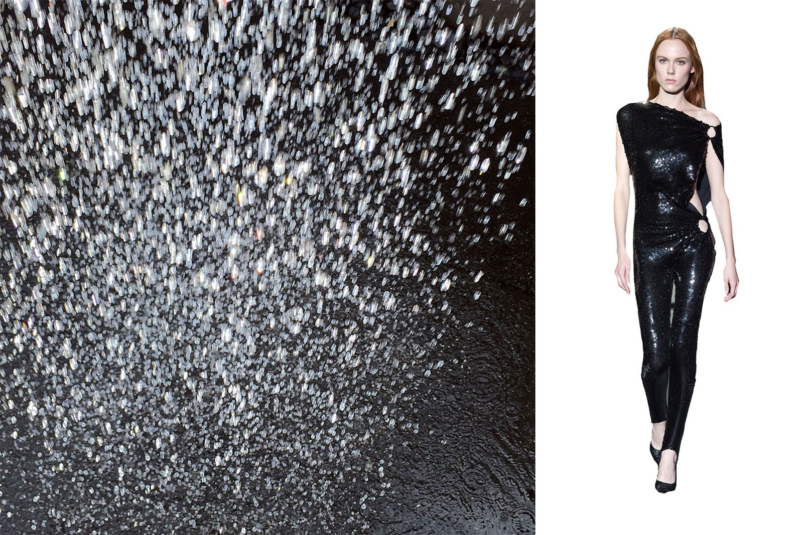
Providenciales, Turks and Caicos Islands, Photography by John Pawson; Paco Rabanne S/S18
8. Paco Rabanne
Julien Dossena chose this season to celebrate nightlife at Paco Rabanne, providing a welcome glimmer of glamorous disco-ball light amongst the dark. Dossena knows the power of glitter and sparkle; his strictly modern design sensibility never veers into the realm of the ludicrous, meaning that shining black sequins on a jumpsuit become dancefloor armour for she who wears it. Glamour, yes, but authoritative too, as black often tends towards in fashion.
Spectrum by John Pawson, published by Phaidon, is out now.