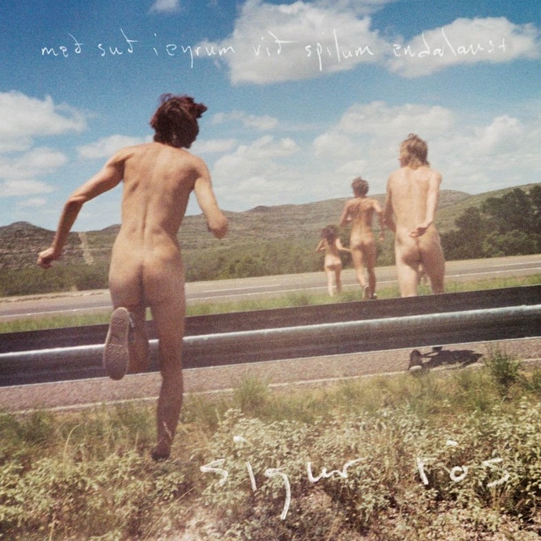
 by Sigur Rós)
Taschen's new book explores some of the most successful collaborations between visual artists and musicians, from Patti Smith and Robert Mapplethorpe to Wolfgang Tillmans and Tiga
For those who have always sought new sounds amid packed record displays, the initial encounter with a soon-to-be favourite album often hits their eyes before their ears. Reading Art Record Covers, then, is like the physical, 450-page incarnation of whiling away an afternoon browsing sticky shelves of album sleeves: occasionally letting a record reveal itself thanks to a pop of colour, or a weird design quirk, all the while coming into direct contact with some of pop culture’s greatest artists.
Exploring the relationship between visual art and music production, art historian Francesco Spampinato’s new tome – out via Taschen this month – is a detailed tribute to the collaborative relationship between contemporary art and the music world. It seems the right moment for such an examination: the end of 2016 saw vinyl album sales outstrip digital downloads for the first time, and many among a new generation continue to value the physical tangibility of record art above the ephemerality of streaming. From the bold femininity of Patti Smith as Mapplethorpe muse, to the quiet power of Gerhard Richter’s lone candle shining a light on Sonic Youth’s Daydream Nation, we delved into the anthology to discover the instant iconicity of some of our favourite artist-musician collaborations all over again.
 by Mason Williams)
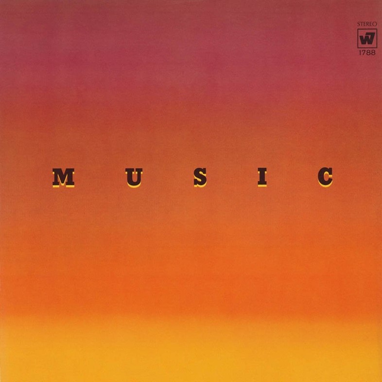
1. Ed Ruscha x Mason Williams
Back in the late 50s, conceptual artist Ed Ruscha and multihyphenate musician Mason Williams were just two childhood friends from Oklahoma with an LA state of mind. Since roadtripping to the city of angels together in 1956, the pair continued to produce genre-defying collaborations inspired by their surroundings, such as photo-text book Royal Road Test (1967). In 1968, Williams achieved monster success for his instrumental work Classical Gas; Music (1969) was released in the aftermath. The latter brought together the spacious vistas of Williams’ instrumentals with Ruscha’s own abstract landscapes, a cross between a billboard and a sunset that speaks to the Californian city they both loved.
 by Yo La Tengo)
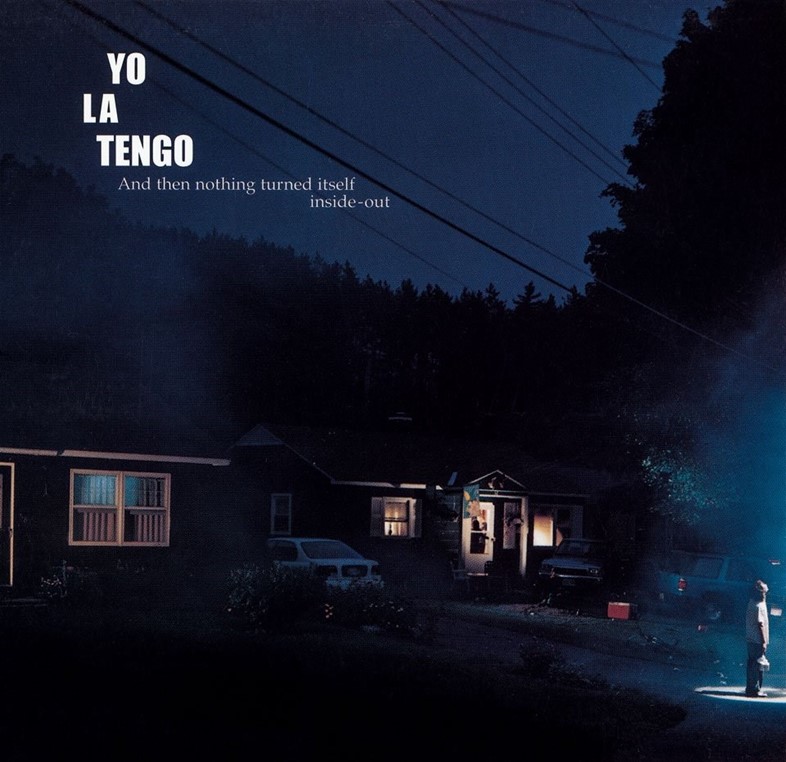
2. Gregory Crewdson x Yo La Tengo
Yo La Tengo’s atmospheric 2000 release, And Then Nothing Turned Itself Inside-Out, proceeds gradually, almost insidiously – like night falling on a small town cul-de-sac, this expansive record is as much about what we cannot quite make out, as what is on display. The album, then, is perfectly matched by photographer Gregory Crewdson’s beguiling tableaus of banal suburbia – here, our gaze is focused on the far right of a sleeve, where a floodlit figure stares upwards where we cannot follow their gaze. In fact, Crewdson was once on the other side of the vinyl sleeve – before he turned to photography, he was a member of New York band The Speedies in the 1970s.
 by Patti Smith)
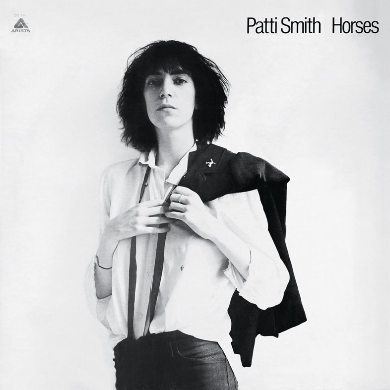
3. Robert Mapplethorpe x Patti Smith
Described by critic Camille Paglia as “one of the greatest photos ever taken of a woman,” Robert Mapplethorpe’s iconic portrait of his then-lover – and forever-soulmate – Patti Smith also served as front cover for her debut album Horses. In one image, the power of two singular visions in perfect harmony is instantly tangible: wearing a white shirt from the Salvation Army, this is the proto punk-poet painted in her truest light by the human who knew her best.
 by Black Flag)
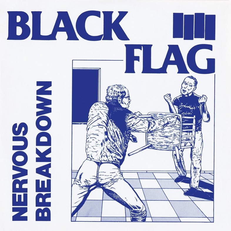
4. Raymond Pettibon x Black Flag
Unnerving and upfront, Raymond Pettibon’s deceptively simple line-drawings are a sucker-punch to American society. Now a majorly celebrated figure in contemporary art, in the late 1970s Pettibon came up in the SoCal underground as the visual answer to the riotous noise of punk bands like Black Flag and the Minutemen. As the younger brother of Greg Ginn, who co-founded Black Flag and STT records, Pettibon’s role as the scene’s visual draughtsman truly began when he coined the band’s name and designed its iconic four bar symbol. On Nervous Breakdown, Pettibon’s visual force is on full, provocative display – the school pupil cornered by his teacher representing the hardcore scene’s push-back against the establishment. Beyond Black Flag, Pettibon should probably be regarded as the punk grandaddy of 20th century record sleeve art: to date the provocateur’s vision has graced over 100 sleeves, from Sonic Youth to Foo Fighters and his own, self-released music records.
 by Sonic Youth)
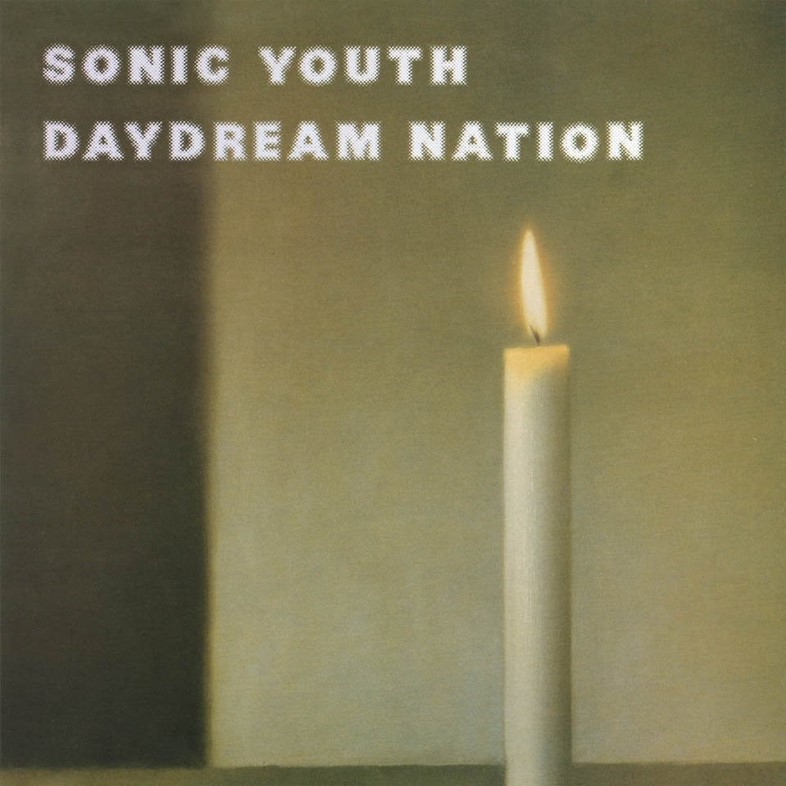
5. Gerhard Richter x Sonic Youth
Now instantly associated with Sonic Youth’s 1988 breakthrough album Daydream Nation, the candle flame of Gerhard Richter’s piece was originally one of the Cologne-based artist’s memento-mori photo-paintings, dating from 1983. That album opened with the jangly opening chords, and Kim Gordon’s matter-of-fact recitation, of Teenage Riot; Richter’s flame, quietly burning but presenting an ever-present threat, seems perfectly in tune with Thurston Moore’s and Gordon’s increasingly focused and thoughtful approach to punk politics on this album.
 by Disco Inferno)
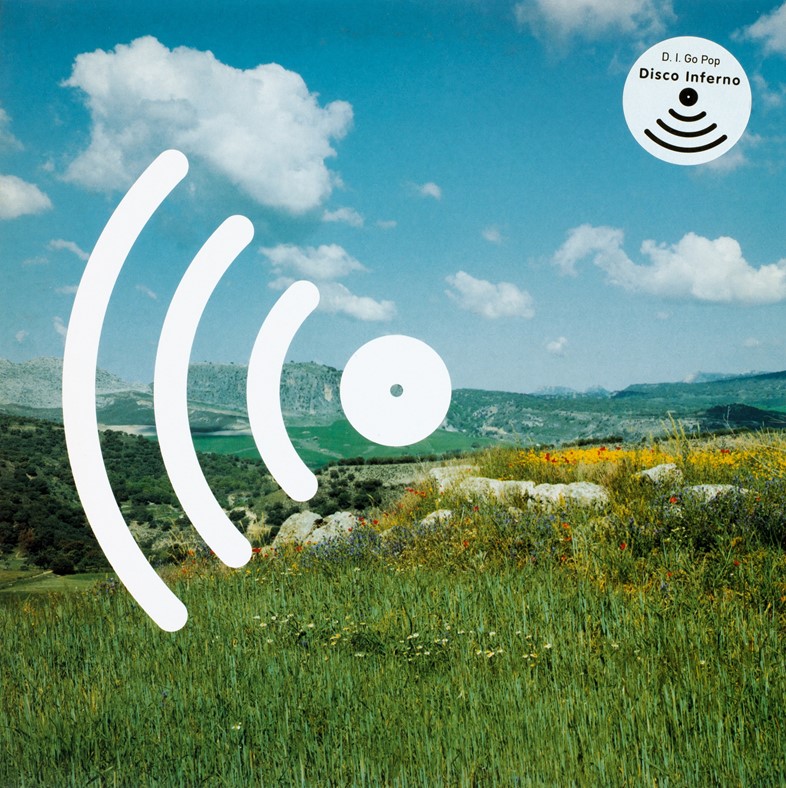
6. David Spero x Disco Inferno
Even in a Taschen tome of such visual and aural heavyweights, there’s room for the little guy – among which, the neat visual identity of shockingly underrated experimental indie band Disco Inferno stands out. Famously limited by a band name that confused audiences who passionately believed disco to be very much dead, Disco Inferno’s remarkable songs tell tales of average and disappointing everyday life. The songs on D.I. Go Pop ring with samples of environmental noises, from kicked footballs to breaking glass; similarly, photographer David Spero lenses everyday, perhaps overlooked landscapes in his practice. Topping it all is London-based design studio FUEL’s art direction, which saw the bold ‘Radar’ logo of the band superimposed on evocative scenes.
 by Tiga James Sontag)
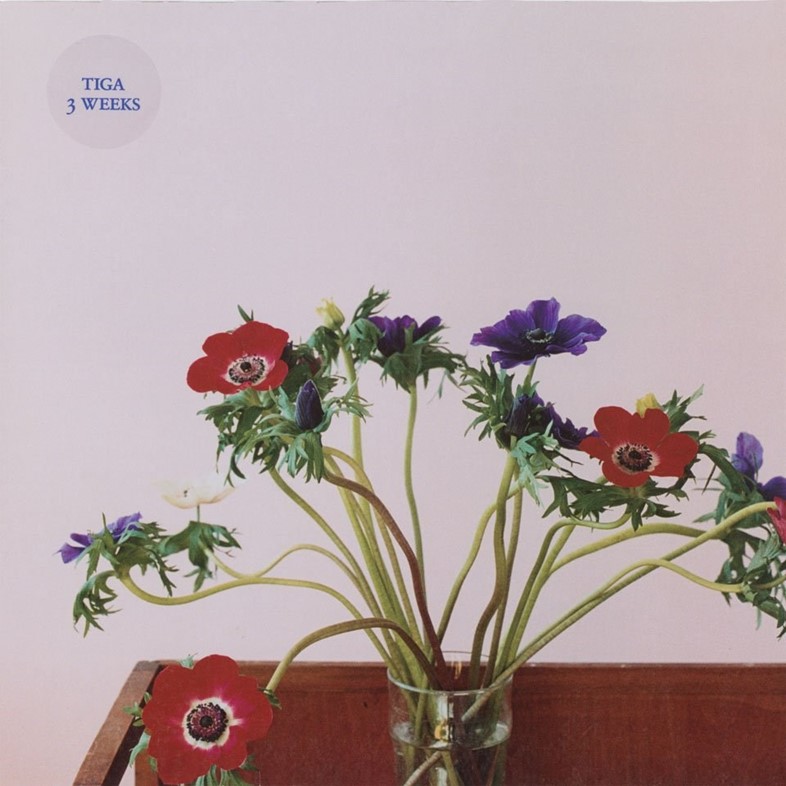
7. Wolfgang Tillmans x Tiga
With echoes of the painted roses that appear on the cover of New Order’s Peter Saville-concepted Power, Corruption and Lies, influential dance music artist Tiga James Sontag also tapped the simplicity of a sparse floral arrangement for his 2006 single, 3 Weeks. The image, titled Anemone II, is taken from Wolfgang Tillmans' series of flower photographs from a few years earlier, and unexpectedly communicates the fragile beauty in everyday encounters that could be said to bring Tillmans and Tiga’s initially disparate-seeming worlds together.
 by Beck)
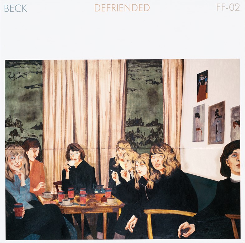
8. Karin Mamma Andersson x Beck
One of Sweden’s most revered contemporary artists, Karin Mamma Andersson’s works are imbued with a sense of rituals and gatherings of everyday life: the women of About a Girl, which covered Beck’s 2013 single Defriended, look like any group of friends on any given Saturday over the decades, gathered for tea around a table. These are paintings that are slightly unsettling in their familiarity – similarly, Californian multi-instrumentalist Beck has always allied his retro flair with a subtle futuristic lean that constantly surprises.
 by The Buzzcocks)
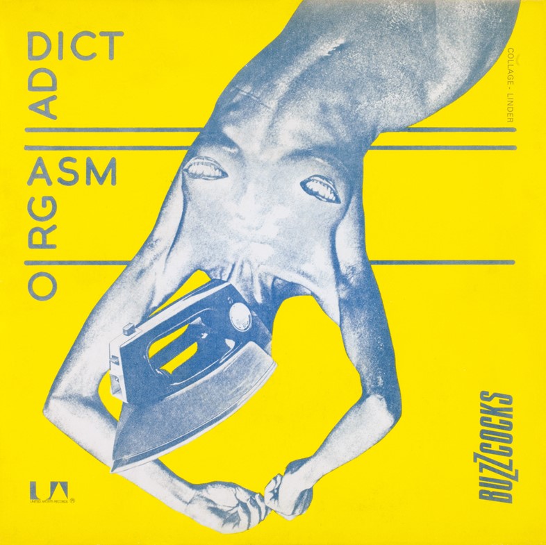
9. Linder x The Buzzcocks
Iconoclastic artist and musician Linder forged her reputation in the punk and post-punk scenes in the North of England in the 1970s, where her collaged visual language soon became synonymous with the rip-it-up-and-start-again ethos of bands like the Buzzcocks. Her design for that group’s first single, Orgasm Addict, saw a female figure with an iron for a head and smiling lips for nipples: an image that burned-canary yellow onto retinas in record stores up and down the country, and made a statement for an underlying feminist agenda in a punk movement where women’s key involvement has since been too often erased.
 by The Red Krayola)
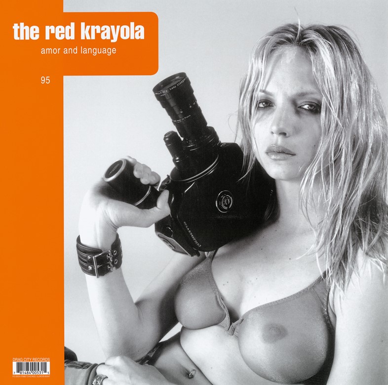
10. Christopher Williams x The Red Krayola
Anticipating the post-punk and no-wave scenes of the 1980s NY underground by some years, The Red Krayola – formerly The Red Crayola – were a Texan psychedelic rock band led by singer/guitarist and visual artist Mayo Thompson. Known for enigmatic and controversial album art, the Christopher Williams-shot cover for 1995’s Amor & Language is one of their most direct critiques on the visual language of advertising. The semi-nude, “unknown” girl brandishing a camera is in fact his sister, supermodel Rachel Williams. Having risen to fame modelling for the likes of Vogue, Elle and Calvin Klein, Williams for once holds the camera, and seemingly the power, in her own hands – a subversive comment on the mantra that sex sells.
Art Record Covers, written by Francesco Spampinato and edited by Julius Wiedemann, is out now, published by Taschen.