
Ana Kinsella analyses the cultural significance of the flesh-tone spectrum through fashion, music, art and design
On the face of it, purchasing ballet shoes should be a straightforward process for a professional dancer. Yet, this simply wasn't so for the likes of Eric Underwood, a black American soloist for The Royal Ballet. Exasperated with the rigamarole of painting peach-tone ballet shoes with makeup for every performance, he joined forces with the respected Australian dance shoe brand Bloch, to create what they describe to be 'the first ever flesh-tone ballet slippers for black skin'. Now, not only will non-white ballet dancers have an easier option for their performances, some progress has been made in making the world of dance more inclusive on the whole.
As long as systemic racism has existed, issues of contextual representation have proliferated. How can we properly pay heed to diversity in art? What can be done about instances where art and culture aren’t representing this well enough? Even today, while more efforts are being made to represent a broader spectrum of colour, Googling 'flesh tone' still brings up more peachy beiges than it does any of the other shades visible in society. In the past, the concept of flesh tones has been fraught in art and culture as it is in life itself. Looking to the future, the question remains: how do we create a more balanced, fairer and more inclusive illustration of colour and skin tone?
In Fashion
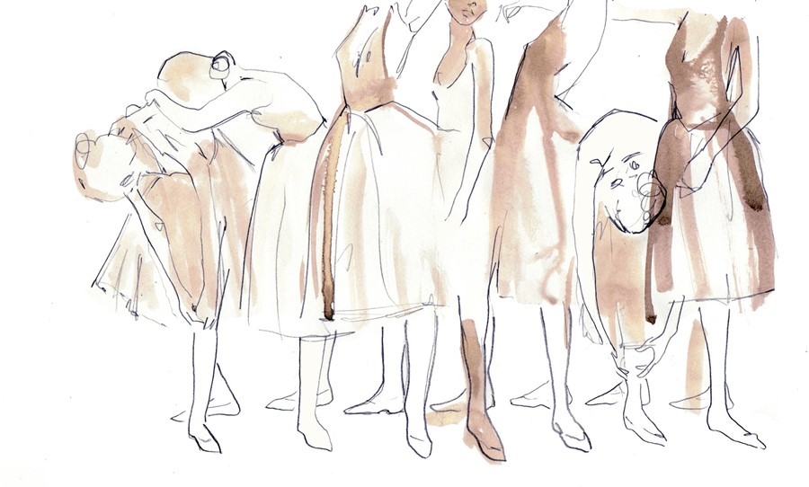
For a long time, the issue of 'nude' as a colour served as a way to highlight fashion’s fundamental problems with language and representation – if nude can only mean beige, oatmeal or peach, what does that say about the outlook of she who uses that term? Is fashion only for people with certain skin tones?
Today, we are hopefully moving towards a broader, more inclusive view. We can recognise that nude, as a word signifying a shade, can mean whatever colour your skin says is neutral. It’s a small step for an industry often mired in racism and issues of representation, one made by designers like Christian Louboutin, who now offers his incredibly popular range of patent leather platforms, beloved by the Duchess of Cambridge and Scarlett Johansson, in colours that go from cream and sand through to caramel and coffee. Each shade is called Nude, with the differences marked by numbers – reclaiming the word from its sole usage as beige or biscuit. It’s a beacon of hope that fashion’s default shade will no longer be for white skin.
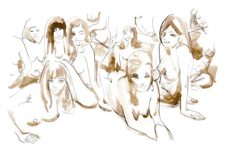
The late fashion photographer Deborah Turbeville put the female form in a range of shades on centre stage in her 1975 Bathhouse Series of images, shot in a changing room in a New York swimming pool. Even in black and white, the models’ bodies are expressive and evocative, individually and taken as a group. Languidly they pose around the tiled bathroom, a certain romance in their physicality together.

In the Digital Landscape
For artists and photographers who work with the female nude form, skirting Instagram’s stringent censorship rules can become a defining parameter for their work. Nate Walton, who shoots for Playboy and American Apparel among others, employs well-placed creases, stray branches or simply a digitally-imposed white line, to maintain a level of decorum amongst the models he works with. The same atmosphere of revelatory intimacy is there in Kava Gorna’s feed, where bras and briefs leave enough flesh visible to create a feeling of radical nudity. The line between decency and NSFW has never been thinner. The images, individually and seen in a stream, are undeniably sexy, and the missing pieces that keep them from crossing that line are a fundamental part of what makes them so intriguing and alluring.

In Music
The naked body has found its way into album art repeatedly over the years, lest we need a reminder that sex itself sells. But never has the colour of the body seemed more dynamic and resolute than on Grace Jones’s 1985 album Island Life. Shot by Jean-Paul Goude – itself an illusion created from several different photographed poses – Jones seems as supple and superhuman as she possibly could. Goude however has been rightly criticised for his exploitative, objectifying view of black femininity, something that underlines most of his body of work. Regardless of whether his images of Jones have lasting iconic appeal, that troubling aspect of Goude’s work can’t be erased or forgotten.
The Jimi Hendrix Experience's Electric Ladyland (1968) ended up being banned in some UK stores for its provocative cover art, in which an array of naked young women smile for the camera, some holding pictures of Hendrix and his records. It wasn’t the vision Hendrix himself had for the record, either – that would have been a simple Linda McCartney shot of the band in Central Park. It has since gone down as one of music’s more controversial covers, and rightly so: the image of raw sensuality it conveys has an unnerving power that goes beyond the confines of the album sleeve.

In Art
Contemporary portraiture necessarily evokes the relationship between a subject’s skin and their identity. Lucian Freud and Lynette Yiadom-Boakye are just two examples of portrait painters who excel at representing their subjects' character through flesh. A life’s depth, with the expansions and contractions of emotion and memory, comes through in the way both painters render the body, whether nude or clothed, before them.
Though he deals chiefly with colour, light and space, James Turrell’s visionary installations aren’t exempt from the influence of the body. Turrell proposed running naked tours of his retrospective at the National Gallery of Australia in 2015 as a way of investigating the naked body’s relationship with light itself. Immersion in fantastical colour can become a levelling force for the viewer, regardless of who they are and what they look like.
While the concept of flesh-tone colours are predicated on the body and the skin itself, their versatility outside that is evident in JMW Turner’s seascapes and landscapes. The abstraction of these neutral colours into images of nature in tumult, from palest oatmeal through to deep browns, in paintings such as The Morning After the Deluge, allow Turner to form a vision of colour in the natural world and, of course, in the eye itself.