
“I don’t like coffee table books,” says Irma Boom, one of the world’s greatest book designers. “Books need to be read and used. That’s why you make a book.”
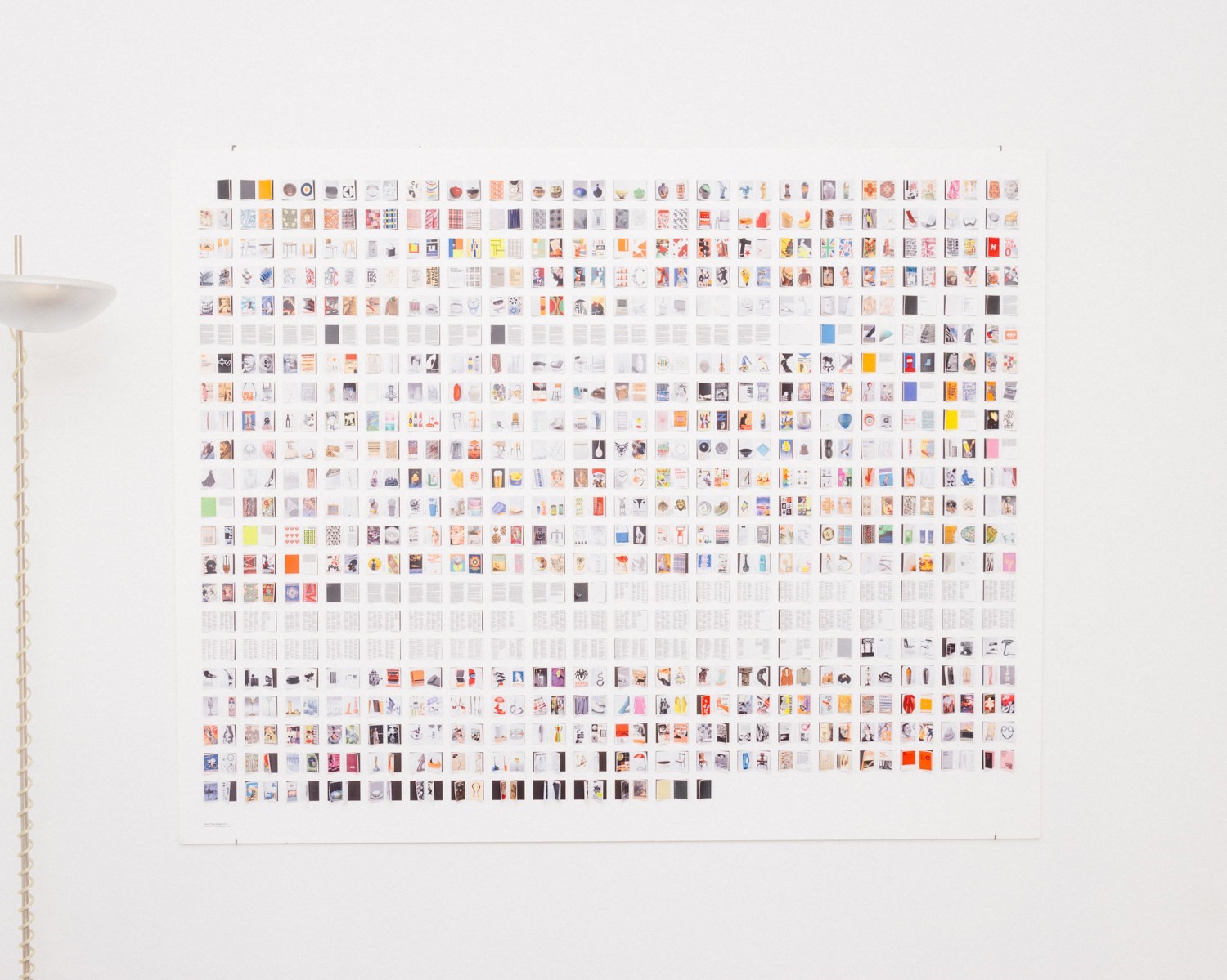
Boom has been described as the ‘Queen of Books’ – a nickname which sums up a 30-year career encompassing more than 300 of them, each a unique experiment. Boom does not like to repeat ideas.
“Already when I was an intern they called me ‘queen’. I don’t know why. 30 years later… Maybe I’m really sort of the advocate for the book? Maybe that’s it,” says Boom. “Books are a tool. Books really do something. And I think that is what you see here,” she says, gesturing to the table in front of us, which is now strewn with them. Many of these have won awards: in 2001, she was named the recipient of the Leipzig Gutenberg Prize for ‘outstanding services to the advancement of book arts’.
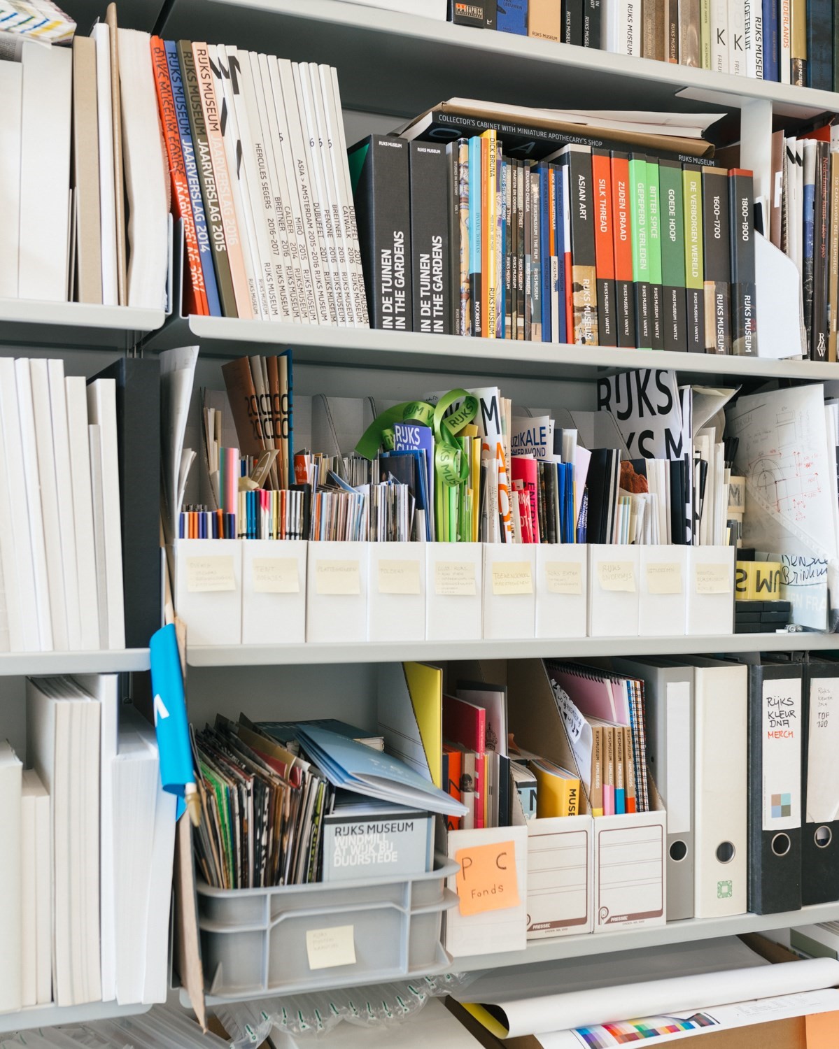
Currently, Boom is in the final throes of a project and very busy, but she is still warm and generous with her time, jumping up to pull books from their shelves in her Amsterdam studio as she tells the story behind each one. Her list of commissioners and collaborators includes artist Olafur Eliasson, designer Hella Jongerius, and brands like Vitra, Ferrari, and Chanel, for which she created a book entirely in white, with all of its content written in embossed paper instead of ink, to represent the idea of a scent – invisible but present. Her book for Sheila Hicks, Weaving As Metaphor, with its blind embossed cover and page edges that form a visual poem based on the artist’s textiles, helped elevate the artist’s career and is now in its fifth print run – an unusual feat for an art book. Boom is a regular collaborator with architect Rem Koolhaas, and has worked with The Stedelijk Museum, Fondazione Prada and MoMA, as well as private individuals and families on deeply personal projects. She also works closely with the Rijksmuseum, the Amsterdam institution for which she created a new, controversial logo in 2012 (splitting the Rijks and Museum into separate words), and continues to design books and exhibitions.
Boom is a designer, but she is also an editor, writer, visual artist, researcher, archivist and critic, depending on what the project demands. She chooses her commissions on instinct, refuses to compromise on her ideas, and is ardent in her belief that books should be experimental in their form.


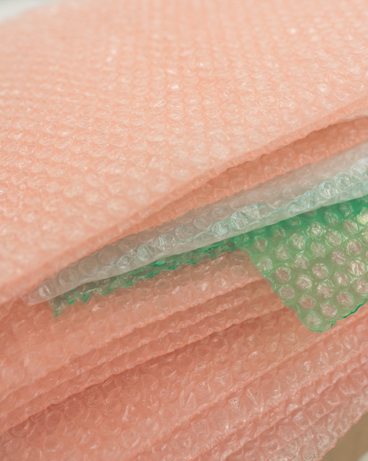
Some take years to develop, like her latest for the Dutch fashion house Viktor & Rolf, which is about as far from the traditional idea of a “book” as it’s possible to get. Entitled Viktor&Rolf Cover Cover, it is made entirely of covers, building on the idea of clothes as a form of covering and as layers. It is stitched together by hand and wrapped in transparent, flexible pink plastic – an incredibly complicated thing to make.
“I’m looking for something specific for each book,” says Boom. “That’s my job. I try to keep the book vital. I make books where it’s relevant to print and to make it in paper. I don’t make PDFs!”
She made a full-scale mock-up of the book by hand to show the fashion designers how it would work, and makes similar models for every project, as well as creating mini protoypes to work through and demonstrate her ideas.
“I always design in a book,” she explains. “I don’t design on a computer, I design in paper. For me, that’s really important. I’m not making something flat on the screen, I’m making a three-dimensional object. That’s what a book is.”

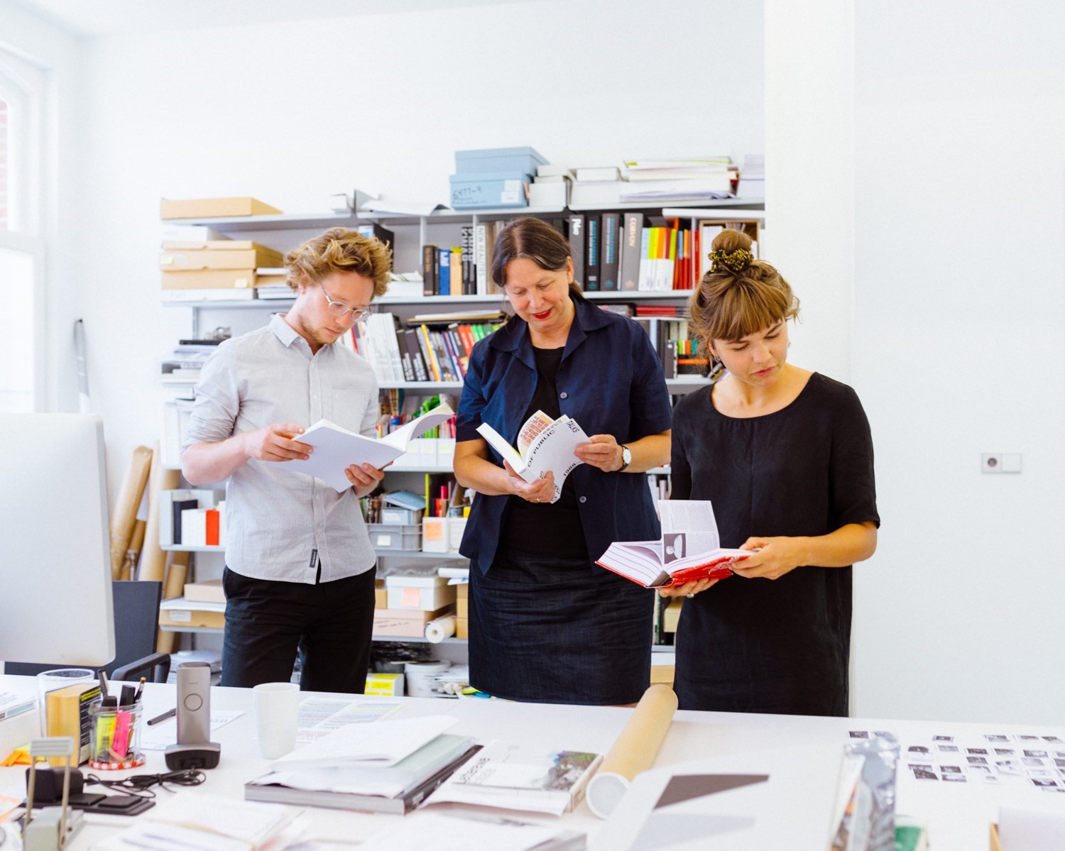
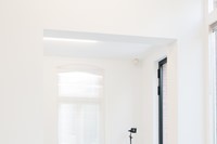
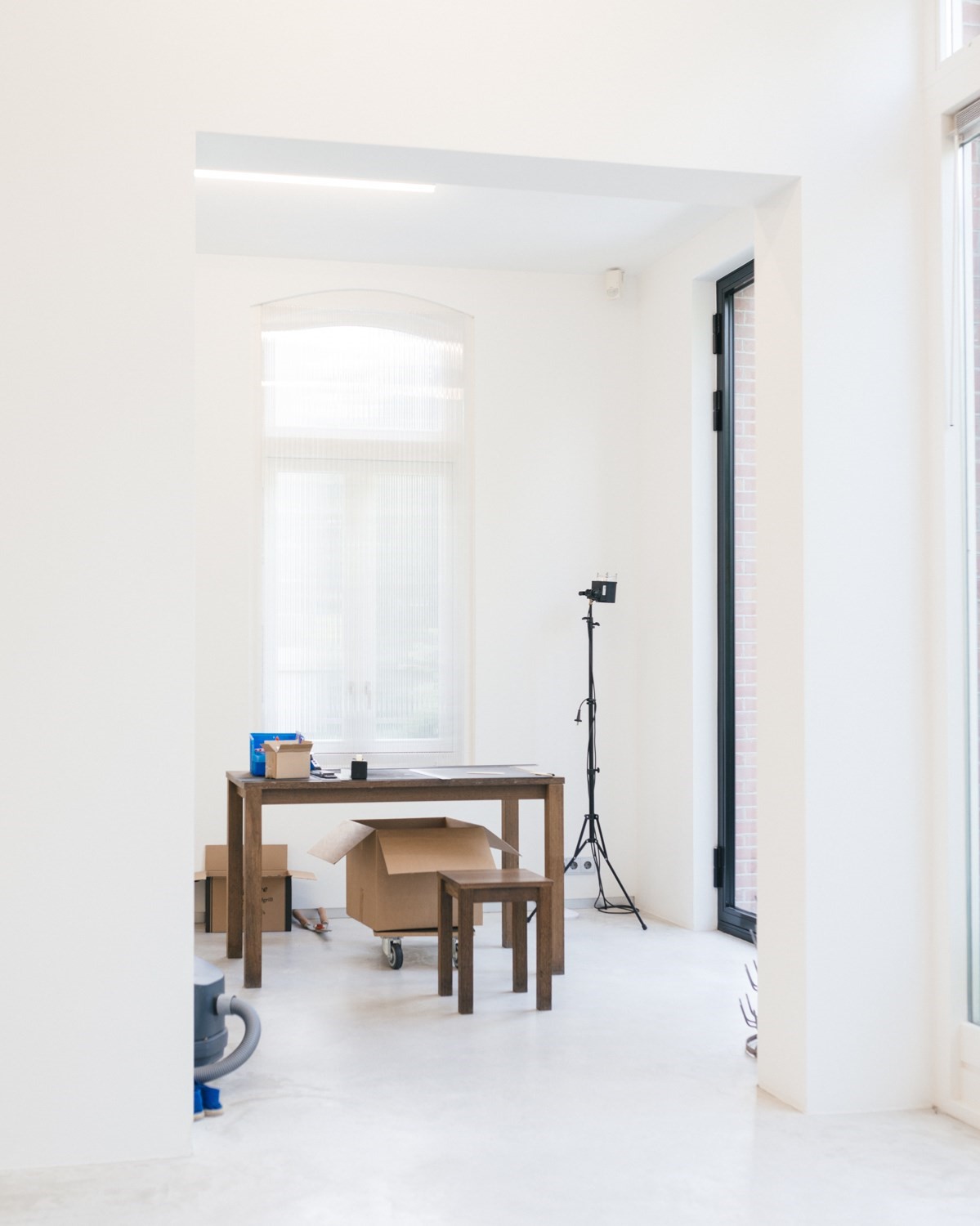
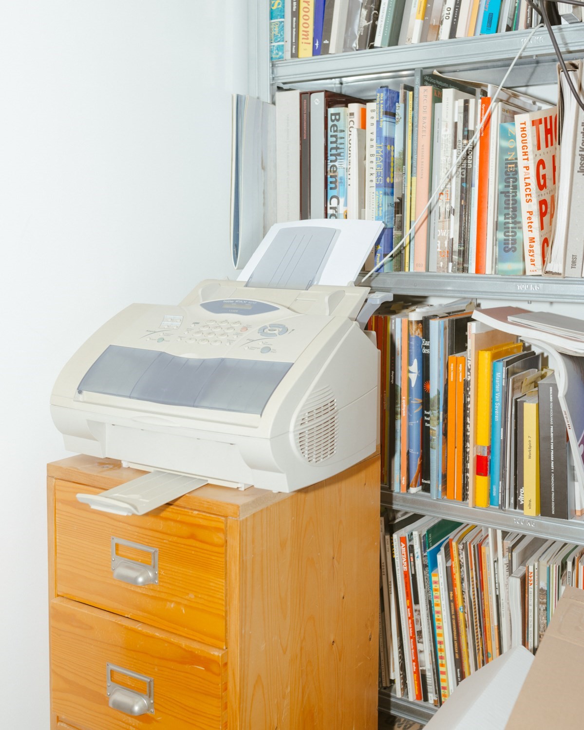
Boom has lived and worked in the same Amsterdam townhouse for 13 years with her partner, gallerist Julius Vermeulen. Four years ago they bought the house next door and knocked the two together, with an extension designed by Barend Koolhaas, Rem’s nephew. The old studio is now a kind of work-in-progress and storage area, while a bigger, sunnier space next door is the real workspace. A strikingly modern, concrete structure leads up to Boom’s library and Vermeulen’s gallery EENWERK.
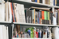
The library is meant to be a resource where designers and researchers can handle rare, experimental books without white gloves. “I buy not so many books,” says Boom. “Only books for my library: books from the 60s, which are amazing – they had freedom – and some old books from 1400, 1500, the first printed books, also amazing. Those are basically my references. And art.”
On the top floor is an unexpected greenhouse, where the couple are growing aubergines, cucumbers and an abundant crop of tomatoes. While we’re talking about books, Julius pops in and out to talk about what to buy for dinner and ask questions about the day. The couple joke with each other, slipping from English into Dutch.
“Julius’ father was a very good novel designer,” says Boom. “He made very famous covers. I went to art school to become an artist and because of Julius’ father’s work, which I got to know at art school, I became a book designer. And years later I met the son. Isn’t that amazing? He’s a very good critic for my work. He helps me a lot.”


Born in the Netherlands, Boom originally studied art at the AKI Academy of Art and Design, or ArtEZ, before switching to graphic design after walking in to a lecture about book design. After graduating, she joined the Dutch Government’s now defunct Publishing and Printing Office, where she was given the chance to design the prestigious annual stamp catalogues for the postal service. The result was controversial. Boom explored ideas of copying and inspiration and created a book with texts printed along the edges, page numbers hidden between French folds and images that were photocopies of other books and artworks. “Everything I did was criticised," remembers Boom, "but if I look at it now it looks still fresh as if I made it today.”
Her first independent project was for the coal power company SHV. Intended to be a celebratory catalogue to make the company’s anniversary, it turned into a more philosophical book, using a series of questions to determine the structure. She refers to it as a tool, a sort of handbook for the company. The project, which Boom researched and edited with historian Johan Pijnappel, started in 1991 and was eventually published in 1996 with 2,136 pages – and no page numbers. The cover was pristine white, the idea being that fingerprints would make it dirty over time, like coal dust.
The Architecture of the Book, her self-designed monograph, is a tiny object. Boom is obsessed with structure, with size and scale. Many of her decisions are guided by her interest in the number three: ”In Indian numerology, it’s the unity. A sort of perfect unity. Basically, the books I make are based on that idea.”
“If you make a book it is about size. It’s about three-dimensionality. That’s the same as architecture. It’s about scale and about proportion.”

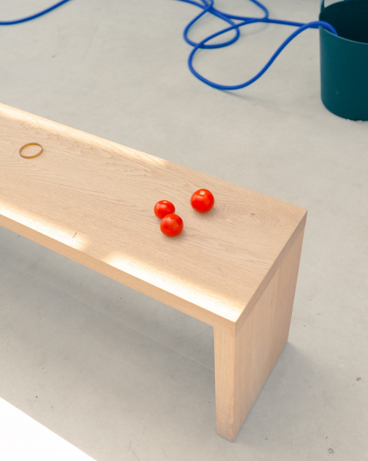
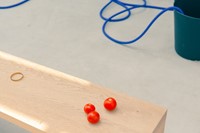
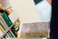
One of her next projects is laid out in front of us in a beam of sunlight to test the cover colours for fading. Elements of Architecture is a revision of the book series she created in collaboration with Koolhaas, Harvard University students and a large team that worked on his Venice Architecture Biennale in 2014. At 2,600 pages, it is in one of her biggest projects to date. Koolhaas lives around the corner, and regularly drops by to work on their collaborations. Like Koolhaas, Boom never really stops working.
“I cannot do anything without going for it,” she says. “If you don’t go for it, why do it anyway?”
Viktor& Rolf Cover Cover is out now, published by Phaidon.