)
The spring/summer 2012 show has produced a number of beautiful and intriguing invitations, but standout was Givenchy designed by M/M (Paris). Here, AnOther speaks to the French graphic design duo and reflects on Riccardo Tisci's latest collection...
The spring/summer 2012 show season has produced a number of beautiful and intriguing invitations, namely Prada's 50s car inspired design and Dries Van Noten's transparent cityscape. One standout example came courtesy of Givenchy, designed by M/M (Paris). The French design duo, established in 1992, have worked on a variety of fashion, art and music projects, notably campaigns for Balenciaga and Calvin Klein and their own fragrance in partnership with Byredo and Björk's Biophilia album. The pair have a longstanding relationship with Riccardo Tisci and have designed men's and women's ready-to-wear and couture invites for the house, for almost the same time as the designer has been at the helm.
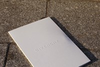
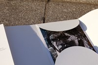
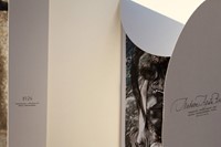
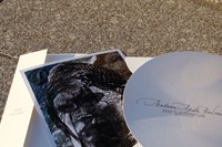
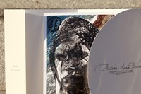
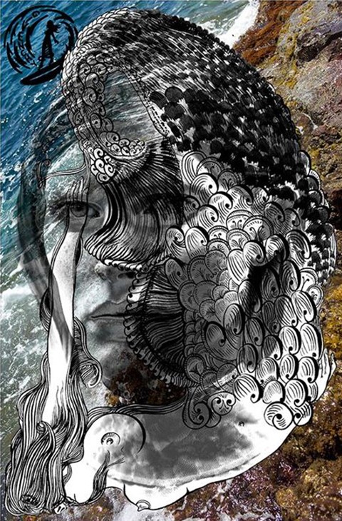
The S/S12 womenswear invite is two-part: a white envelope with curved edges with details of the show and seat number, and inside, a M/M (Paris) artwork. As well as delivering the all-important details of the show, invites traditionally provide the first clues to what is to come. M/M (Paris) think laterally – they take Tisci's key theme and translate them, as Mathias explains: "The idea is for us to interpret Tisci's main inspiration, not just produce a corny illustration." This season, Tisci looked to the water world – a major trend for the upcoming season, also seen at Peter Pilotto, Versace and Karl Lagerfled for Chanel. The show, which took place on Sunday evening, saw Tisci move away from the striking print work central to his previous women's and men's shows, and focus on tailoring, introducing a lighter colour palette. Tisci's moodboard of surfers, mermaids and sea animals resulted in black tuxedo jackets with eel skin panels, a cotton piqué polo shirt matched with hand-painted sea wolf, a degradee silver sequined pantsuit, ocean wave edged jackets and giant shark tooth pendants.
Here, AnOther caught up with one-half of M/M (Paris, Mathias Augustyniak, to discuss the ideas, process behind the Givenchy S/S12 invite, their thoughts on the secret of a succesful invitation and their upcoming 20th anniversary.
Can you describe your working process on the Givenchy invitation?
We were briefed on the S/S12 show just after the couture show in July. What's interesting about Riccardo is that there are always idea threads between his collections (men's, women's and couture) so at the couture show, we started to think about ideas (in particular, a scaly-type fabric) and also Riccardo's key words for S/S12, the "surfing mermaid". We don't get to see the S/S12 collection beforehand because the production times are too tight but we always attend the shows, as it's important for us to keep in tune with what Riccardo is doing. During a summer holiday in Côte d'Azur, I was on some rocks by the sea and realised it would make a perfect image for the background of the invitation. The portrait of the girl on the artwork was from the Givenchy couture collection, and the mermaid illustration (arranged upside-down over the girl's face) was done in September. There are layers in a physical sense but also in time, over the period that the invite was created.
You have a longstanding working relationship with Riccardo Tisci – what is it like working with him?
We know him so well now – it's a bit like a football team; the players know each other so well, they play a great game together. We spend a lot of time talking to him, discussing ideas – it's always an ongoing conversation and then we avoid misunderstandings. Previously for ready-to-wear, we've done stars, a mask, a handkerchief. Riccardo thought it was enough variation, he thought it too confusing and we agreed. We decided to introduce a formula that we would stick to: to present ready-to-wear show invitees with a 'gift'; an artwork presented inside a folder. For couture, it's a type of broadsheet, a poster; an evocation of a woman or a mood. We like the idea of giving people a special souvenir each season. For the ready-to-wear design, we reversed the idea of the traditional invite format: the folder or envelope is the important information bit that one takes to the show and the inner (the artwork) is the part you keep at home, the "object".
This particular invitation has caused quite a stir – were you surprised at such a positive response?
We both didn't expect it to such a success – Michael said the other day 'Everyone's raving about it!' I've been wondering what made this stand out from the others – maybe it has all of the right ingredients. I guess it's the same for a singer or a band – one record can be a huge hit.
You've been designing show invitations for many years – what's the secret to a good design?
A good invitation shouldn't be an illustration of the show – it is a standalone object, like a film poster or a record cover. You can have a record that has a sound and has a vibe and then a cover that has a complimentary vibe to something that hasn’t got any view attached to it. A ready-to-wear collection or a representation is something extremely ephemeral. It's so complicated to produce an image of a show – it's best to translate an idea and produce something one will keep and remember the collection by.
It's your 20th anniversary soon – what are you doing to celebrate?
We're currently working on a monograph, edited by Emily King and published by Thames & Hudson. It's a big job because it involves us going through a lot of work, including the invitation designs we've done over the years and work for clients such as Yohji Yamamoto and Martine Sitbon.
M/M (Paris) upcoming book will be published in spring 2012 by Thames & Hudson.
Text by Laura Bradley