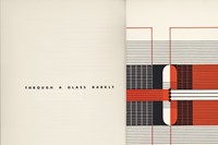
More Careful, Th)
A unique selection of graphic design reflects morphing Californian culture during the twentieth century
California’s lack of terra firma has left the Golden State predisposed to reinvention, paving the way for new and vibrant innovation. Earthquakes, Mudslides, Fires & Riots, edited and designed by Louise Sandhaus, renders the unstable evolution of Californian graphic design between 1936-1986. Taking hold of the Left Coast’s counterculture aesthetic, the volume correlates renderings from Haight’s hippy culture alongside the sleeker compositions of Palo Alto’s high-tech industries. This mecca of consumerism and new ideas propelled an enormous body of distinctive graphic design in California throughout most of the twentieth century. Here, the California New Wave aesthetic of the 1980s is placed amidst a raucous gathering of designs by Merle Armitage, Alvin Lustig, Herbert Matter et al. A “dinner party that serves only desserts,” it is a celebratory journey through iconic and beautiful design.

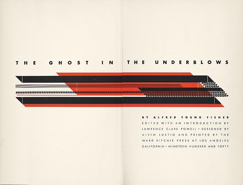
Ward Ritchie and Alvin Lustig
Ward Ritchie was an independent and adventurous publisher and printer; Alvin Lustig played a crucial role in giving American design a modern face. They collaborated on The Ghost in the Underblows, a suite of books containing the eponymous poem by Alfred Young Fisher. Ritchie, who printed the book at his press, requested that Lustig design a different type-ornament composition for ten of the books. According to Ritchie, while others had used “printers flowers” for centuries, nothing comparable to Lustig’s arranging the texts themselves in decorative design in lieu of illustrations had ever been done. “He created a new art form, virile, abstract, and colourful,” Ritchie recalled. In the end, Fisher’s poem never found success equal to the designs of its publication.

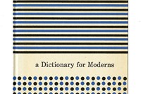
Louis Frimkess, Ken Parkhurst and Edd Smith
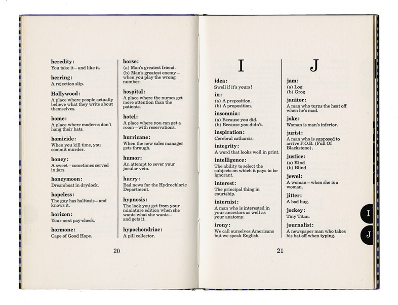
Frimkess, an advertising art director, Smith, a typographer and designer Parkhurst created the collective Advertising Designers, revolutionising annual-report design and transforming bland legal documents into flashy PR vehicles. A Dictionary for Moderns, written by Hal Stebbins, presents a cynic’s worldview, with charming but wry slogans such as “Advertising: Free speech – except that you pay for it,” “Ears: Through these portals pass the most beautiful lies in the world,” and “Hollywood: A place where people actually believe what they write about themselves.”

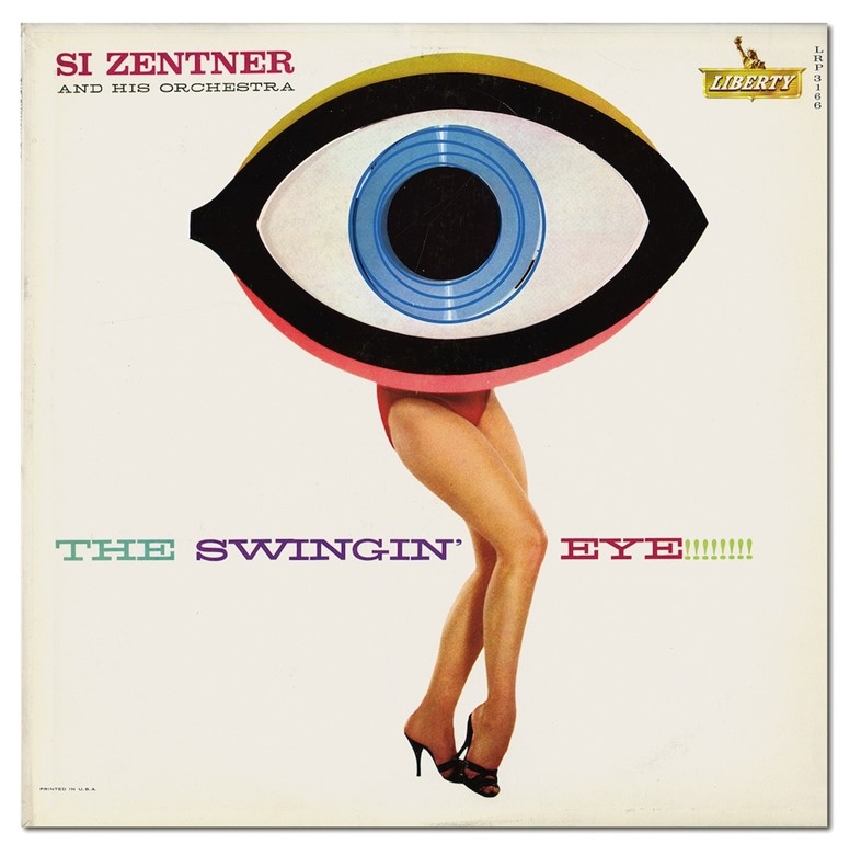
Bill Pate and Gene Howard
In the 1950s, one of the most prolific teams producing LP record covers was the design group Pate/Francis and photography studio Garrett-Howard. In the early 60s, the foursome added designer and art director Leo Monahan to form Group Five, though Pate and Francis left shortly afterward. With their instinctive, just-go-for-it creative process, Group Five produced as many as 350 album covers a year, for the Rat Pack, Nancy Sinatra and Dino, Desi & Billy and the Beach Boys. “They invented so many style genres that they may be the single greatest pop culture innovators of all time.”

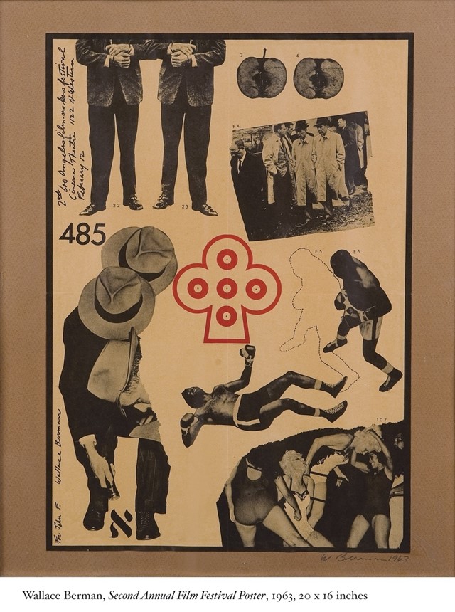
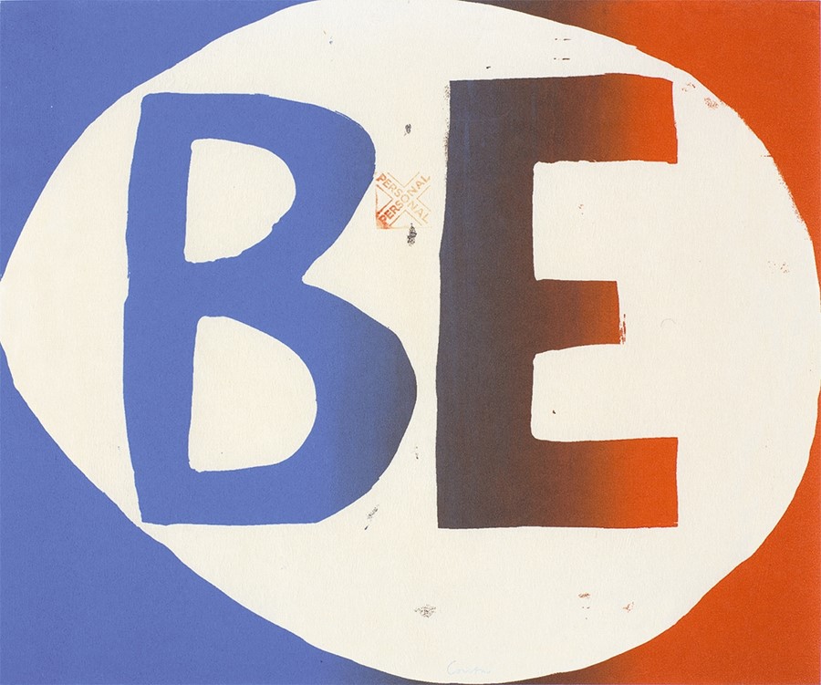
Wallace Berman
As a fine artist interested in graphics and graphics-associated production forms – handwriting, typography, photography, appropriated imagery offset lithography, and letterpress - Berman preferred the simple, direct images and just-the-facts-ma’am lettering. With a particular affection for boxing posters, especially those from Los Angeles in the 1940s - 1960s. Berman’s efforts at ephemera, which cross the line between art and graphic design, are best represented by Semina, the zinelike publication that he assembled between 1955 and 1964 in Los Angeles and San Francisco.

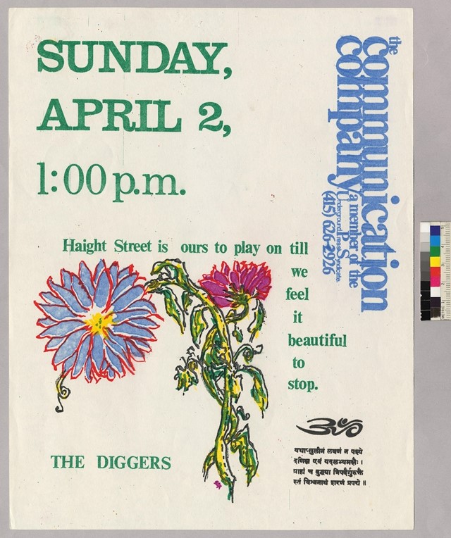
Claude Hayward
In 1963, Claude Hayward moved to California in search of what he called “the door to the underground.” Three years later, he met science fiction writer Chester Anderson, a denizen of the psychedelic mecca that was San Francisco’s Haight-Ashbury. With a mutual vow to provide people the “means to compete with the Establishment Press for public opinion,” they launched the Communications Company. “Love is communication” was their policy, an agenda Joan Didion viewed with a cold eye in her description of the group in her famous, and famously skeptical, essay “Slouching Towards Bethlehem,” about the social shifts in San Francisco at the time.

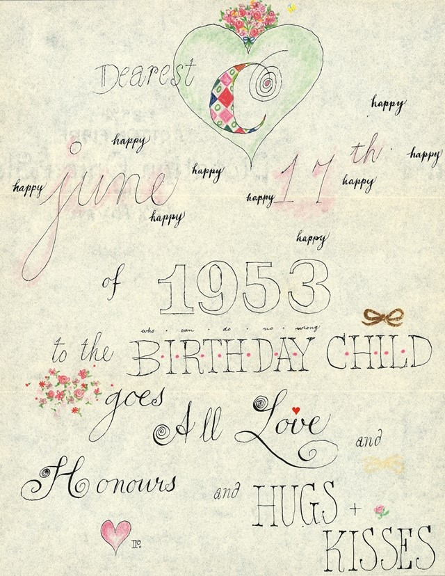
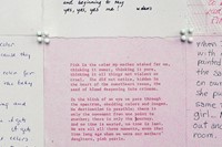
Ray Kaiser Eames
For many years, people assumed Ray Eames was Charles Eames’s brother – in fact she was his second wife and design partner. And despite all obvious indications of her importance, it wasn’t until Pat Kirkham’s 1955 biography, Charles and Ray Eames: Designers of the Twentieth Century, that Ray’s role in the Eames studio and her contributions to design became more widely understood. Although originally interested in engineering, Bernice “Ray” Kaiser later studied painting with Hans Hoffmann in New York. With her sharp eye for colour, shape, texture, letterforms and composition, Ray also applied a loving hand to her many activities and creations, professional or personal. These letters to Charles are just one such example.

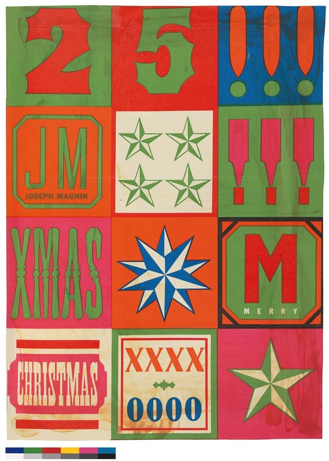
Marget Larsen and Betty Brader
In the 1950s Marget Larsen took a job at Joseph Magnin, the “hip” department store that was responding to the young, post-war, baby-boomer consumer. Larsen was hired by JM’s visionary founder, Cyril Magnin, who teamed her with in-house advertising manager Toni Harley and illustrator Betty Brader. Together they transformed the bland and tasteful retail fashion advertising into bold, colourful, dynamic ads that made both shoppers and designers look twice. Whimsy and inspiration ruled. The women’s memorable graphic compositions garnered praise from the design community and the fashion trade and were prized, pinned-up, and republished by their fans.
 More Careful, Th)
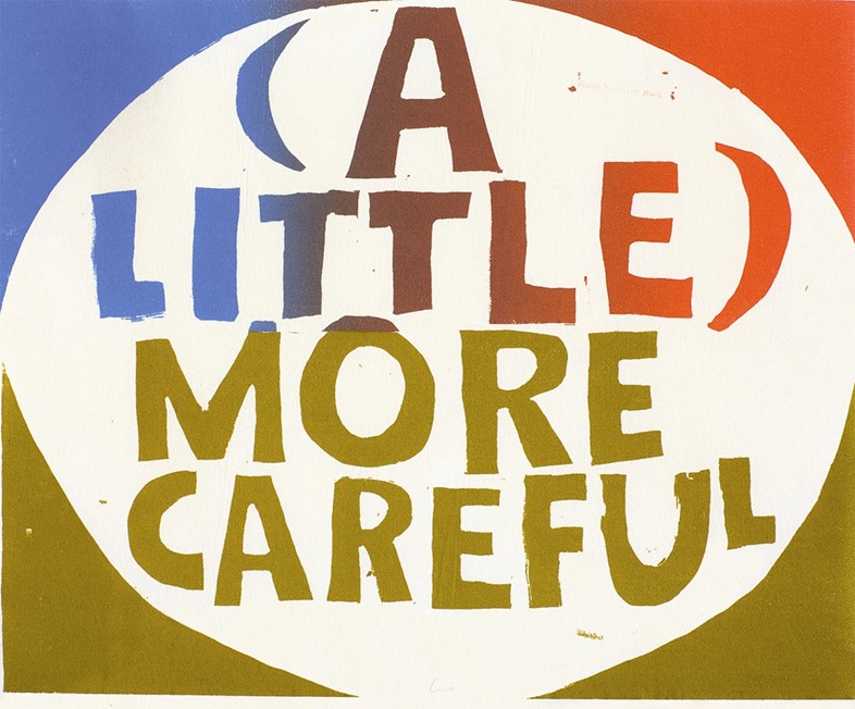
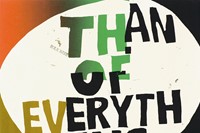
Sister Corita Kent
Introduced to silk screening at the University of Southern California in 1951, Corita's iconography departed radically from the usual Christian-themed depictions of crucifixes and Madonnas. In 1954, she began to combine typographic elements in the form of inspirational phrases – religious and secular – with her formally sensitive and playfully abstract imagery. Corita took the flotsam and jetsam of daily life and invested its seemingly banal messages with the spiritual and profound. She was also deeply influenced by Charles Eames, whom she credited with inspiring her to live out the Balinese credo “We have no art, we do everything as well as we can” and to make connections between unrelated ideas.

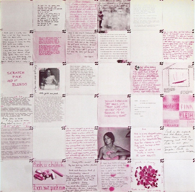
Sheila Levrant de Bretteville
In 1971, de Bretteville formed the Women’s Design Program within the Californian Institute of the Arts, followed two years later by the landmark Women’s Design Program. Her interest in design’s potential for inclusiveness then led her to co-found the landmark Women’s Building in Los Angeles. The environment and programming there allowed de Bretteville to focus on developing a graphic language that was less about satisfying the designer’s aesthetic interests and more geared toward giving voice to the aesthetics and interests of others.
Earthquakes, Mudslides, Fires and Riots is out now, published by Thames & Hudson.
Compiled by Gillian Hopper