, 1968, acrylic on canvas)
This article is taken from the Spring/Summer 2021 issue of AnOther Magazine.
David Hockney is perhaps Britain’s greatest living artist. The Bradford-born Royal Academician graduated from London’s Royal College of Art in 1962 with a gold medal for his year and his place already cemented in the British pop art scene. He secured his first gallery immediately upon graduation and his output has continued at full throttle ever since. To call Hockney prolific would be an understatement, but the influence and emotional power of his most important works are anything but ephemeral: they endure. A pluralist long before the term became as overused as it is today, Hockney has experimented with photo collage, video, multi-canvas landscapes, iPad drawings, hyperrealism, abstract expressionism and set design for opera. He bounds between visual styles and media, from high to popular culture, his extraordinary sense of optimism and beauty and hugely perceptive mind and eye being the unifying factors. While his seductive, saturated colours have inspired work by landmark figures of contemporary culture (Luca Guadagnino for film, Christopher Bailey for fashion, to name just two), Hockney’s poised compositions hold aeons of art history within their frames – there are, for example, nods to Fra Angelico, Chardin or, more recently, the Bayeux Tapestry. Hockney has co-written numerous books on the history of image-making – he is constantly interrogating the ways in which we experience the world around us, his curiosity and love of life irrepressible.
Paco Rabanne’s creative director, Julien Dossena, remembers first delving into Hockney’s work during a brief flirtation with art history before studying fashion at La Cambre National Visual Arts School in Brussels. He explains: “I remember seeing pictures of him and his friends in his everyday life that felt so joyful, almost like a cultural testimony to what he was going through inside his art, to his complete vision. It was really inspiring for me – his commitment to his joy but also to sharing and expressing his impression of the world.” And it’s this artistic sensitivity that has vibrated through Dossena’s work, first as senior designer at Balenciaga under Nicolas Ghesquière, then through his own brand Atto and, of course, while at the helm of Paco Rabanne, where he has been since 2013. Here, he has reimagined the label’s 1960s space-age aesthetic with a clean and contemporary touch, drawing upon the pop-culture references he turned to throughout his Breton beach-town upbringing, during which he would regularly hang out at his father’s nightclub. Today, his collections channel the grit and glamour of the visual culture that sustained him: the industrial New York of the 1980s, the fashion imagery of the 1990s and a cinematic view of 1970s Los Angeles. In the span of those inspirations, his designs come back to the world of Hockney, a subtle intersection of his art, Ossie Clark’s clothes and the music of Brian Eno.
For this issue, Dossena curated a selection of his favourite Hockney works, in a celebration of that first love of Hockney’s cool, acrylic flatness and clean-contoured modernism, their dates ranging from 1966 to 1978. In the process, he spoke to Edith Devaney, Hockney’s newly appointed curator, who is also overseeing the compilation of his catalogue raisonné, during her second week on the job. Previously contemporary curator at the Royal Academy for more than 20 years, Devaney has worked with Hockney on several major exhibitions, including his forthcoming show, The Arrival of Spring, Normandy, 2020, at that same institution (scheduled, at the time of writing, to open on 23 May this year). Having also sat for a portrait by the artist, she has extensive knowledge of his working process and vision. Here, Devaney and Dossena take a new look at a period of great productivity for the artist.

Edith Devaney: I loved your selection, Julien. I was looking for patterns in your choices.
Julien Dossena: There wasn’t a pattern in a conscious way. Really, I just picked out the works that have touched me the most – of course there was a link between them in their level of sensitivity.
ED: It was very instinctive. Your interest in colour is evident. You picked a couple of drawings and there’s just one line drawing [Christopher Isherwood’s House, Santa Monica (1966)], which, of course, is such a beautiful piece. But the colour was fascinating to me, and there is also a predominance of the double portraits – they are the most remarkable body of work that David made over almost a decade. When you look at the portraits that were painted in Los Angeles and a portrait done in New York and a portrait done in Paris, the light is different. That’s something I thought that you would have been especially sensitive to.
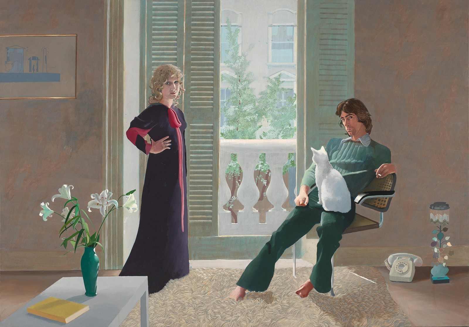
JD: Definitely, but also the exercise in intimacy and the play on official portraits – the empathy and psychology. You can feel all the relationships going on. There are little narratives – for example, the portrait of Shirley Goldfarb and Gregory Masurovsky [1974], you can read the situation. She’s in the window, as if she is exposing herself [to the] outside, and her husband is working in the shadows.
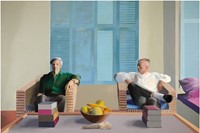
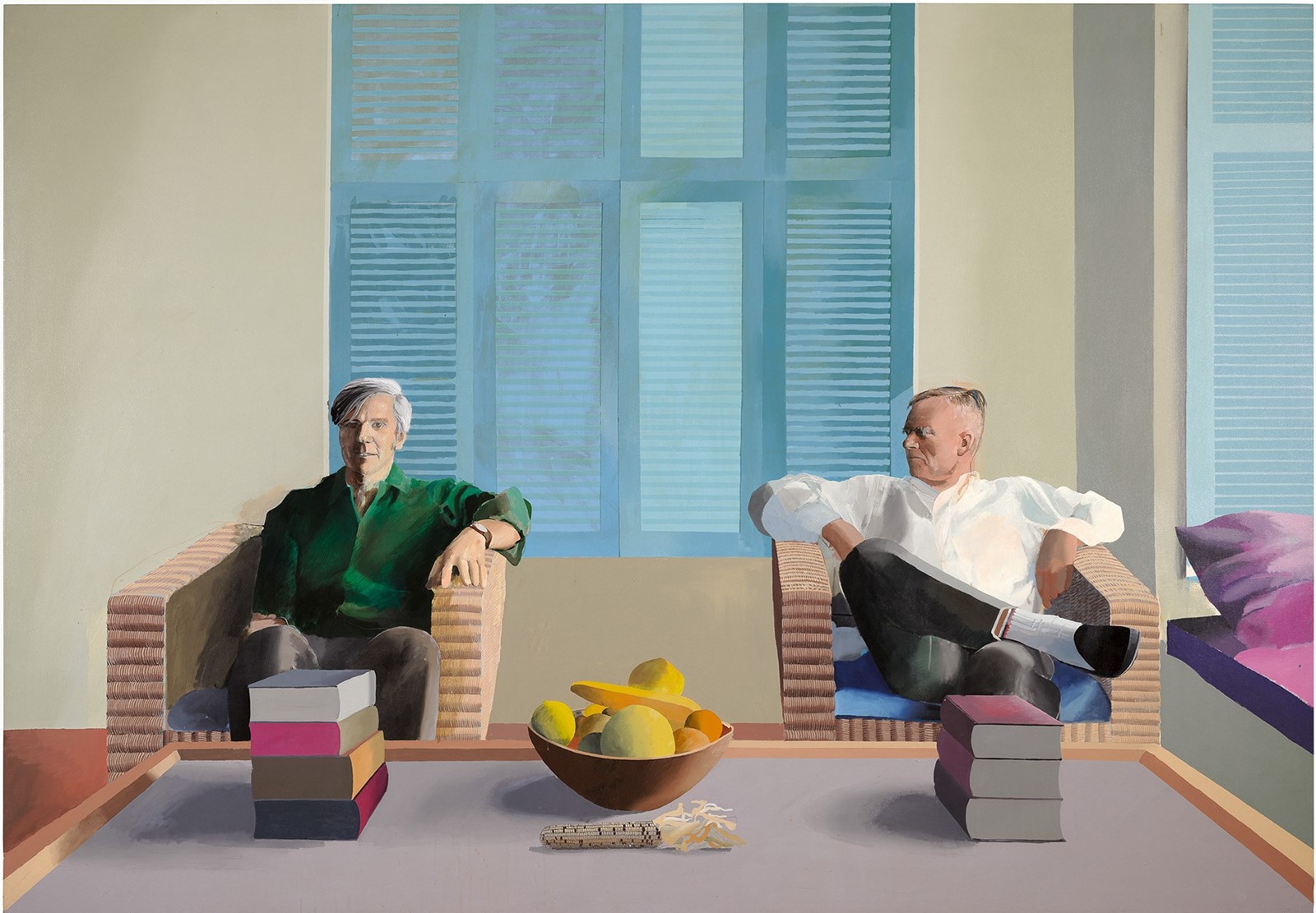
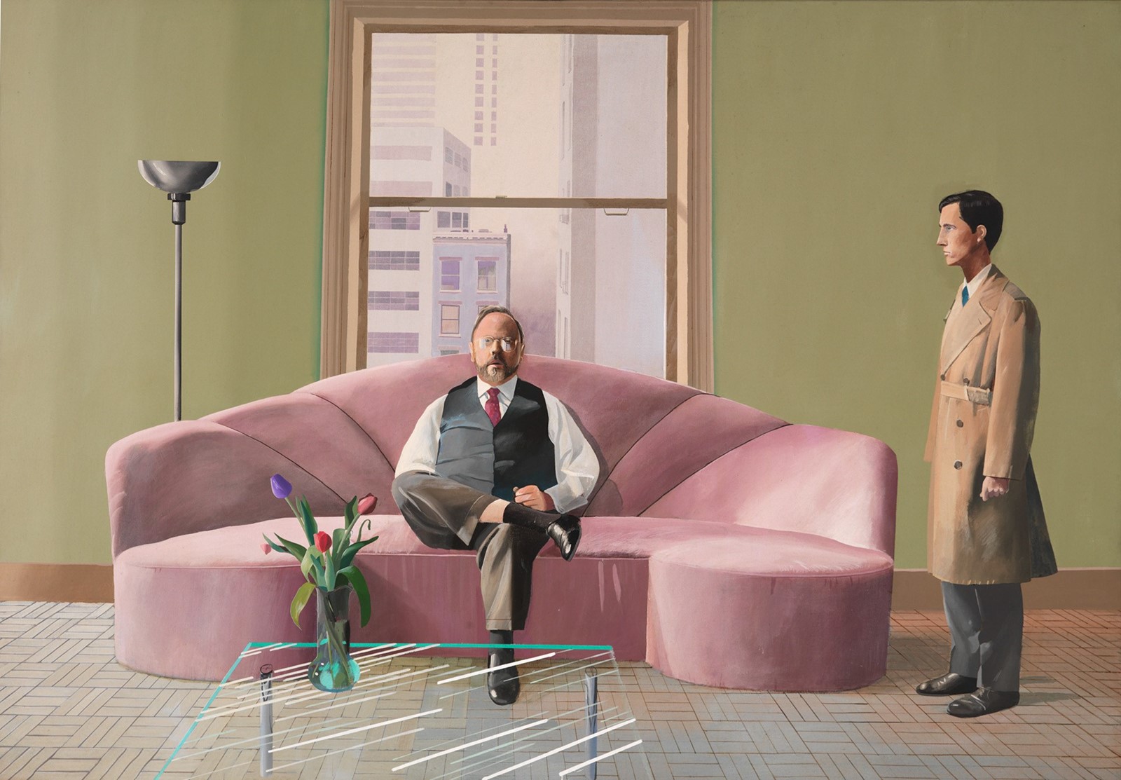
Then there’s Henry [Geldzahler and Christopher Scott (1969)], which really spoke to me as the first expression of an official portrait of a gay couple in that moment. You get the feeling that Henry, on the pink sofa, is the star – he’s really frontal – and that Christopher is about to leave. You start asking questions about the way power is displayed in that relationship.
Hockney is the only painter in whose work I find this humanity, empathy, and at the same time a kind of sharp psychology. They’re psychoanalytical – it’s like watching a movie. And beside the composition, of course, the mastery, the colours, the light and the moments that he catches.

ED: Yes, they’ve all got that tension you inevitably find between couples. And I think the one of Henry and Christopher Scott is a really interesting one, because one of the things that David has said about Renaissance painting is that you usually have someone who’s the static main character – the Madonna or the Christ figure – and all of the others are moveable, peripheral players.
With just one exception [Portrait of Sir David Webster (1971)], none of his portraits have been commissioned. He has always decided who he wants to paint so he’s got total artistic freedom, which was unbelievably important to him as a young artist – and still is now.
JD: When I was looking at his work, his artistic life and production, it all feels like research for his curiosity – a way of expressing his own vision. I love that bravery of going exactly where he wanted to go without confronting what was going on in art history at that moment. I love that consistency of freedom. There’s a stubbornness – I say this in a complimentary way – in his being so keen to keep his creative freedom and live how he wanted to.
And of course, working in fashion, I love the way he linked his personality to his work. At that moment it was new that an artist should constantly express what he felt about the world via his appearance. The way he composed his look – the way he still does – mixing colours, the stripes, the socks and everything. He’s a total artist in that sense as well – he’s living for his art, creating strong images on every occasion. For me that’s a sign of total commitment and engagement.
ED: It’s interesting about the clothing – it’s that notion that, with a true artist, their creativity imbues every area of their life. I was also interested in the prevalence of Los Angeles in the works that you chose. He was there for quite a long time. He first went to New York in 1961, so he was still a student at that stage. With London – as we know from photographs taken in the 1960s – everyone says, “Well, it’s when it was happening. It’s when the Beatles were coming up.” But that was a tiny pocket of the population, it was actually very, very dull and very grey. To go to New York and then, three years later, to go to Los Angeles – it was an extraordinary thing for him.
JD: Definitely. I think it must have blown his mind at that moment. You can see that when you look at the way his paintings changed, the space and the scale. I have the impression it all changed when he moved to LA – the pictures themselves got bigger and bigger. You can feel that it’s a sensitive impression of what’s going on around him. And more than that, I guess that, culturally, it must have been a shock for an Englishman to go to the US at that moment.


ED: Exactly. It was a really interesting time. It’s always that thing about taste and fashion – the main museums were cottoning on, getting interested in abstract expressionism and collecting it just when it was actually waning as an art movement. But pop art was starting. David met Andy Warhol when he went over to New York – and Jasper Johns and Robert Rauschenberg were really taking the city by storm. You can see there were elements of both the abstract expressionist movement and pop art that he was absorbing into his own work.
JD: Yes, you can feel it straight away, and the fact that New York is very different from Los Angeles. As if everything was through a different filter in Los Angeles – as if the colours were more vivid and more raw. It seems as if it was an eye-opener for him – that light, those colours, those spaces – that he was discovering a totally new world.
ED: I think he almost knew that before he went. I remember talking to him a few years ago when I was curating a show on the work of Richard Diebenkorn. Diebenkorn had always lived in California and his last body of work was made in Los Angeles. David said that when he was a student, he saw Diebenkorn’s work in London and he knew, looking at his paintings, that he was painting under a completely different light, and that it was something he had never experienced, and he wanted to get there.
JD: Wow, so he perceived that from another artist’s work and he left straight away. He went to Los Angeles as soon as he could, right?
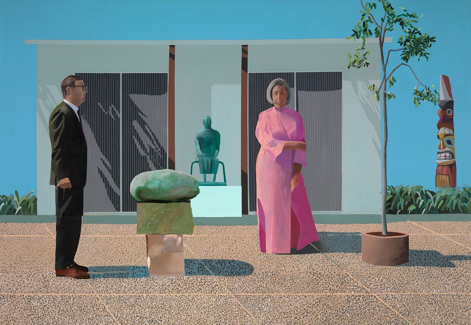
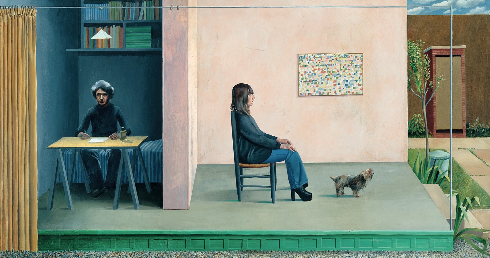
ED: Yes, in 1964. He was a regular visitor there and finally settled in the late Seventies. But it became a really important place for him. There was a huge art scene going on there, so he befriended people like Ed Ruscha, who he’s still friends with, and John Baldessari and that whole group of artists there. But he was doing something completely different. That’s the interesting thing, when you think about what was going on there. David was painting these extraordinary double portraits – the picture of Mr and Mrs Clark and Percy [1970-71] is based on Thomas Gainsborough, that formality of the classic couple in a portrait. He’s always swum against the tide in that way.
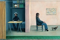
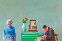
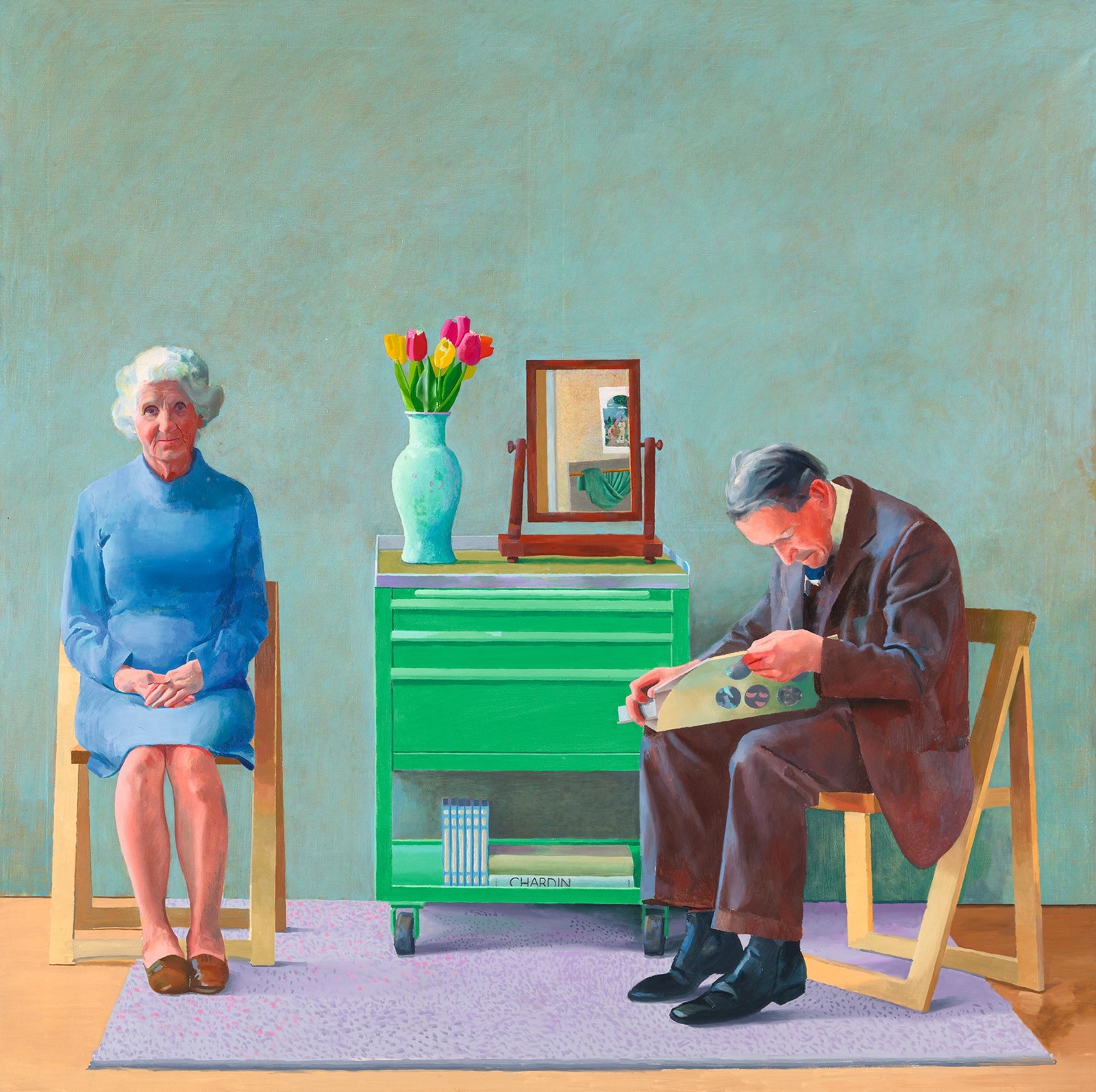
JD: He always managed that balance between curiosity – or the sharpness of his observation – and his empathy for humanity. For example, I love the portrait of his parents [My Parents (1977)], which I guess is much more personal for him.


ED: It’s beautiful, yes.
JD: There is something so intimate in that portrait. His mother is this all-complete character, while the father is on the edge of the chair, reading a book, because he didn’t want to be too intimate sitting for the portrait. It is so delicate.
ED: It’s so touchingly done, and you’re right, it’s got that tenderness to it. You mentioned the father, and I love the way his toes are on the floor, his heels are up because he’s levelling his lap for the book to sit on and he’s engaged in that, but his mother is taking it much more seriously because this is her son. It’s absolutely amazing – there is such humanity there that we can’t help but respond to it.
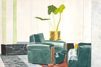
JD: He’s the master of the interior. The balance between that sensitivity and the extraordinary mastery of his art, technically. There aren’t many painters I feel that connection with. In the Los Angeles pictures there is something a bit more meditative. For example, I love that almost-abstract composition of Rubber Ring Floating in a Swimming Pool [1971].
ED: I was so pleased you chose that. It’s one of my favourite works.
JD: There’s the composition, the colours – you are touched by the fact that maybe it’s a more meditative moment for him, that there is no character. Maybe there’s a loneliness in that moment – it’s a quiet environment.

, 1978, coloured and pressed paper pulp)
ED: It’s a remarkable work, and it’s got that abstract quality to it, hasn’t it? If it didn’t have the title, you would see it in a different way. But as soon as it’s given that title, which becomes the narrative, you understand it as an image. And I find that really interesting, and the red is such a strong force within that overall painting – at that stage, he was thinning his paints quite a lot and painting straight onto the canvas, and to some extent that was influenced by some of the second-generation abstract expressionist painters, like Helen Frankenthaler. Mark Rothko used to do it a bit as well. But you go straight onto the blank canvas, and the paint then stains it rather than sits on the surface. So it’s got this very, very watery quality, which of course is in sympathy with the subject matter.
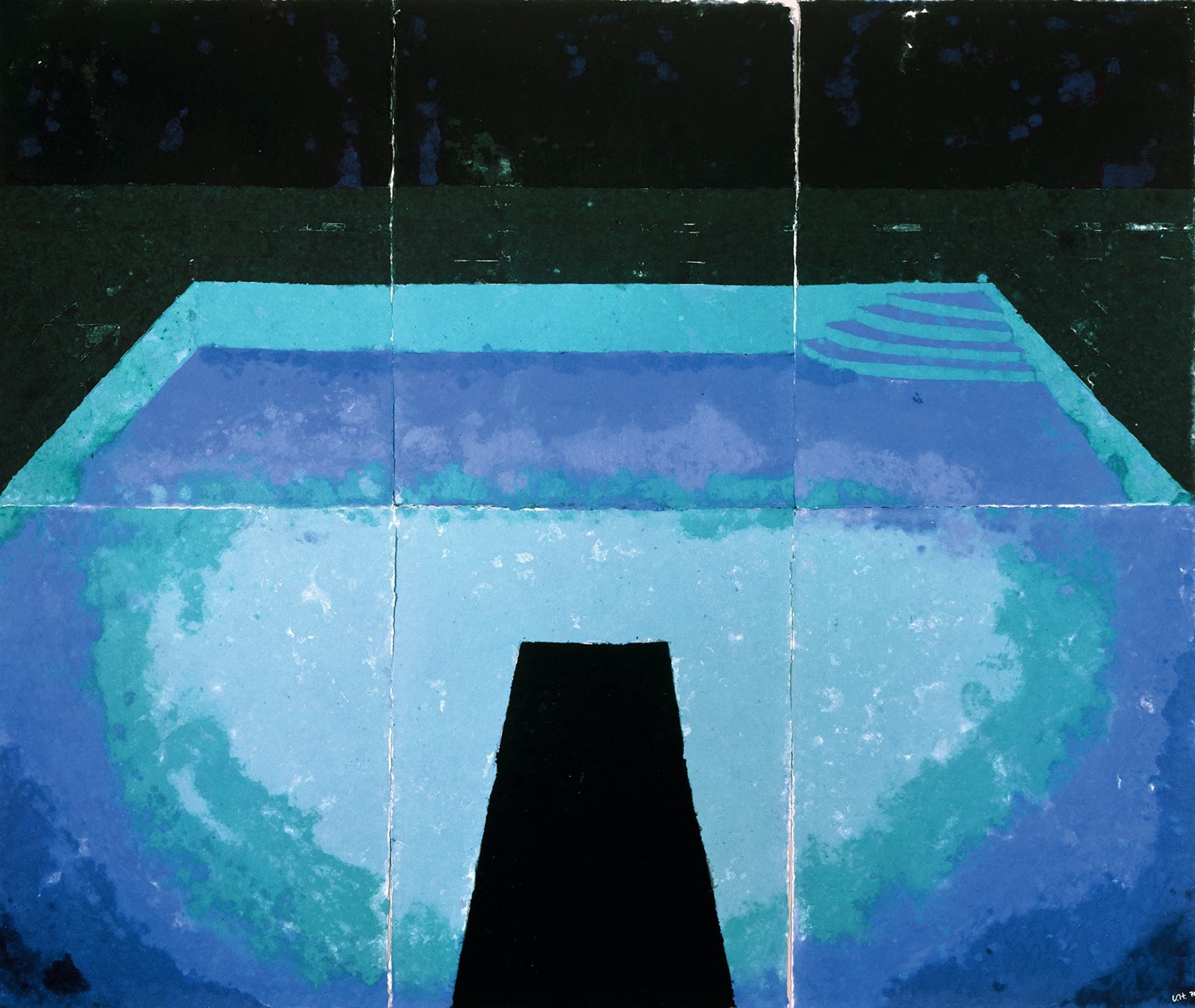
I was also very interested that you chose one of the Paper Pools [Midnight Pool (Paper Pool 10) (1978)] ...
JD: Yes. I read that, for those, he would put the paper directly into the colour – that he worked so hard on that technique because it expresses colour super-vividly.
ED: I think he made the paper into pulp that absorbed all of the dye, which he then arranged. That’s why they’ve got that really abstracted quality. It really is an exercise in working with colour, and the colour dominates the whole composition.
JD: And the light as well, because you can see the light going through, as if the light was going through the pulp of the paper, even before the colour. It’s like an apparition, it’s almost magical. And the same precision is in the composition as well, the delicacy of the little stairs.
ED: You’re absolutely right, the little stairs. Again, that and the diving board give a clue as to what it is.

JD: Exactly. I love that flirtation between abstraction and this figurative and tangible sensitivity.
ED: You know, in the range that you’ve chosen, you start with that hyperrealism – he never got into photorealism because that just wasn’t his thing at all. But the naturalism in the work – like Mr and Mrs Clark and Percy, and My Parents – it’s so strong. And yet he can veer right to the other extreme as well. And you almost, almost get to abstraction, but he never crosses that line.
JD: Yes, I love that precision in what he wanted to achieve – never losing sight of expressing his viewpoint. He never goes theoretical within the art movement. Of course, you can feel that he’s thinking about what he’s doing at that moment and how he’s going to make progress in this discipline, but there’s always that stubbornness of precision but also a delicacy about his choices and his work, which I find extremely rare.
ED: Yes, it is rare. He’s very interested in art history as well as what’s going on around him. His knowledge and his interest are just extraordinary. He will go to every exhibition of consequence he can. Matisse is another artist he is really interested in – and Matisse is extraordinary because he also flirted with the idea of abstraction. He went very far, but again, like David, he was too interested in the world around him. They’re both too engaged in life, and abstraction just doesn’t get them there.
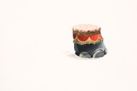
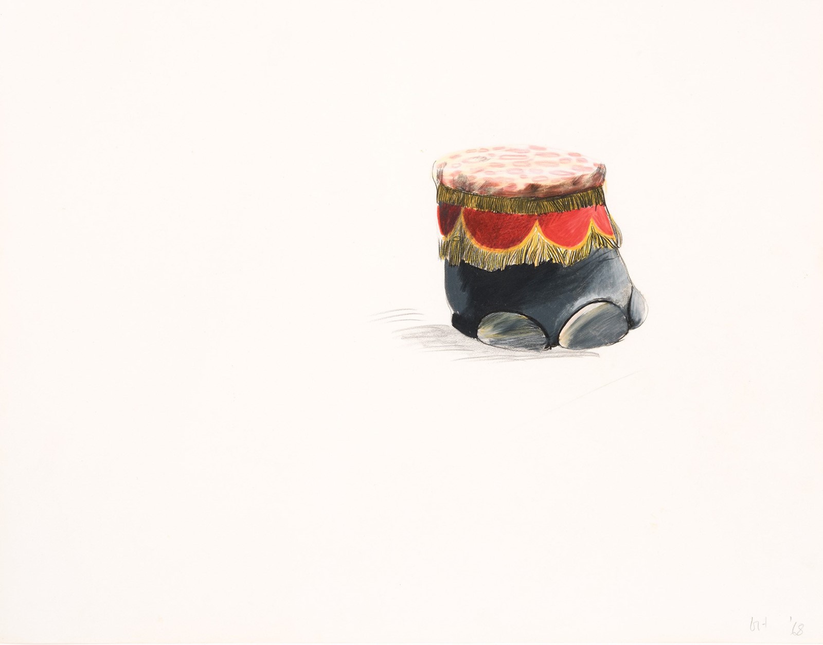
JD: That’s it – too engaged in life, which really is deeply admirable and brave. I know it was a big departure point for him when he was able to see the big exhibition of Picasso [at the Tate in 1960] when he was young. I always felt that fertility, that richness in his work – that he was always searching for new ways to express himself, which I find super-hard to do. It makes his work the most consistent over a lifetime. That’s why I chose Elephant Foot Stool [1968].
ED: It’s so beautiful, yes, it’s gorgeous.

JD: I felt like it was evidence of something that piqued his interest – not a memory, but an object that he extracted from its reality. This might be my fantasy, of course, but I felt that it could be anywhere, anytime, without any boundaries other than the limit that he has to be creative. That’s almost childlike, that genuine joy that you have to create and to express yourself as an artist, which I found really extraordinary.
ED: One of the things he says about drawing – and you chose that very, very beautiful drawing from Christopher Isherwood’s house – is how important it is as a discipline for artists when they’re young. He said that the thing about drawing is it teaches you how to look. And it’s a very simple thing to say, but actually it’s very profound as well. And that’s something that he continues to see, and you were right, he’d see that stool and want to capture it, want to see it properly – the way he sees it properly is to draw it.
JD: It’s almost like a language, like a filter that you apply to the world to learn how to look at it. It’s as if he translates his own relationship with the world into drawings. Those drawings seem to be something that he can totally involve himself in. You can feel that he’s caught by, not an urge exactly, but a total perception of the world, a way of looking.
This article originally featured in the Spring/Summer 2021 issue of AnOther Magazine which will be on sale from 8 April, 2021.