
Katie Treggiden speaks to the India-born surface pattern designer bringing vibrancy of the subcontinent to London
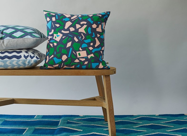
Having moved to London to study at Central Saint Martin’s, it was homesickness that led surface pattern designer Kangan Arora to create her debut collection, inspired by the colour and chaos she had left behind in the Punjab. “Not for nothing is pink known as the ‘navy blue of India’,” she says. “I have some magical childhood memories of Holi, the festival of colour. Our faces would be stained magenta or bright blue for days afterwards, and the streets looked as if they’d been washed with paint.” Combine that colour-filled childhood with a family textiles business that goes back generations, and years of study at Central Saint Martins and the National Institute of Fashion, and Arora’s inimitable style starts to make perfect sense. The institutions who can identify it are plenty, too – she has collaborated with Heal’s, Urban Outfitters and Floor Story, and her work has been showcased at Milan’s Triennale Design Museum, the Southbank Centre and the V&A Museum.


Homeward Bound
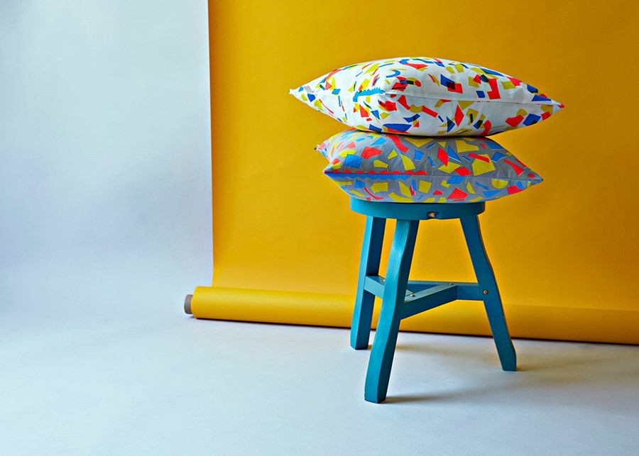
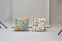
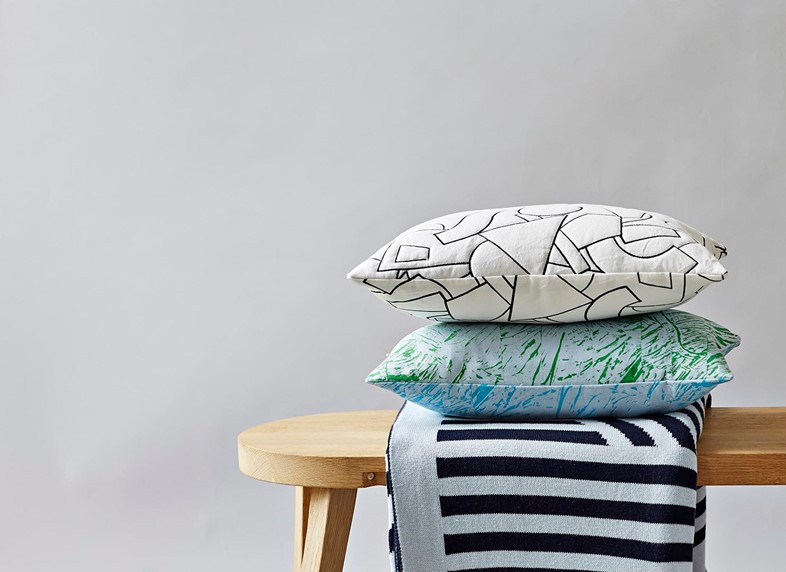
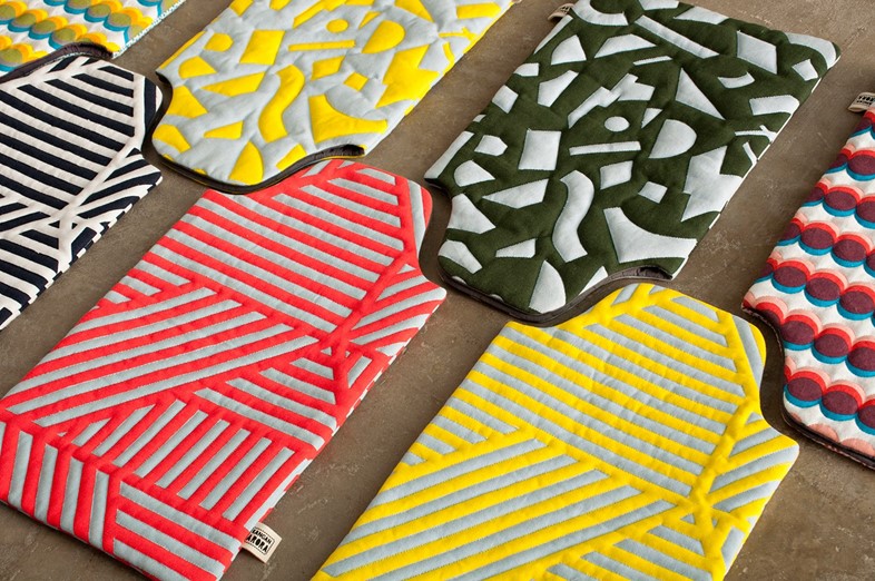
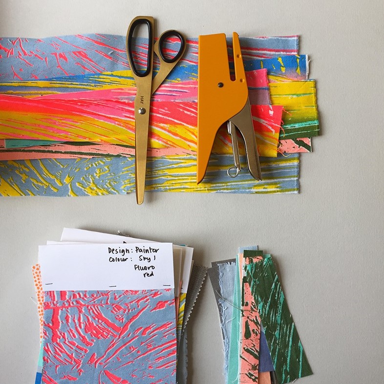
Arora regularly goes back to India, and every trip sparks new ideas. “I can go home and be inspired by something on every corner, from a wall of peeling paint, to somebody wearing a ridiculous outfit,” she says. “It’s the accidental and unexpected juxtapositions that inspire me – the orderly chaos. I always come back feeling energised, as if all five of my senses have been fully charged.” Her most recent collection, Fluorescent Forest, comprises three prints: Painter, Radium and Jali. Painter is a tribute to the beautiful hand-painted signs that adorn commercial trucks in India; Radium takes cues from the vinyl offcuts that cover every surface of the workshops that create more contemporary signage; and Jali references decorative steel screens used to protect Punjabi windows.

Colour Theory
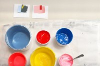
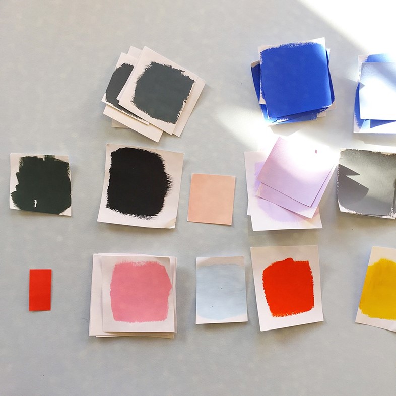
“Growing up in India, you can’t escape colour,” she says. “It’s in our homes, on the street, in our food, our clothing and especially our festivals.” Arora uses the Pantone colour system for commercial freelance work, and a 4000-colour ‘pom-pom box’ for her collaborations with rug manufacturer Floor Story, but for her own work, she prefers to mix colours herself. “I had a wonderful tutor at CSM called Garth Lewis who taught us colour theory. We spent two weeks painting thousands of little squares to make value charts to understand the subtle differences between various hues and tones,” she says. “As a result, I can now be very intuitive about colour. I love the sheer alchemy of blending paint and pigment – the colours that emerge sometimes really take me by surprise.”

Creative Practice
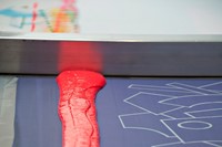
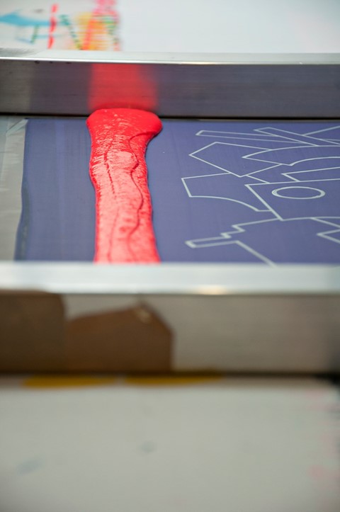
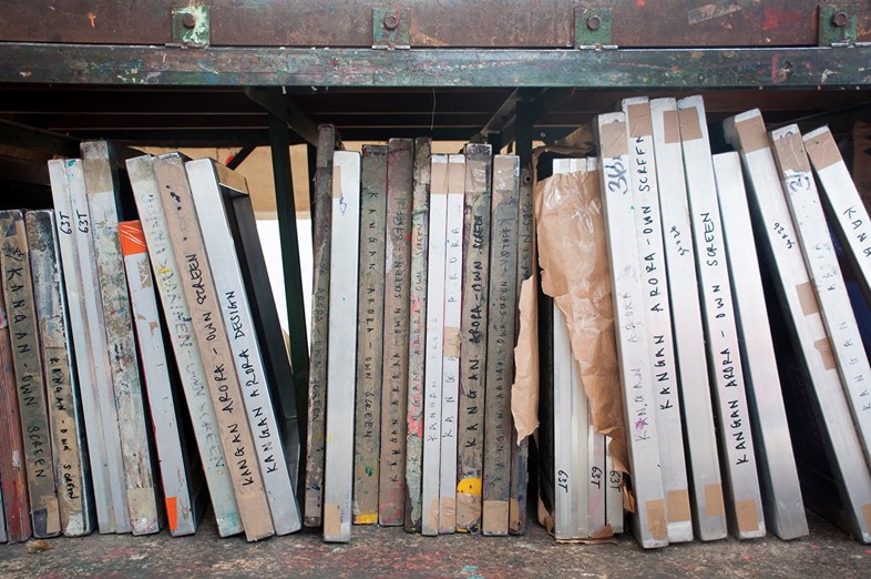
Having first studied at Central Saint Martin’s, Arora now teaches there, something she says is an important part of her practice as a working designer. “Teaching and learning go both ways,” she says. “I’m constantly learning new things from my students and that’s something one shouldn’t ever take for granted.” Arora is also a firm advocate of ‘hand learning’ as well as ‘head learning’. “One of the things I love about CSM is that, for all of its modern equipment and progressive teaching methods, it doesn’t neglect the basics - painting, drawing and learning by doing,” she says. “It’s amazing to see students discover the magic of screen-printing with child-like enthusiasm, just like I did when I was at college. It’s wonderful to give something back – it’s that thing of ‘sending the elevator back down.’”


With special thanks to Kangan Arora.