Gareth Hague is a leading type designer, graphic designer, and co-founder of Alias, which he began in 1996 with acclaimed art director David James. Alias is a type foundry and graphic design agency that creates bespoke and innovative logos, typefaces, and graphic identities for clients including AnOther Magazine, Another Man, Prada, McQ, 3.1 Phillip Lim and London 2012.
On early inspirations... "Growing up just outside of London and having an older brother and sister were both driving factors for my interest in design [they both introduced me to music]. I had a very broad set of music references, particularly graphics. I would also go to football matches and that part of youth culture was really interesting for me."
"The thing about type is it's not fashion. Fashion is the fashion 'moment'; it's always changing. Type is a permanent thing"
The difference between fashion and type design... "The thing about type is it's not fashion. Fashion is the fashion 'moment' – it's always changing. Type is a permanent thing. The balance between the two is quite interesting. I think that's why David James and I work so well together – he built a career on image, and mine has always been focused on type."
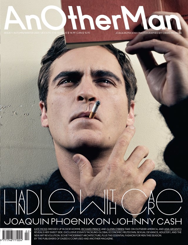
Another Man, Autumn/Winter 2005
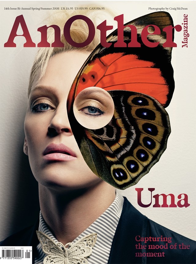
AnOther Magazine, Spring/Summer 2008Photography by Craig McDean
AnOther Magazine, Spring/Summer 2010Photography by Craig McDean
AnOther Magazine, Spring/Summer 2010Photography by Craig McDean
On designing the Another Man and AnOther Magazine logos... "A logo is a flag, especially for a fashion magazine. It's an opportunity to make a statement of difference. It's the first thing people see. If someone doesn't like the logo, there's a good chance they're not going to pick up the magazine. We worked on Another Man before AnOther Magazine. We started out with lots of complicated graphic design solutions for the logo and eventually settled on quite a simple technique which was playing around with the two words – 'Another' and 'Man' – and separating so it becomes 'an' 'other' 'man' by the capital letters. It created a really grammatically quirky word. We created a backwards slant typeface which was a way to add to the quirkiness. A good logo doesn't try to do everything at once. AnOther Magazine is essentially a serif version of the Another Man typeface. The big 'O' added an element of surprise. The intention is to always catch someone's eye and create something memorable."
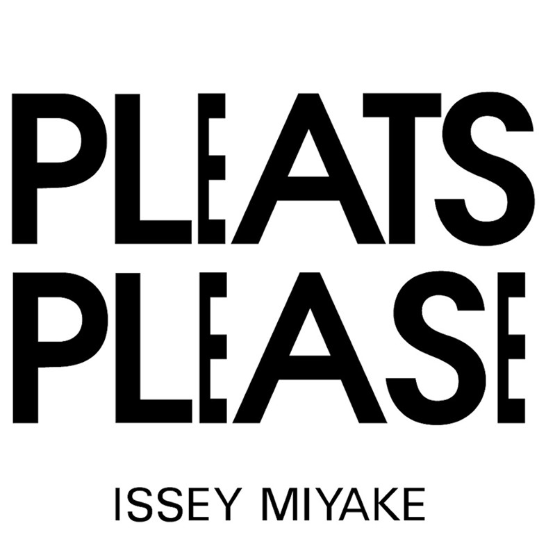
Pleats Please logo, Issey Miyake
On his favourite fashion logos of all-time... "I've always loved the Issey Miyake Pleats Please logo. It's an incredibly clever, simple idea. Just to take those two words, put one above the other and to just stretch and condense the letter forms so they suggest pleats. It's fantastic."
On the importance of having an unique viewpoint... "You always try and express a point of view. If you’re in a creative industry and you don’t have a point of view, or a position of difference, then why are you doing it?"
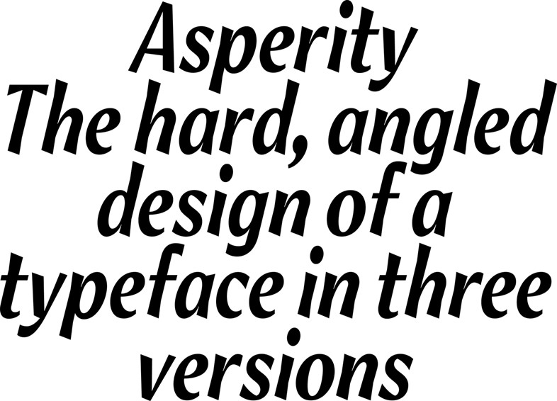
AsperityType Face by Alias.
On naming fonts... "Naming fonts is a bit like naming your children, but you have more fonts than you have kids. They have to be unique so it's a tricky process. A lot of the Alias font names are organic things such as Cactus and Elephant."
On his working environment... "Designing lettering in particular does involve an awful lot of time and effort and layers and layers of development in it, and it does sort of mean you’re stuck at a computer for a good number of hours a day. Drinking the occasional cup of tea, going to the loo, and not talking to people."
On the most rewarding part of his job... "Making work you believe in. I think that if you can do something that you believe in, other people can believe in it too. That’s a fantastic moment."
On favourite words... "The names of my two children."
Text by Laura Bradley
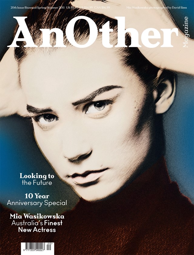
AnOther Magazine, Spring/Summer 2011Photography by David Sims
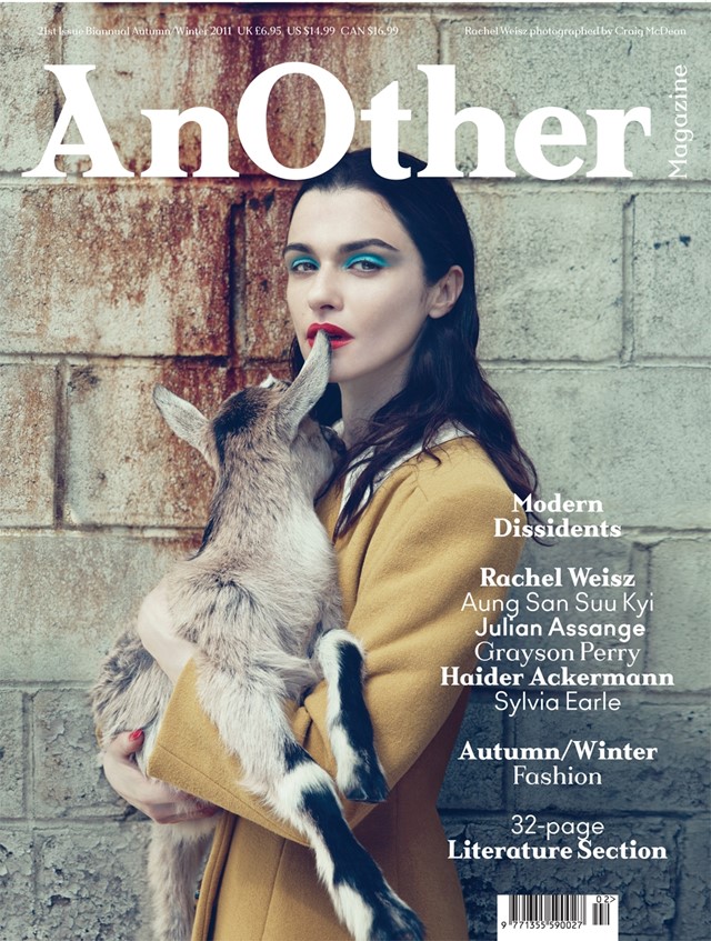
AnOther Magazine, Autumn/Winter 2011Photography by Craig McDean
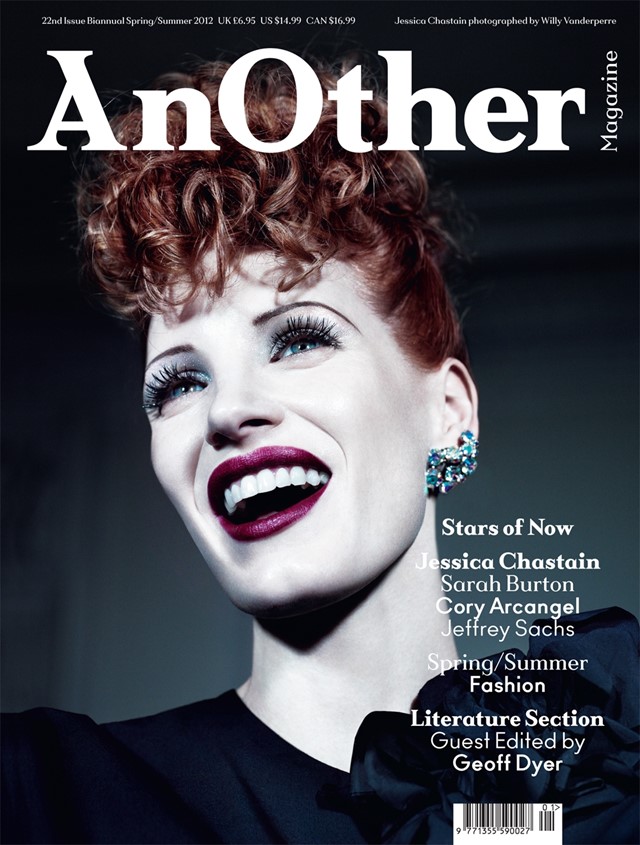
AnOther Magazine, Spring/Summer 2012Photography by Willy Vanderperre