
Day two of #WordWeek on Anothermag.com, and we plunge headfirst into Steven Heller and Gail Anderson's remarkable Typographic Universe
It is easy to wax lyrical about the beauty of words. Describing the depth of emotion they are able to convey sometimes, ironically, surpasses the medium itself. But what of their physical beauty? What of the coils and undulations of written words, that are so often overlooked? From sign posts to bank statements, the typographic medium permeates even the most mundane aspects of our existence; so much so, that we often forget there is a design process behind it. Yet the fact is, words and letters are the most democratic art form, in which the majority of people participate daily.

Authors Steven Heller and Gail Anderson explore this idea in their latest book, The Typographic Universe; taking an unrestricted approach to celebrating the world of letters in their most organic state. This, they explain, is essentially a form of pareidolia – the condition of perceiving a pattern in a situation where it does not exist. Derived from the Greek words, para – meaning ‘alongside’ – and eídōlon – meaning ‘form’ – pareidolia can be as simple as seeing a face in your bowl of cereal. So it is with words, Heller and Anderson suggest – “it is impossible not to see letters everywhere.”
"Pareidolia – the condition of perceiving a pattern in a situation where it does not exist"
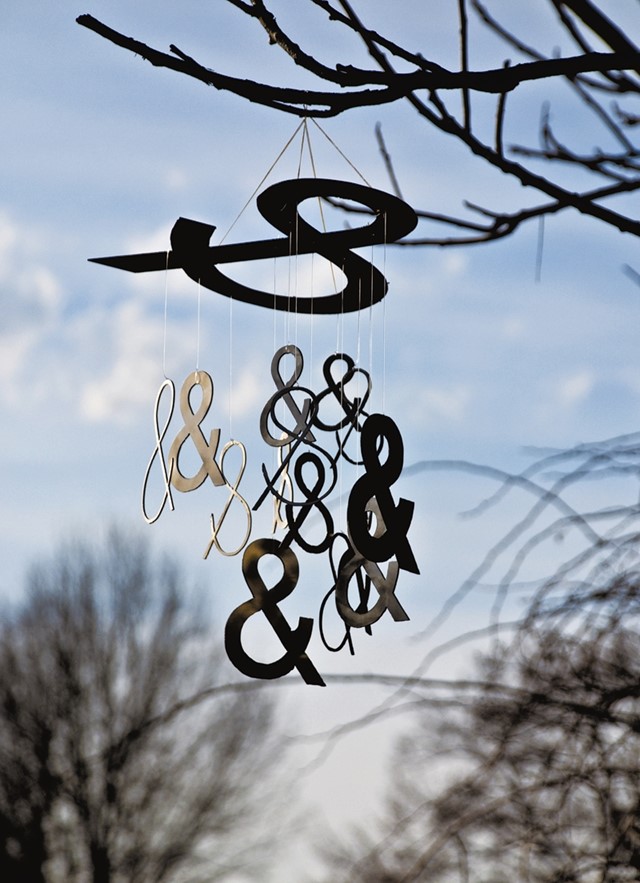
The result, is a witty and innovative compilation of more than 300 examples of typeface, that each defy the limitations of classic serifs and sans serifs. Whether by deliberately manipulating everyday objects – from foodstuffs to underwear – or capturing ephemeral moments of nature, such as the serendipitous position of clouds; for Heller and Anderson, letters are ubiquitous. And discovering them is as simple as A, B, C...

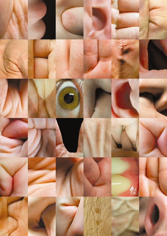
A is for Anatomy
In their anatomical alphabet, photographers Piotr Gajewski and Grzegorz Samson reference the human fascination with mimickery; harking back to the days when we used our hands to make shadow puppets. The series stems harnesses the fragility of the living body, forming letters from the wrinkles and creases of delicate human skin.

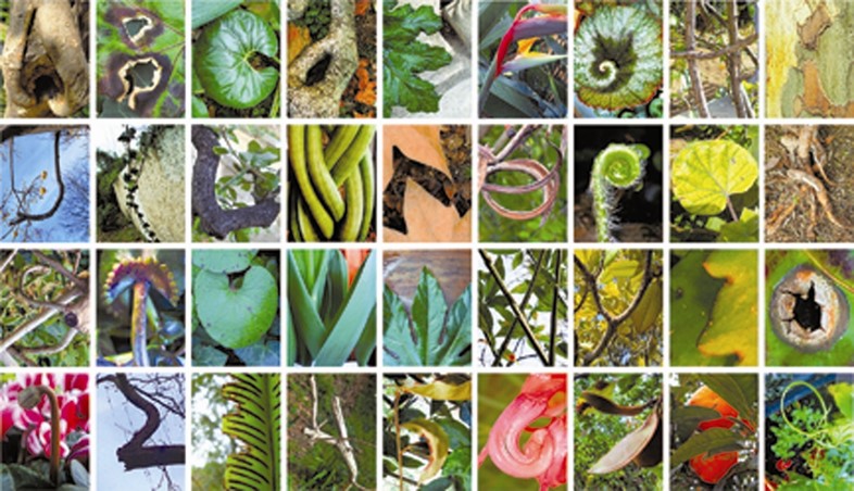
B is for Bright and Beautiful
From branches and bark, to fauna and foliage; all things bright and beautiful can be viewed as recognisable letter forms, as proved by Fabio de Minicis' brilliant ABC Plants. Yet, while such chance occurrences may be easy to miss – relying on a keen eye and a deliberate effort towards pareidolia – we can't help but wonder how we didn't see them before.

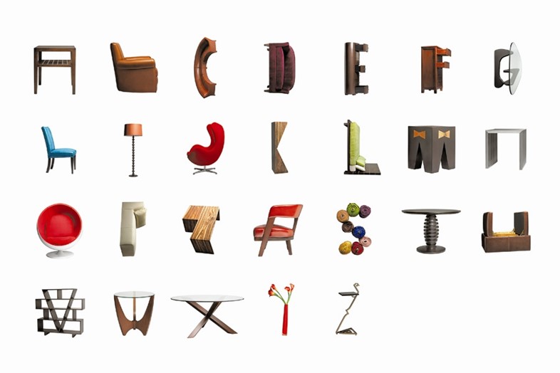
C is for Creature Comforts
Giving movement to inanimate household objects and furniture, The Butler Bros play on the aesthetic of retro interior design to create their playful alphabet series.
The Typographic Universe is published by Thames & Hudson on August 4.
Text by Abigail Gurney-Read