
The charismatic photographer talks us through her timeless snapshots of Belgravia's luxurious homes and their equally fabulous inhabitants
Born in Frankfurt am Main in Germany, raised in San Juan, Puerto Rico, and educated in Paris and London, photographer Karen Knorr has always been, in her own words, a bit of an outsider. "I've always felt slightly removed, but that's a great place to be when you’re a photographer," she tells AnOther. "It's really helpful to have that distance and it gives you the courage to do things that maybe other people wouldn’t dare do."
Knorr first took an interest in photography at the age of 14 when her mother, a photojournalist, converted her daughter's playhouse into a darkroom. Knorr soon learnt how to take and print her own images but it wasn't until a few years later, in 1977, that she decided to pursue the medium as a career, opting to apply to the notoriously oversubscribed Photography and Film BA course at the Polytechnic of Central London (now the University of Westminster). Her place was secured without difficulty, courtesy of her brilliant documentation of the city's punk scene (a series produced in collaboration with her friend Olivier Richon), which would later be transformed into iconic book, Punks. Knorr had finally found her photographic feet, and she didn't look back.
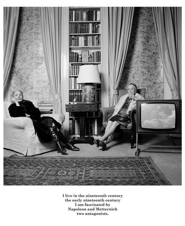
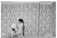
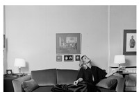
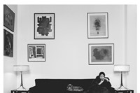
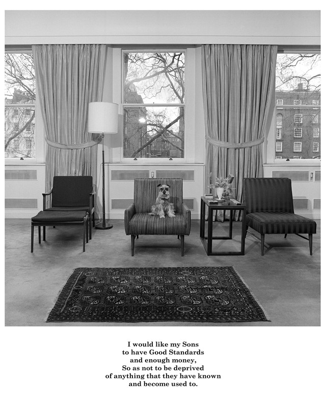
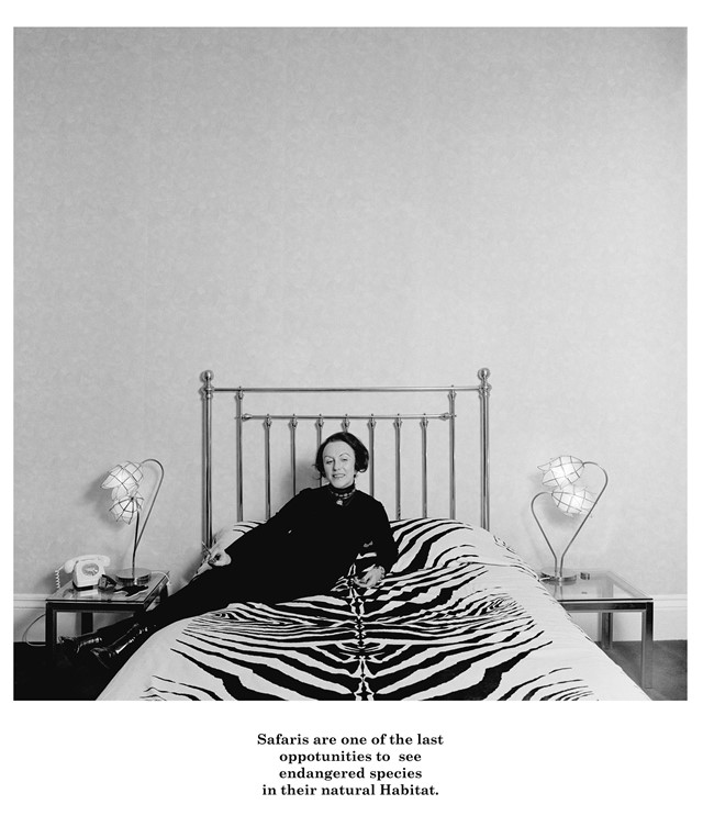
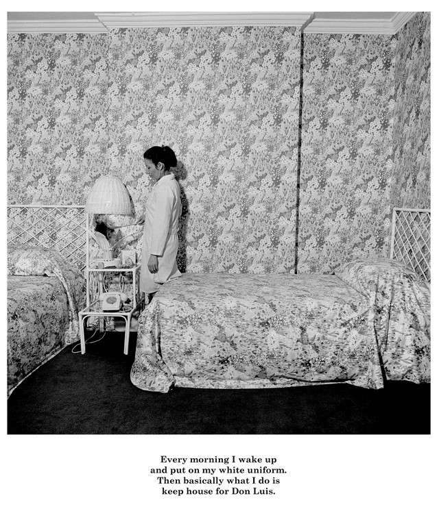
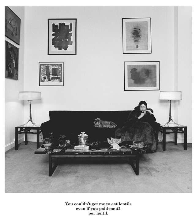
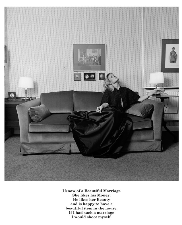
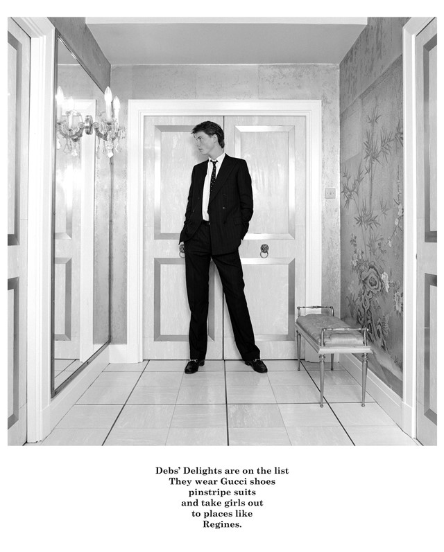
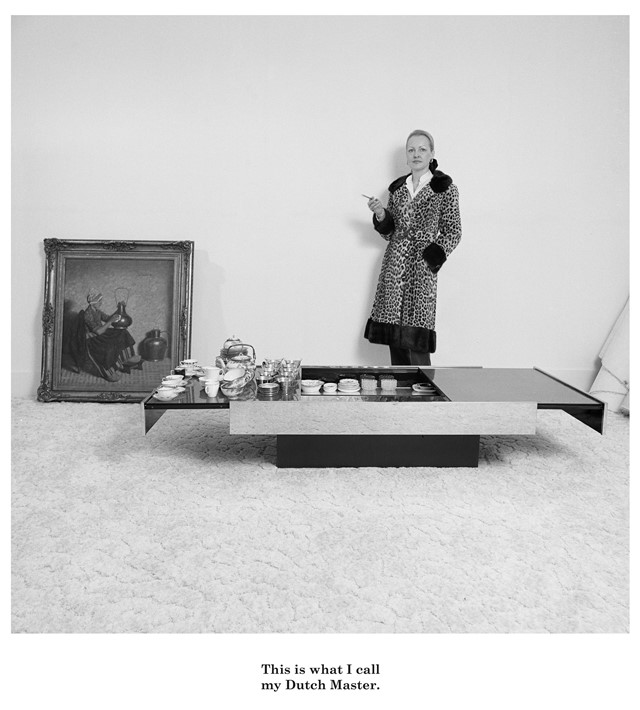
It was while in her second year of the course that Knorr decided to turn her lens to a very different sector of society – those populating the luxurious London district of Belgravia, where her own family then lived. A witty combination of image and accompanying, conversational text, the resulting photographs capture the elaborate homes of this upper echelon, introducing the viewer to its deliciously Gucci-clad characters and their various narratives. Every image is a fantastically stylised, environmental portrait, captured in a deliberately neutral tone and taken at exactly the same distance from the subject (a nod to the formalised compositions of Ed Ruscha). Now, 37-years on, the pictures have finally been compiled into a spellbinding book, titled simply Belgravia. Ahead of its release, we catch up with Knorr to discover the influences and intentions behind her timeless series.

On her inspiration for the series...
"I heard a talk by a really interesting photographer called Bill Owens, who did a book called Suburbia. At that time, photographers were just beginning to make books themselves – raising the money to publish them independently, which really inspired me. So I looked at that, and then I also looked at Diane Arbus and August Sander, different types of photographers. I decided that one thing that hadn’t been done in documentary photography was looking at the affluent in an interesting way, at least not since people like Bill Brandt who had done a lot of great stuff in the 1930s."

On the personal element behind the photographs...
"I myself was the product of a very well-to-do family; I had a lot of privilege and I was able to study in Britain thanks to them. I wanted to do something about my own family – who had recently moved to Belgravia – and their friends. Living in England, I’d become very cost-conscious, and although I was brought up in Latin America, in an American environment, I began to reflect on these privileges that I’d had all my life. So it's sort of a self-critique. I actually started with my mother and my grandmother in the living room; that was the very first portrait.
"To reiterate, I was an outsider from the inside; I'd always had that slight distance from it. When I came to London, I moved out of Belgravia after just a few months. I didn’t want to hang out in there; I just found it really boring. I’m more interested in subcultures, in street culture – like my series Punks – I felt uncomfortable actually being in Belgravia, I couldn’t relate to it."

On the unusual format...
"I decided that I wanted to do a piece that used image and text because I was trying to find a way of bringing in humour into my work. The quotations under the images are laid out like poems, to show that they’ve been tweaked and constructed. At the time, I was really influenced by conceptual art that was combining text and image. I also loved the work of artists like Dan Graham, who used photography for the printed page, which was how I wanted my work to look – so the image and the text are on the same surface of photographic paper."

On creating the scenes and accompanying text...
"I would bring my equipment to the people’s homes and we'd go into their closets to choose the clothes and shoes together. Then I would suggest several sites in the house and we'd work out the set-up – it would be a like little theatre really and it would quite entertain them. I would chat with them and get to know them and I would take the photographs. Then afterwards, thinking about the things that we’d talked about, I would construct the texts. I showed all the work to the people I photographed with the text and of course – because they’re totally in that environment, in that lifestyle – they didn’t see any humour in it. Some did, but a lot of them said, 'Yes, that’s pretty much how things are.'"

On her anti-portraitist stance...
"It’s not about the people themselves as individuals, it’s about the group. I wanted the images to be 'non-portraits'. A lot of these people were quite cosmopolitan – London was always really multicultural, even at that strata. Some of these people were from Turkey, my parents were American, there were Germans... but I wasn’t interested at all in the sort of stuff that you see in the National Portrait Gallery, where everybody has their name next to their photograph. And in those days, the National Portrait Gallery was only displaying photographs of British subjects, so I was also criticising that."

On her favourite image from the book...
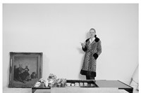
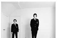
"I really do like the one on the cover [above], it’s one of my favourites. He looks like a giant but it’s because the apartment he’s standing in was built for Elizabeth Taylor and it’s very theatrical looking. If you photograph someone who’s quite tall using a two and a quarter square camera – where you have to look in at the top from a lower angle – people look taller. He looks a bit like a star from one of those old Hollywood movies. He went on to become a banker, of course."

On finally seeing her vision realised...
"It was actually a French gallery who showed Belgravia for the first time; funnily, the French were more supportive and sympathetic of my work than the English, until relatively recently when they began to pick up on it. Finally my work got published in 1991, in a comprehensive book by Thames & Hudson called Marks of Distinction, which had work from Belgravia in it – but not the whole series. This is what is special about this publication, it has all 26 images together – and it's also up as a series at the Tate, which is great. So they're finally having their moment!"
Belgravia is out next month, published by STANLEY/BARKER.